Form Design Principles: 12 Rules for Forms People Finish
Form Design Principles: 12 Rules for Forms People Finish
Good form design comes down to one idea: every field is a small ask, so make each ask clear, short and easy to answer. In practice that means a single-column layout, visible labels above fields, honest marking of optional fields, error messages that say how to fix the problem, and code that works with a keyboard and a screen reader. Get those right and most of the rest takes care of itself. 📝
We design forms for startups all the time (signup flows, demo requests, investor intake, checkout), and we have a confession: nobody wakes up excited to fill one in. Your job is to make it painless. Here is how.
TL;DR
- Use one column, labels above fields, and the same order in the code as on screen.
- Mark optional fields with “(optional)”, skip placeholder-as-label, and cut every field you can’t justify.
- Write errors in plain text beside the field, tied to it in code, and tell people how to fix them.
- Build for keyboards, screen readers and thumbs from day one: correct input types, autocomplete, no disabled fields.
- Test with real people and automated tools, then follow up with a manual pass.
Table of Contents
- Start with structure: fewer fields, one column, logical order
- One page or several steps?
- Labels, instructions and required fields
- Validation and error messages that help
- Accessible form design
- Mobile forms: where thumbs rule
- Emails that belong to your forms
- Perspective: why we design forms like product moments
- Make the form part of your design system
- Want a form that matches your brand and converts?
- A 12-point form review you can run this week
- FAQ
- Sources
Start with structure: fewer fields, one column, logical order
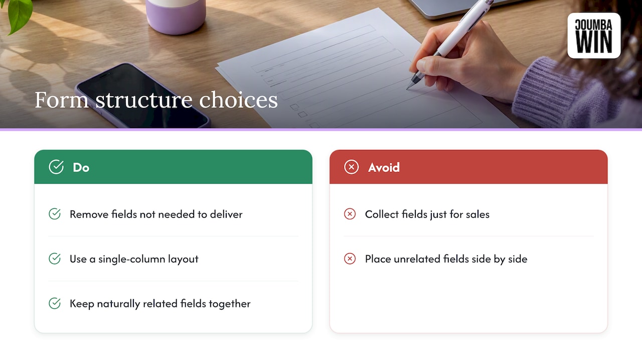
Before you touch a label or a button color, look at the list of fields. Each one adds effort, and each one is a place someone can quit. Ask of every field: do we need this to deliver the thing the person came for? If the answer is “it’d be nice for sales,” it’s a candidate for a follow-up email, not the first screen.
For what’s left, the U.S. Web Design System recommends a simple vertical layout, which is the single-column approach. One column gives the eye one path to follow: down. Side-by-side fields invite skipped questions and confusion about reading order. The exceptions are fields that belong together naturally, like city, state and ZIP, or a short month and year pair.
Group related fields
USWDS also advises grouping related controls with fieldsets and legends. A “Shipping address” group, a “Billing address” group and a “Contact details” group make a long form feel like three short ones. For sighted users that’s visual chunking. For screen reader users, the legend is announced as context for every control inside the group, so “Street” is understood as part of the shipping address.
Keep code order and screen order identical
This one bites teams who love CSS tricks. The same design system says form controls should appear in the HTML in the same order as on screen, because screen readers narrate form elements in HTML order and CSS rearranging doesn’t change that. If your layout visually moves the “Email” field above “Name” but the markup doesn’t, keyboard and screen reader users will tab through a form that makes no sense.
Write for a broad reading level
The Queensland Government’s form guidance suggests writing form content to a reading age below grade 9. It’s a government standard from Australia, but the logic travels: short words, short sentences, no internal jargon. “What’s your company’s legal entity name?” beats “Please provide registered corporate designation.”
One page or several steps?
This is the classic argument, and the honest answer is “it depends on the form.”
The Helsinki Design System suggests splitting a form into steps when it divides into distinct themes, when it is very long, or when users tend to make many errors, since steps show less information at once. The CFPB Design System adds the trade-off: single-page forms give context from neighboring sections, while wizards handle branching and saving progress better. It also notes that wizards can make long forms feel more manageable but can slow people down as they click and wait for each section to load.
Here’s how we’d decide:
| Situation | Better fit |
|---|---|
| Short form, 3 to 6 fields (newsletter, demo request) | Single page |
| Distinct themes (account, company, payment) | Multi-step |
| Answers change which questions come next | Multi-step with branching |
| People may need to stop and come back | Multi-step with saved progress |
| Users need to compare or review earlier answers | Single page, or a review step at the end |
If you go multi-step, show where people are (“Step 2 of 4”), let them go back without losing answers, and end with a review screen. Nobody likes the feeling of being trapped in a hallway with no exit signs.
Labels, instructions and required fields
Labels are where most forms quietly fail.
- Put labels above the fields. The W3C Design System places labels above inputs and advises against the placeholder attribute on text fields.
- Don’t use placeholders as labels. They vanish the moment someone types, they’re often low contrast, and people with memory or cognitive challenges lose the instruction mid-answer. Use placeholders, if at all, for a format hint, never the question itself.
- Keep labels short and specific. “Work email” is better than “Please enter your email address here.”
- Put hints between the label and the field, and keep them to one line.
Required vs. optional
USWDS suggests marking required fields with a red asterisk and explaining the symbol in text at the top of the form, and labeling optional fields with the word “optional” in parentheses. It also says to use the HTML required attribute and notify users when a required field is incomplete. Our habit: if most fields are required, flag the few optional ones with “(optional)” instead of scattering asterisks everywhere. Either way, never rely on color alone.
Validation and error messages that help
An error message is a tiny customer-service moment. Done well, it saves the submission. Done badly (“Invalid input!” in red), it ends the relationship.
WebAIM’s guidance on form validation says validation should identify errors clearly, explain in text how to fix them, and work by keyboard. Messages belong beside the field and should be associated with the control using aria-describedby so screen reader users hear them. Section508.gov says the same thing: describe errors in text and connect them to the field.
WebAIM also frames accessible error recovery as three steps: tell the user about the error, give access to the field that has the problem, and let them resubmit after fixing it. Concretely:
- On submit, move focus to a summary of errors at the top, or to the first invalid field.
- Link each item in the summary to its field.
- Put a specific message by each field: “Enter a date like 04/18/2026,” not “Wrong format.”
- Keep everything the person already typed. Never wipe a form because one field failed.
- Don’t signal errors with red alone. Add an icon and text.
On timing, validating after someone leaves a field (rather than on every keystroke) avoids scolding them for an email address they haven’t finished typing.
Accessible form design
If you’ve been wondering how accessibility fits in, here’s the short version: it isn’t a separate layer. The W3C Web Accessibility Initiative points out that accessible forms are easier for everyone, including people with cognitive disabilities, people using speech input, people with limited dexterity and people using screen readers.
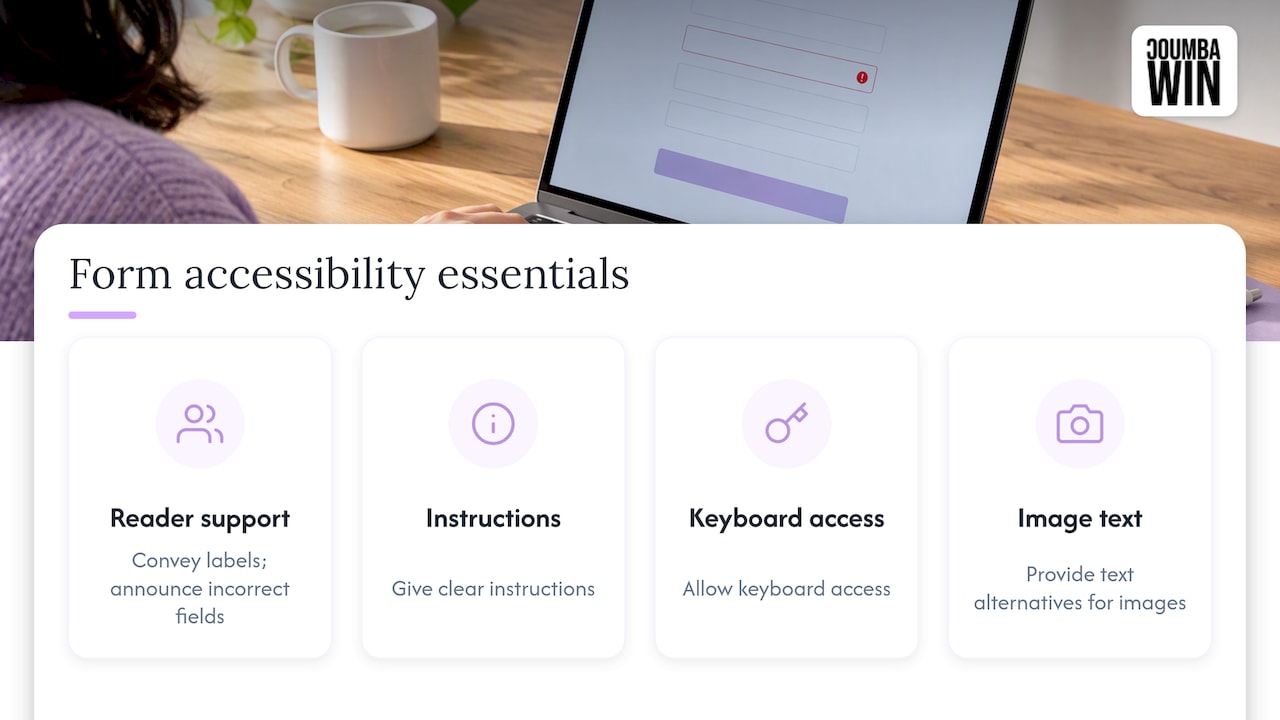
The U.S. Department of Justice’s web accessibility guidance names the form basics: labels that screen readers can convey, clear instructions, keyboard access, text alternatives for images, and automatically informing screen reader users when a field is incorrect. It also says sites should give the public a way to report accessibility problems, so put a contact route near your forms.
Skip the disabled button
It’s tempting to gray out “Submit” until everything is valid. USWDS recommends avoiding disabled states, especially on text inputs, because they have low contrast, give screen reader users no meaningful feedback and can’t be focused by keyboard. Leave the button active and explain what’s missing when someone presses it.
Quick accessible-form checklist
- Every input has a programmatically associated label.
- You can complete the form with the keyboard alone, and focus is always visible.
- Related fields are in fieldsets with legends.
- Errors are in text, linked to fields, and announced.
- Nothing relies on color alone.
- Text and borders have enough contrast.
For a wider walkthrough, our WCAG 2.2 checklist covers fast checks and test steps, and our website accessibility audit guide explains what a full review looks like.
Pair tools with a human
Automated scanners catch missing labels and contrast failures, but they can’t tell whether your error message makes sense. The DOJ says automated checkers should be paired with a manual check. The overlap between accessibility and SEO impact is one more reason to combine automated checks with hands-on review. Tab through the form yourself, then try it with a screen reader, then watch someone who isn’t on your team try to finish it.
Mobile forms: where thumbs rule
Most of the research above is device-agnostic, but phones expose lazy form code instantly. Three attributes do most of the work, and CSS-Tricks recommends treating them as a team: the right input type, inputmode and autocomplete.
- Input type:
email,telandurlbring up the right keyboard on a phone. The benefit is subtle on desktop and obvious on mobile. - Autocomplete: tokens like
name,emailandstreet-addresslet browsers fill fields in one tap. WCAG’s technique for HTML autocomplete attributes also notes this helps people with cognitive disabilities who may not recognize the purpose of a field from its label alone. - Touch targets: make fields and buttons big enough to hit without zooming, and leave space between them.
- Short answers: replace long dropdowns with radio buttons or segmented choices when there are only a handful of options.
We go deeper on this in our piece on mobile UX design best practices for startups. Whitespace matters here too, since cramped fields cause mis-taps; our guide to whitespace in web design shows how to give inputs room to breathe.
Emails that belong to your forms
A form doesn’t end at the submit button. Confirmation emails, receipts and “please fix this” notifications are part of the same experience, and they need the same care. People searching for HTML email accessibility guidelines are usually after a short list:
- Don’t use color alone. Section508.gov’s guidance says digital content should avoid using color alone to convey information.
- Offer a text version. The same page notes that inaccessible documents should have an equivalent text version, whether accessible HTML, another file format or the body of the email.
- Put key details in real text, not in an image. Confirmation numbers, dates and next steps should be selectable and readable by a screen reader.
- Use clear subject lines and plain structure: one idea per email, headings in order, descriptive link text.
If you’re polishing the bottom of those messages, we’ve also put together six email footer patterns.
Perspective: why we design forms like product moments
We think of forms as the most underrated piece of a startup’s brand. A founder will spend weeks on a logo and then hand a prospective customer a generic, twelve-field box that screams “template.” 😅
Our view: the form is where interest turns into a lead, a signup or a sale, so it deserves the same strategic attention as the homepage. That’s why we reject generic templates and AI-generated shortcuts, and why we work side by side with founders who treat design as a competitive advantage. A form built around your actual users, your actual growth goal and your actual tone will beat a pasted-in widget every time.
We also don’t treat accessibility as a late-stage patch. Labels, error handling, keyboard flow and mobile behavior are decisions we make at the start, alongside layout and copy, because it’s cheaper to build a form right than to rebuild it after the first complaint. That’s the work our UI and UX design, web development and accessibility audits are built for.
Coumba Evelyn
Make the form part of your design system
Once your form patterns work, write them down. Your input styles, error states, spacing and button hierarchy should live in one place so every new form inherits them. That’s how startups keep forms consistent as they scale, and how new hires avoid reinventing the wrong thing.
A few other details to standardize:
- Typography: readable sizes and line spacing in labels and hints. Our guide to typographic web design is a good companion.
- Calls to action: specific button text (“Get my demo,” not “Submit”). See our rundown of website call to action types.
- Interactive touches: inline hints, progress indicators and smart defaults, as shown in our interactive website features examples.
Want a form that matches your brand and converts?
If your signup, demo request or investor intake form feels like the weakest link in your funnel, we can help. Coumba Win designs and builds custom websites, UI and UX, and runs accessibility audits for startups, so your forms are on-brand, usable and built to scale with you.

See how we can help through our web design and development services, or look at our Webflow development work if your site lives there.
A 12-point form review you can run this week
- Cut every field that doesn’t serve the immediate goal.
- Use one column, with related fields grouped.
- Keep HTML order identical to visual order.
- Place visible labels above fields.
- Use no placeholder text as a label.
- Mark optional fields clearly with “(optional)”.
- Set correct input types and autocomplete tokens.
- Write errors in plain text beside fields, linked with
aria-describedby. - Keep the submit button enabled.
- Test with keyboard only.
- Run an automated scan, then a manual and screen reader pass.
- Review the confirmation and error emails too.
FAQ
What are the most important form design principles?
Keep the form as short as possible, use a single column, and put visible labels above each field. Mark optional fields clearly, write error messages that explain the fix, and make everything usable by keyboard. Those basics are supported by U.S. government design guidance and accessibility bodies.
How do I make a form accessible?
Give every input an associated label, group related fields with fieldsets and legends, and make sure the form works with a keyboard alone. Connect error messages to fields with aria-describedby and avoid disabled inputs. Then test manually in addition to running automated checkers.
Should I use a multi-step form or a single page?
Use a single page for short forms, and steps when a form is long, has distinct themes, needs branching or has users who make many errors. Steps show less at once, though they can slow people down with extra clicks. A review screen at the end helps either way.
Are placeholders okay instead of labels?
No. Placeholders disappear as soon as someone types, and W3C’s design system advises against them on text fields. Use a persistent label above the field and, if needed, a short hint beneath it.
How should emails tied to forms be accessible?
Put important information in real text, don’t use color alone to carry meaning, and provide a text-based version of anything that isn’t accessible. Keep the structure simple, with clear subject lines and descriptive link text.
Sources
- Form | U.S. Web Design System
- Form design principles | Queensland Government
- Multi-page forms | Helsinki Design System
- Designing forms | CFPB Design System
- Forms | W3C Design System
- Usable and Accessible Form Validation and Error Recovery | WebAIM
- Guide to Accessible Web Design and Development | Section508.gov
- Guidance on Web Accessibility and the ADA (PDF) | ADA.gov
- Guidance on Web Accessibility and the ADA | ADA.gov
- Forms Tutorial | W3C WAI
- Making Agency Communications Accessible to Everyone | Section508.gov
- Technique H98: Using HTML autocomplete attributes | W3C
- Better Form Inputs for Better Mobile User Experiences | CSS-Tricks