Logo vs Wordmark: Which One Should Your Startup Use?
Logo vs Wordmark: Which One Should Your Startup Use?
Here’s the short version: a wordmark is a logo, just a particular kind. It’s your company name set in custom type, with no symbol attached. “Logo” is the umbrella term, and it can be a wordmark, an emblem, an icon, or a combo of text and picture. So the real question isn’t logo versus wordmark. It’s whether your brand should lead with its name alone or add a symbol. For most early-stage startups, we say start with the name. 🙌
Below, we’ll untangle the vocabulary (it’s a mess, we promise it’s not just you), walk through when each option earns its keep, cover the sneaky trademark angle, and show how to make whichever you pick work from a 16-pixel favicon to a Demo Day banner.
TL;DR
- A wordmark is a text-only logo built around your name. A logo is the broader category that includes wordmarks, symbols and combinations.
- New brands, short names and distinctive names tend to suit wordmarks, because people learn the name and the look at the same time.
- Symbols pay off when you have a strategic reason for one, or when you need a compact mark for tiny spaces like app icons and avatars.
- The safest path for many startups is a wordmark plus a simple compact mark, built as a system from day one.
- For trademarks, a standard character (text) filing protects the wording itself, while a design filing protects one specific look.
Table of Contents
- What’s the difference between a logo and a wordmark?
- When a wordmark is the right call
- When you need a symbol or a combination mark
- Wordmark vs symbol vs combination: a quick decision guide
- Don’t forget the trademark angle
- Making your logo work everywhere
- A quick stress test before you commit
- Perspective
- Where this shows up: website, deck and booth
- Want a mark built for how your startup actually grows?
- FAQ
- Sources
What’s the difference between a logo and a wordmark?
Let’s get the definitions straight, because the internet uses these words loosely.
A logo is the simplest visual representation of an organization, and it may be a wordmark, an emblem, or a combination of both. A wordmark, by contrast, is a text-only typographic treatment that features just the name, with no images, icons or emblems. Think of it this way: every wordmark is a logo, but not every logo is a wordmark.
Then there’s the extra layer people trip over. Google Fonts describes a logomark as the specific graphic element, symbol or icon that stands for the brand, while the wordmark (also called a logotype) is the typographic design of the name. Many brands end up with both and pair them, which is what’s usually called a combination mark.
Here’s a quick cheat sheet:
| Term | What it is | Contains the name? |
|---|---|---|
| Logo | The umbrella term for a brand’s identifying mark | Sometimes |
| Wordmark (logotype) | The full name set in distinctive, custom typography | Yes |
| Logomark (symbol, icon) | A standalone graphic that represents the brand | No |
| Combination mark | A symbol and a wordmark designed to work together | Yes |
| Lettermark | Initials set as a logo | Initials only |
| Monogram | Letters interlocked or fused into one decorative shape | Letters only |
One more pair that confuses founders: lettermark versus monogram. In common design usage, a lettermark shows initials clearly and legibly (think of a company known by three letters), while a monogram fuses or interlocks letters into one decorative form. If your name is long, a lettermark can be a handy shortcut. But it has the same catch as any abbreviation: nobody knows what the letters mean until you’ve taught them.
When a wordmark is the right call
Wordmarks have a reputation for being the “safe” option. We’d call them the focused option. Here’s when they shine.
Your brand is new
A symbol is a piece of vocabulary your audience has to learn. Sagi Haviv, writing in PRINT Magazine, argues that visual identities work through familiarity, that people will learn as little as they can get away with, and that without a compelling strategic reason for a symbol, it’s better to put the emphasis on the name and find a simple, focused way to make it memorable.
For a startup with no brand awareness yet, that logic is hard to argue with. Every investor email, every conference badge and every landing page is a chance for someone to learn your name. A wordmark makes that the whole job.
Your name is short and distinctive
Shopify’s guide to wordmarks notes that they can suit new businesses, short names and distinct names, while longer names can look cluttered and get hard to read on smaller surfaces or screens. If your name is two syllables and a little bit weird (in the good way), you’ve got a wordmark just waiting to happen.
You want a direct, confident look
Wordmarks are about typography: letter shapes, spacing, weight, a custom detail in one character. That’s the whole stage, so the details matter. A single tweaked letterform can do more for personality than a generic icon ever will. This is also where whitespace does heavy lifting, and we’ve written about the role of whitespace in branding if you want to see how breathing room makes type feel premium.
You’re watching the budget
A wordmark has fewer moving parts than a full symbol-plus-type system, so it’s often a leaner way to get a professional identity out the door. Just don’t confuse “fewer parts” with “less thinking.” A good wordmark is drawn or heavily customized, not typed out in a default font and called a day.
When you need a symbol or a combination mark
Wordmarks aren’t magic. Here’s where they run into trouble, and where we’d reach for something more.
Tiny, square spaces
App icons, social avatars and favicons are small and usually square. A long horizontal name doesn’t fit in there gracefully. One overview of logo types notes that wordmarks can struggle at very small sizes and may need a secondary simplified mark. The fix isn’t abandoning your wordmark, it’s adding a compact companion.
Narrow navigation bars and odd containers
FOROALFA’s breakdown of logo types points out that wordmarks on backgrounds can work less well in places like borders, marquees or website navigation bars with limited dimensions. Translation: test your mark in the actual header of your site before you fall in love with it on a big mockup.
You need recognition without reading
Symbols give people a visual shortcut. Some analysts argue that a wordmark has to work harder, because it offers no picture to latch onto and requires reading and recall. For brands that expect to be seen at a glance, on packaging, on a product, or on a swag tote across a crowded expo hall, a symbol can help. It just takes time and exposure to earn that recognition.
Your story really does need an image
Sometimes a symbol is the right strategic move: a name that’s hard to visualize, a product that lives mostly in an icon, or a brand that’s expanding into several categories. That’s the “compelling strategic reason” in action, and it’s a conversation worth having with a designer rather than guessing.
Wordmark vs symbol vs combination: a quick decision guide
Want a fast gut check? Run through this table.
| Your situation | Lean toward |
|---|---|
| Brand-new startup, name is short and memorable | Wordmark |
| Brand-new startup, long or descriptive name | Wordmark plus a simple compact mark or lettermark |
| Mobile app is the main product | Combination mark with a strong standalone icon |
| Heavy use of social avatars and favicons | Wordmark plus a compact mark |
| Established brand with wide recognition | Symbol can stand alone, over time |
| Premium, editorial or apparel feel | Wordmark with custom typography |
And one big rule of thumb: if your brand is new, your audience can’t decode a standalone symbol yet, so keep your name visible somewhere in the lockup.
Don’t forget the trademark angle
This is the part nobody puts on a mood board, but it can matter a lot later. (Quick note: we’re designers, not lawyers, so talk to a trademark attorney before you file anything.)
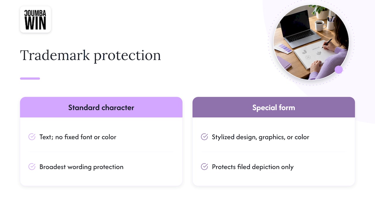
The USPTO describes two main ways to show a mark. A standard character drawing presents the trademark in text only, with no particular font style, size or color, while a special form drawing shows stylization, designs, graphics, logos or color. The USPTO also explains that a standard character registration offers the broadest protection, because it covers the wording itself rather than a specific font or look, whereas a special form registration protects only the depiction you filed.
That has a practical consequence for how you think about your identity. According to one trademark firm’s guide, a design mark protects a specific visual representation or something confusingly similar, and if you later change the shape or refresh the layout, you may need to file a new application to protect the update.
So here’s the founder takeaway: your name is the asset that tends to stay put, and your visual logo may evolve as you scale. Designing a strong name-led identity, and talking to counsel about how to protect both the wording and the visuals, is a smart sequence.
Making your logo work everywhere
Whether you go with a wordmark, a symbol or a combo, today’s logo has to live in a bunch of places at once. Google Fonts puts it well: a modern logo needs to be infinitely flexible, working in app icons, responsive websites, apparel and social avatars. Their view is that success depends on components you can reconfigure without losing the essence, like a logomark alone at small sizes and the wordmark paired with it in roomier spaces.
In practice, that means building a small set of variants:
- A primary header logo for your site and decks.
- A compact mark for avatars and app icons (this can be a lettermark, a symbol or a trimmed-down wordmark).
- A favicon version simplified for the browser tab.
- A one-color version for stamps, embroidery and single-ink print.
- A reversed version for dark backgrounds and dark mode.
That’s essentially the list SVG Genie recommends for web and app logos, and it also suggests designing favicons for 16×16 and 32×32 pixels. Their tip is to test at 16px first, because if a mark falls apart there, higher-resolution exports won’t rescue it. 😅
On sizing for your site header, there’s no universal pixel requirement, but Renderforest suggests a starting range of roughly 160 to 250 pixels wide for a horizontal logo in a typical desktop navigation bar, adjusting for your layout. Treat that as a starting point, not a law.
If you’re thinking about how those variations carry across channels, this piece on flexible logo variations across media is worth a skim. And for keeping it all coherent once you’ve got variants multiplying, our guide to creating a consistent visual brand language covers the rules that keep everything feeling like one brand.
A quick stress test before you commit
Before you sign off on any mark, run these checks. They take about twenty minutes and can save you a painful redo.
- The shrink test. Scale it to 16 pixels and to about an inch wide on a printed page. Can you still read or recognize it?
- The squint test. Blur your eyes. Does the overall shape still feel distinct?
- The one-color test. Drop all color. Does it hold up in black or white?
- The header test. Drop it into your actual website navigation, on desktop and mobile.
- The say-it-out-loud test. Can someone who heard your name once find and recognize your logo?
- The scale test. Imagine it on a booth banner, a pitch deck cover and a sticker. Same brand?
If you’re still shaping the bigger picture, our founder’s guide to brand identity design shows where a logo sits among color, voice, type and everything else.
Perspective
We’ll be honest: when a founder walks in asking “logo or wordmark?”, they’re usually really asking “what will make us look like a real company by next month?” And the answer almost never starts with a symbol.
At Coumba Win, we’re big believers in treating design as a competitive advantage, and that means every choice has a job. For a young startup, the job is getting your name remembered. That’s why we’d rather spend your first design budget on a custom, ownable wordmark than on a clip-art-adjacent icon that says nothing. We don’t do templates and we don’t do AI-generated shortcuts, because a mark that looks like everyone else’s is a mark nobody remembers.
What we do love is thinking in systems. A wordmark for the big moments, a compact mark for the tiny ones, a color palette and type rules that tie it all together, and then the stuff that actually puts you in front of people: your website, your pitch deck, your Demo Day booth. When the identity is designed with all of those in mind from day one, you stop scrambling to resize a logo at 11 p.m. before an investor meeting. (We’ve been there with our clients. It’s not cute.)
So our advice is simple. Start with the name, make it unmistakable, and add a symbol only when you’ve got a real reason and the audience to learn it.
Coumba Evelyn
Where this shows up: website, deck and booth
A logo decision isn’t really finished until you’ve seen it in the wild. Here’s how the choice plays out in the places startups care about most.
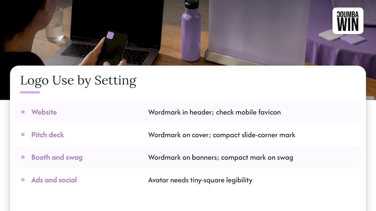
Your website. The header is prime real estate, and a wordmark often reads cleanly there because the name is right in front of every visitor. Check it at mobile width, and make sure the favicon still looks intentional. If you’re also rethinking the site itself, take a look at the common startup website design pitfalls we see most often.
Your pitch deck. On a cover slide or footer, a wordmark gives investors your name at a glance. A compact mark can sit in the corner of every slide without crowding your content.
Your booth and swag. Large-format banners love a wordmark with room to breathe. Pens, stickers and tote bags often prefer a compact mark. This is exactly why we like designing both together.
Your ads and social. Platforms crop and shrink everything, so your avatar needs to be legible as a tiny square. If you run LinkedIn campaigns, our LinkedIn ad sizes cheat sheet will help you plan how your logo variants fit each format.
Want a mark built for how your startup actually grows?
If you’d rather not spend your week nudging kerning, that’s literally what we’re here for. Coumba Win is a design partner for startups: we work with founders on custom branding, web design and development, UI and UX design, pitch deck design, print and graphic design, and more, all tailored to your stage and goals rather than pulled from a template.
If you’re ready to turn a name into an identity that looks great on a website, a deck and a booth, take a look at our design services and tell us what you’re building. Planning a Webflow site? See our Webflow development work too.
FAQ
What is the difference between a logo and a wordmark?
A logo is the broad term for a brand’s identifying mark, and it can be text, a symbol or both. A wordmark is one type of logo made only of the brand name in distinctive typography. Every wordmark is a logo, but plenty of logos are not wordmarks.
What is a logomark versus a logo?
A logomark is the graphic symbol or icon that represents a brand, usually without text. A logo is the overall identity mark, which might be just the logomark, just the wordmark, or the two combined. When a brand pairs a symbol with its name, designers often call that a combination mark.
Is a wordmark better for a startup?
Often, yes, especially when your name is short and distinctive and nobody knows your brand yet. A wordmark puts the name front and center so people learn it quickly. If you’ll depend heavily on app icons or tiny avatars, add a compact mark alongside it.
What is the difference between a lettermark and a monogram?
A lettermark presents initials clearly and legibly, usually to shorten a long name. A monogram interlocks or fuses letters into a single decorative shape. Both are built from letters, but a lettermark is meant to be read, while a monogram is meant to be recognized as a form.
Does a wordmark protect my brand name legally?
A wordmark is a design choice, while trademark protection comes from registering. A standard character registration with the USPTO covers the wording itself regardless of font or color, whereas a design registration covers one particular look. A trademark attorney can advise which filing fits your brand.
Sources
- FAQs | UGA Brand Style Guide
- From type to logotype | Google Fonts Knowledge
- Wordmark Logo: Examples and How To Design One | Shopify
- When to Wordmark? | PRINT Magazine
- Logo Types Explained | Logotouse
- How to Choose the Right Type for Your Logo | FOROALFA
- Drawing of your trademark | USPTO
- Wordmark vs. Design Mark vs. Combination Mark | Ivetic Law
- Responsive SVG Logo Variants | SVG Genie
- Logo Sizes in 2026 | Renderforest
- Visual storytelling tips | Babylon Love Growth
#logodesign #wordmark #startupbranding #brandidentity