Interactive Website Features: Startup Examples That Convert
Interactive Website Features: Startup Examples That Convert
Interactive website features for startups are specialized UI and UX elements that replace passive page-reading with real-time, personalized user participation. The best interactive website features startup examples we’re seeing right now go way beyond slick animations. We’re talking AI chatbots that cache prompts to cut costs, 3D avatars powered by Gemini Live API, bento grid explorers that show live data before a single form field appears, and scroll-driven WebGPU worlds that make visitors feel like they’ve stepped inside your product. If you’re a founder or UX designer trying to create an interactive startup website experience that actually converts, this is your field guide.
1. Streaming AI chatbots with prompt caching
The Bees Knees platform is one of the clearest interactive website features startup examples of AI chat done right. Their chatbot uses Server-Sent Events to deliver token-by-token responses, which means users see the answer forming in real time instead of staring at a spinner. That single UX decision removes the “waiting friction” that kills engagement on most AI widgets.
The cost angle is just as interesting. Prompt caching cuts input costs by approximately 90% for repeated chatbot requests within five minutes. For a startup watching every dollar on its AWS bill, that’s the difference between deploying a quality AI chat feature and shelving it entirely.

Pro Tip: Set your cache window to cover your most common repeat queries (pricing, onboarding steps, feature comparisons) and you’ll absorb the bulk of your traffic at a fraction of the token cost.
2. Voice-enabled 3D avatars with screen awareness
The Interactive Website Navigator project demonstrates what happens when you combine Gemini Live API with a 3D avatar that understands your screen context in real time. The avatar doesn’t just answer questions. It sees what the visitor is looking at and responds accordingly, guiding them through the product without ever opening a separate help window.
This is one of the most immersive website interactivity examples available today. Visitors get a conversational guide that feels like a product demo and a support rep rolled into one. For B2B startups with complex products, that kind of contextual hand-holding can shorten the time-to-understanding dramatically.
3. AI pointers that understand on-page context
Google DeepMind’s work on AI pointer innovation reframes what a cursor can do. Instead of a passive arrow, an AI-aware pointer interprets what’s on screen and surfaces relevant help inline. No separate chat window. No context switching. The assistance lives where the user’s attention already is.
For startup websites, this translates to a UX where visitors never feel lost. The pointer becomes a silent guide, reducing bounce rates on complex feature pages and keeping users in the conversion flow longer. It’s one of those website design trends that sounds futuristic until you realize the infrastructure is already here.
4. Animated logo bars with hover color effects
This one sounds simple, and that’s the point. An animated logo bar showing partner brands or integration logos, where each logo shifts color on hover, communicates credibility and product depth without a single word of copy. Visitors interact instinctively because motion invites touch.
The best startup websites use this feature in their social proof sections. It keeps the eye moving, signals a healthy ecosystem, and gives visitors something to explore rather than just read. Pair it with a tooltip that shows a one-line description of each integration on hover, and you’ve turned a static trust badge into a mini product tour.
5. Bento grid explorers with live data
Successful startup landing pages use interactive elements that demonstrate product value early, engaging users before conversion forms ever appear. The bento grid explorer is the best execution of this principle. Each card in the grid shows a live-feeling data point, a chart, a metric, a feed, and visitors can click or hover to explore before they’ve committed to anything.
Rocket’s Ticker landing page template is a strong reference here. The grid lets visitors experience the product’s output before signing up, which builds the kind of trust that a bullet-point feature list never could. Think of it as a free trial that lives on the homepage.
6. Progressive lead capture forms
Progressive lead forms with segment-specific fields increase completion rates and qualify leads more effectively than standard single-step forms. The mechanic is straightforward: show one or two fields first (email, role), then reveal the next layer based on what the user selected. A founder gets different follow-up fields than an enterprise buyer.
This approach reduces the visual weight of the form and pre-qualifies leads at the same time. Startups using this pattern report cleaner CRM data because intent and role are captured upfront, not inferred later from behavior. It’s one of those user engagement features that does double duty for both UX and sales ops.
7. Scroll-driven 3D worlds with WebGPU
Shader.se’s scroll-driven WebGPU pipeline is the benchmark for immersive interactive web design. WebGL/WebGPU with React Three Fiber and TSL enables performant, scroll-driven 3D web experiences that integrate UI directly inside the GPU pipeline. As the user scrolls, they move through a fully rendered 3D scene with seamless transitions between sections.
For startups with a strong visual brand (think fintech, creative tools, or hardware), this kind of experience signals serious investment in craft. It’s not decoration. It’s a statement about the quality of the product behind the website.
Pro Tip: Coordinate GSAP’s animation timing with React Three Fiber’s declarative scene graph from the start. Retrofitting animation libraries into an existing 3D scene is a painful refactor that costs you two sprints you don’t have.
| Feature | Tech stack | Best for |
|---|---|---|
| Scroll-driven 3D world | WebGPU, React Three Fiber, GSAP | Brand-forward startups with visual products |
| Streaming AI chatbot | SSE, Claude or GPT APIs | SaaS onboarding and support |
| 3D avatar navigator | Gemini Live API, Three.js | Complex B2B products needing guided tours |
| Bento grid explorer | React, live API feeds | Data products and analytics platforms |
8. Cross-device input consistency with GSAP Observer
3D web technologies achieve their full effect only when input events are unified across devices. GSAP’s Observer API handles scroll, touch, pointer, and wheel events through a single normalized interface. This means your immersive desktop experience doesn’t fall apart on a phone or a trackpad.
Cross-device consistency is one of the most overlooked interactive web design tips. Founders demo their sites on MacBooks and forget that 60% of their traffic arrives on mobile. GSAP’s Observer API solves this without requiring separate mobile-specific code paths, which keeps your codebase sane and your UX intact.
9. Corporate satire and branded visual themes
Humor is a legitimate UX strategy. Startups like those featured in Shader.se’s 80s Business Tech project use retro corporate aesthetics and light satire to create a memorable brand voice that visitors actually want to share. The interactivity here is emotional: the site makes you feel something, and that feeling becomes associated with the product.
This works especially well for B2B startups selling to people who are tired of enterprise software’s visual blandness. A website that makes someone laugh or feel nostalgic creates a memory hook that a clean, minimal SaaS template never will. It’s a bold move, and bold moves get screenshots.
10. Persistent interactive CTAs
A persistent CTA that stays visible as the user scrolls, and that changes its copy based on scroll depth or section context, is one of the highest-leverage user engagement features a startup can deploy. When a visitor is reading your pricing section, the CTA should say “Start free” not “Learn more.” When they’re on the features page, it should reflect the feature they just read about.
This kind of context-aware CTA requires a small amount of scroll-tracking logic but delivers outsized results. It keeps the conversion path visible without being aggressive, and it matches the visitor’s intent at each stage of their journey through the page.
Key takeaways
The most effective interactive website features for startups combine AI-driven personalization, immersive 3D visuals, and progressive engagement mechanics to convert visitors before a single form field appears.
| Point | Details |
|---|---|
| AI chatbots with caching | Prompt caching cuts costs by ~90%, making quality AI chat viable for early-stage startups. |
| Bento grids before forms | Showing live product data before lead capture builds trust and increases conversion likelihood. |
| Progressive forms qualify leads | Segmenting fields by role and intent reduces friction and improves CRM data quality. |
| Cross-device input unification | GSAP Observer API ensures immersive 3D experiences work equally well on mobile and desktop. |
| Context-aware CTAs | Scroll-depth-triggered CTA copy matches visitor intent and keeps the conversion path visible. |
What I’ve actually learned building interactive sites for startups
I’ll be honest with you: the first time I pitched a scroll-driven 3D world to a seed-stage founder, they looked at me like I’d suggested they build a theme park before hiring their second employee. And they weren’t entirely wrong to be skeptical. The trap with innovative website features is that they’re genuinely exciting to build and genuinely easy to over-engineer.
What I’ve found actually works is starting with the interaction that removes the most friction, not the one that looks the most impressive in a Dribbble shot. For most startups, that’s a streaming chatbot or a bento grid explorer, not a full WebGPU scene. The 3D world earns its place once you have a brand strong enough to carry it.
The other thing nobody tells you: context-aware AI features like the Google DeepMind pointer concept are going to make a lot of current “interactive” features look passive by comparison. I’d start building toward that paradigm now, even if your current implementation is just a well-configured chatbot. The architecture you choose today either makes that upgrade easy or makes it a full rebuild.
I’ve also seen too many founders treat interactivity as a launch feature rather than a conversion tool. The Coumba Win case study for Setsale is a good example of what happens when you design interaction around a specific conversion goal from day one. The result is a site that feels alive and actually moves the needle on signups.
— Coumba Evelyn
Build your interactive startup website with Coumba Win Design
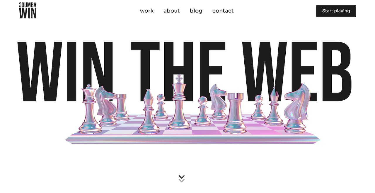
If you’ve been taking notes on this list and thinking “okay but where do I actually start,” that’s exactly what Coumba Win Design is here for. We work with founders who treat design as a competitive advantage, not a checkbox. Our UI component library includes interactive elements built for startup conversion flows, from progressive forms to animated bento grids. The style guide gives you the visual system to make those components feel like a cohesive brand, not a collection of widgets. And if you’ve got a Demo Day coming up, the Demo Day Kit gets your interactive pitch assets ready in 14 days. No fluff. Just the stuff that makes investors lean forward.
FAQ
What are interactive website features for startups?
Interactive website features are UI and UX elements that respond to user input in real time, including AI chatbots, 3D avatars, bento grid explorers, and scroll-driven animations. They replace static content with dynamic experiences that engage visitors and guide them toward conversion.
How do AI chatbots reduce costs on startup websites?
Prompt caching cuts input costs by approximately 90% for repeated requests within five minutes, making AI chat features economically viable for startups without large infrastructure budgets.
What is a bento grid explorer and why does it convert?
A bento grid explorer is a modular card layout that displays live or live-feeling product data before any lead capture form appears. Visitors engage with live data and build product trust before committing, which increases conversion likelihood.
How do I make a 3D website work on mobile?
Use GSAP’s Observer API to unify scroll, touch, and pointer events across devices. This ensures your immersive 3D experience behaves consistently on mobile without requiring separate code paths.
What interactive feature should a startup prioritize first?
Start with a streaming AI chatbot or a progressive lead capture form. Both deliver immediate engagement and conversion benefits without the build complexity of 3D environments, and both can be upgraded as your product and brand mature.