
Email Footer Design: 6 Copyable Patterns for Designers

Email Footer Design: 6 Copyable Patterns for Designers
Every commercial email footer needs four non-negotiables: a real physical address, an unsubscribe link nobody has to hunt for, clear sender identification, and a quick reminder of why the recipient is hearing from you. Beyond that, your job is to make the whole thing scannable, thumb-friendly, and quiet enough that it doesn’t compete with your actual message. Nail both halves and you protect your sender reputation while still squeezing out a little brand love at the bottom of the inbox.
TL;DR:
- Including a clear physical address, an unsubscribe link, and sender identification is mandatory under CAN-SPAM, and these elements significantly impact deliverability.
- The footer’s layout should prioritize the unsubscribe and permission reminder at the top, followed by legal information, with links grouped into no more than eight items for scanability.
- Use a minimum font size of 12px with high contrast, ensure tap targets are at least 44×44 pixels, and pair icons with descriptive alt text to enhance accessibility.
- Implement table-based layouts with inline CSS for maximum compatibility across email clients, and automate address and unsubscribe links through merge fields to stay compliant.
- Track footer performance indicators like unsubscribe rate and click-throughs to validate design choices and reduce spam complaints effectively.
Table of Contents
- What an Email Footer Design Actually Does for You
- The Legal Checklist Your Footer Can’t Skip
- What Goes in the Footer, and in What Order
- Design Rules for Readability and Accessibility
- A Footer Snippet You Can Actually Copy
- Six Footer Patterns Worth Adapting
- Design Trade-Offs Nobody Puts in the Style Guide
- How Coumba Win Design Builds Footers That Hold Up
- Sources
- FAQ
What an Email Footer Design Actually Does for You
Think of your footer as the fine print that also has to work a room. It’s doing three jobs at once: keeping you compliant, signaling trustworthiness to spam filters and humans alike, and (if you’ve got room left) nudging people toward your Instagram or your latest blog post.
Here’s the part people underestimate: footer content directly feeds deliverability. Internet service providers read your footer for red flags, and a hidden or hard-to-find unsubscribe link correlates with higher spam complaints, which then tanks your sender score across your entire list, not just the one annoyed recipient.
Not every footer looks the same, either:
- Newsletter footers carry the heaviest engagement load: social icons, archive links, maybe a referral nudge.
- Promotional footers stay leaner and lean hard on the legal basics since these are the emails most likely to get reported.
- Transactional footers (receipts, shipping updates) skip most marketing links entirely and focus on support contact and sender identity.
The Legal Checklist Your Footer Can’t Skip
This is the part where “creative freedom” takes a back seat to “don’t get fined.” The FTC’s CAN-SPAM Act sets the floor for every commercial email sent to a US inbox, and it’s not optional decoration.
Here’s what has to be in there, full stop:
- A valid physical postal address. A street address, a registered PO box, or a commercial mail-receiving agency address all count. A vague “based in Chicago” does not.
- A working unsubscribe mechanism. It has to be visible, it has to function, and you must honor the request within 10 business days.
- Clear sender identification. The “From” name and footer text need to make it obvious who’s actually emailing.
- A privacy policy link. Not required by CAN-SPAM itself, but GDPR requires it for EU recipients, along with data-controller details, and CASL in Canada expects similarly transparent identification.
Pro Tip: Add support for the List-Unsubscribe header alongside your visible footer link. Gmail and Yahoo increasingly surface a one-click “Unsubscribe” button right next to the sender name when this header is present, and skipping it makes your emails look dated to spam filters even when your footer itself is compliant.
Here’s the number that should make legal review non-negotiable in your workflow: CAN-SPAM violations can run up to $51,744 per violation. That’s per email, per infraction, not per campaign. A sloppy footer template blasted to 50,000 people isn’t a design mistake anymore. It’s a balance-sheet problem.
One more thing worth building into your process: a simple “You’re receiving this because you signed up for [brand]'s newsletter” line does more for your complaint rate than most designers give it credit for. It’s the single most effective trust builder in the entire footer, and it costs you almost nothing in space.
What Goes in the Footer, and in What Order
Not every element deserves equal real estate. Treat your footer like a priority queue, not a junk drawer.
- Unsubscribe link. First priority, always visible, never buried in six-point gray text.
- Permission reminder. The “why you’re getting this” line sits right near the unsubscribe link, reinforcing that the recipient opted in.
- Physical address and sender name. Your legal identity, stated plainly, no acronyms the reader has to decode.
- Privacy policy and preference center links. Give people a way to adjust frequency instead of unsubscribing outright. A preference center often saves subscribers that a flat opt-out would lose entirely.
- Contact or support link and copyright line. Low-stakes, but expected.
- Social icons, website link, and one secondary call to action. This is your engagement layer, the only part of the footer that’s purely optional.
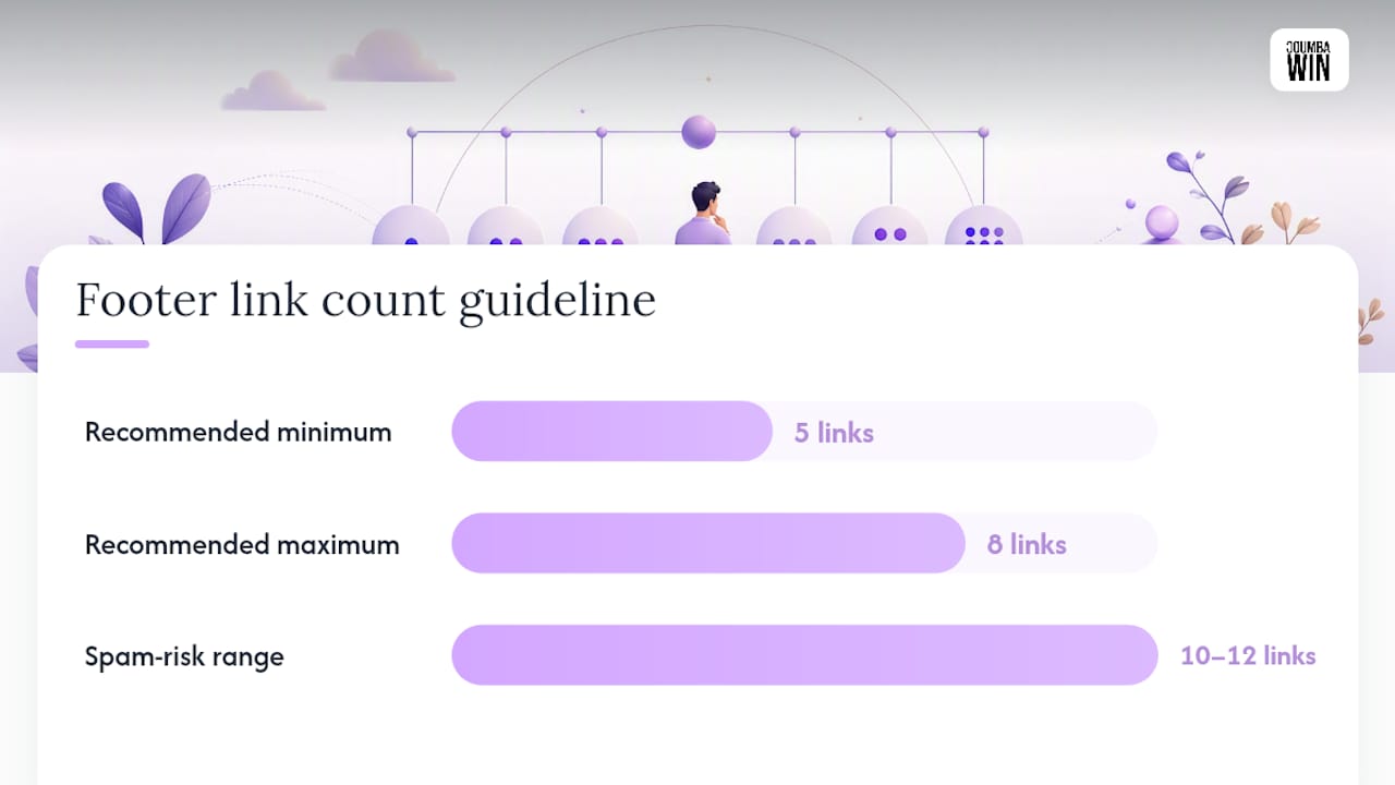
Keep your total link count somewhere in the five to eight range. Cram in ten or twelve links, and you’re not just cluttering the design. You’re actively working against your own scannability and, per the same deliverability research, increasing the odds of triggering spam filters that read excessive linking as a manipulation signal.
Pro Tip: Group your secondary and engagement elements into two visual clusters separated by a thin divider or extra padding, rather than letting all eight links run together in one dense paragraph. The eye needs a place to stop scanning.
Vertical height matters more than people assume. A footer that stretches 400 pixels down the screen pushes your unsubscribe link (which recipients are legally supposed to find easily) further from view on mobile, where most opens now happen. Compress vertical padding between rows instead of stacking every element with generous whitespace.
Design Rules for Readability and Accessibility
A footer that’s technically compliant but visually unreadable is still a liability. Text too small to read isn’t “legally present” in any meaningful sense.
Set a floor and don’t go below it:
- Font size: 12px minimum for footer body text. Anything smaller and you’re relying on the recipient squinting, which they won’t do.
- Contrast: Aim for the WCAG standard of at least 4.5:1 for body-level text. Near-white gray on a white background might look “elegant,” but it fails accessibility guidelines and reads as deliberately hiding legal disclosures.
- Tap targets: Every link and icon needs roughly 44×44 pixels of tappable area, per standard mobile touch-target guidance. Cramming five icons into a 100-pixel row guarantees mis-taps.
- ALT text on icons: Every social icon needs descriptive alt text (“Follow us on Instagram,” not “icon-3.png”). Screen readers can’t interpret a graphic, and plenty of corporate inboxes block images by default.
- No image-only links. Pair every icon with either alt text or a text link fallback so the footer still functions when images don’t load.
You can de-emphasize the legal text without hiding it. Drop the font weight to regular instead of bold, shave the size down slightly, and use a mid-gray rather than your brand’s boldest accent color. Just don’t cross the 12px/4.5:1 thresholds to do it.
| Element | Minimum standard | Why it matters |
|---|---|---|
| Body text size | 12px | Below this, most readers can’t comfortably read on mobile |
| Text contrast | 4.5:1 (WCAG) | Prevents “invisible” legal text that fails accessibility audits |
| Tap target size | 44×44 px | Reduces accidental taps and mis-clicks on small screens |
| Total footer links | 5 to 8 | Balances engagement with deliverability and scannability |
A Footer Snippet You Can Actually Copy
Skip the flexbox instinct. Email clients, Outlook especially, still render best with table-based layouts and inline CSS rather than modern responsive frameworks. The same logic applies to icon rows: keep image dimensions small and consistent, and stack columns for mobile using inline widths rather than relying purely on media queries, since not every client honors them.
Structurally, a solid footer breaks into three stacked table rows: a permission-reminder row, a links row (privacy, preferences, contact), and an address/unsubscribe row with your merge fields dropped in. Your unsubscribe URL and physical address should both live as merge tags pulled from your sending platform, never hardcoded, so every send stays accurate without manual edits. If your platform supports it, expose the List-Unsubscribe header at the same time so Gmail and Yahoo can surface the one-click option outside the visible footer.
For mobile, use a single-column stack with generous inline padding rather than a flex row that a client might not support, and give social icons consistent alt text like “Follow us on X” or “Visit our website” so a blocked-image inbox still tells the reader what’s clickable.
Before you ship any template, run through this list:
- Render-test in Gmail, Outlook (desktop and web), Apple Mail, and at least one Android client.
- Click the unsubscribe link end to end and confirm it actually processes.
- Check contrast and font size against the WCAG 4.5:1 and 12px floors.
- Confirm tap targets don’t overlap on a 375px-wide mobile preview.
- Verify List-Unsubscribe header support if your platform allows it.
Six Footer Patterns Worth Adapting
You don’t need to invent a footer from scratch every time. A handful of proven structures cover almost every email type, and design communities like Dribbble’s footer collections are worth browsing for layout ideas, though every visual pattern still needs your own compliance and accessibility pass before it ships.
- The minimal legal footer. Address, unsubscribe, sender name, nothing else. Best for transactional receipts where marketing links would look out of place.
- The newsletter footer. Social icon row up top, permission reminder and legal block below. Five to six links total; icon order should mirror your homepage nav for consistency.
- The promo-heavy footer. One secondary CTA (a shop link or referral offer) placed above the legal block, kept visually smaller than the main email content.
- The onboarding footer. Adds a help-center or FAQ link since new subscribers generate more support questions. Keep this link bolded slightly to stand out.
- The commerce footer. Order-tracking or account-management link alongside standard legal elements; icon row often swaps social for trust badges.
- The preference-forward footer. Puts the preference-center link ahead of unsubscribe, useful for high-frequency senders trying to reduce outright opt-outs.
Design Trade-Offs Nobody Puts in the Style Guide
Every footer decision is a negotiation between brand expression and legal clarity, and the mistake most teams make is treating that as a design problem alone. It’s a measurement problem first. If you’re not tracking unsubscribe rate, spam complaint rate, and click-through on footer links after a redesign, you’re guessing whether your “cleaner” footer actually performed better or just looked better in Figma.
The permission reminder is the most underrated line in the entire footer. It costs almost no visual weight and does more for complaint reduction than any color or spacing tweak you’ll agonize over. If you want to see how this plays out across real client work, including how Coumba Win Design handles footer systems as part of broader brand builds, that portfolio is worth a look before your next redesign cycle.
— Coumba Evelyn
How Coumba Win Design Builds Footers That Hold Up
Most agencies treat the footer as an afterthought bolted onto whatever template came free with your email platform. Coumba Win Design builds it as part of the same system as your logo, your color palette, and your site’s style guide, so the bottom of your email looks like it belongs to the same brand as the top.

That matters most for founders juggling multiple email types (newsletters, receipts, onboarding flows) who don’t have time to rebuild the footer from scratch every time marketing needs a new template. Coumba Win Design’s email marketing and UI/UX work covers exactly that: reusable footer components, consistent icon assets for social links, and implementation across every template your platform sends, so compliance and brand consistency travel together instead of getting rebuilt every quarter. If your current footer is either a legal risk or an eyesore, engaging a professional design partner is the next step toward a version that does both jobs properly.
Sources
- CAN-SPAM Act: A Compliance Guide for Business - FTC
- Email Disclaimer Examples and When to Use Them - HubSpot
- 11 B2B email footer elements that protect deliverability
FAQ
How Do I Design an Email Footer?
Start with the legal must-haves (address, unsubscribe link, sender identification, and a permission reminder), then layer in secondary links like your privacy policy and social icons without exceeding roughly five to eight total links. Keep font size at 12px or above and test the whole thing on mobile before sending.
What Should an Email Footer Include?
At minimum, a footer needs a physical postal address, a working unsubscribe link, and clear sender identification, all required under CAN-SPAM. Beyond that, include a privacy policy link, a preference center if you send frequently, and a short reminder of why the recipient is on your list.
What Are the Best Email Signature Designs for 2026?
The strongest signatures stay minimal: name, title, one contact method, and a small logo or headshot, without stacking multiple social icon rows that clutter mobile previews. Consistency with your broader brand style matters more than any single visual trend.
How Do I Make a Footer for My Email?
Use a table-based HTML structure with inline CSS rather than modern flexbox, since older clients like Outlook render tables more reliably. Pull your address and unsubscribe URL from merge fields so they update automatically, and stack columns into a single mobile-friendly layout using inline widths.
Does a Small Business Need a Physical Address in Every Email?
Yes, if the email is commercial in nature. CAN-SPAM requires a valid physical address, a street address, PO box, or registered mail-receiving agency address, in every marketing email sent to US recipients, regardless of company size.


