Typographic Web Design: What Developers Need to Know

Typographic Web Design: What Developers Need to Know
Typographic web design is defined as the practice of selecting, arranging, and styling on-screen type — including typefaces, sizes, spacing, and hierarchy — to make text legible, readable, and aligned with both UX goals and brand identity. The IxDF describes typography as a foundational UX layer that shapes how users read, scan, and perceive a website, not just a visual styling choice. Get it wrong and visitors bounce. Get it right and your content does the heavy lifting before a single button is clicked. Whether you’re a developer building component libraries or a designer crafting brand systems, understanding web typography is non-negotiable.
What is typographic web design, really?
Typographic web design is the industry term for what most people loosely call “font choices.” But it goes much deeper than picking something that looks cool in Figma. It’s the orchestration of every text element on a page: the typeface families, the size scale, the line spacing, the contrast ratios, and the visual hierarchy that tells a reader where to look first, second, and third.
HubSpot draws a clear line between typography (a system-level design discipline) and font (a single typeface style at a specific weight and size). That distinction matters enormously. A font is a tool. Typography is the strategy behind how you use it. Confusing the two is like saying a hammer is the same as architecture.
The IxDF frames typography as shaping user experience through legibility, readability, and scalability, ultimately affecting aesthetics and brand perception. That’s three distinct outcomes from one design decision. Most visible UI elements on any website are text, which means typography quality directly determines whether your content gets read or abandoned. That’s not a small thing.
How typography in web design affects usability and readability
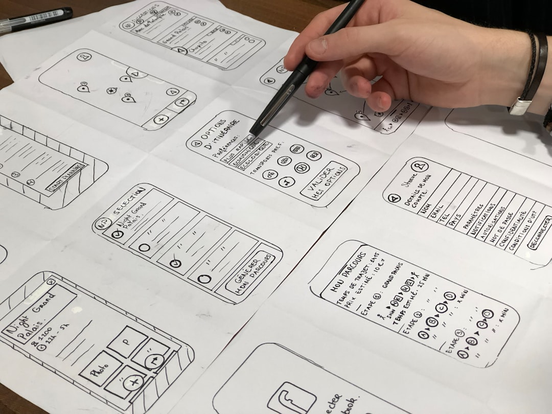
Typography decisions touch every layer of usability. Size, spacing, hierarchy, and contrast are not decorative choices. They are functional ones. Typographic decisions affect usability through hierarchy, sizing, spacing, contrast, and cross-device performance, determining whether content is read or skipped entirely.
Typographic hierarchy is the system that guides a reader’s eye through a page. It establishes relationships between headings, subheadings, body text, captions, and labels using size, weight, and spacing. Hierarchy facilitates readability by clarifying structure both visually and semantically, which means it works for screen readers and sighted users alike.
Here’s what actually moves the needle on readability:
-
Font size: Body text below 16px on screen creates unnecessary strain for most users. 18px is increasingly the baseline for long-form content.
-
Line height (leading): Values between 1.4 and 1.6 are the sweet spot for body text. Too tight and lines blur together. Too loose and the eye loses its place.
-
Line length (measure): The optimal measure for body text is 45 to 75 characters per line, ideally around 66, implemented as "max-width: 65ch` in CSS. This is one of the most ignored rules in web development.
-
Contrast: Text must meet WCAG contrast ratios to be accessible, but contrast also affects perceived brand tone. High contrast reads as bold and confident. Low contrast reads as refined and subtle.
-
Responsive scaling: Typography must adapt across viewport sizes without breaking rhythm or measure.
Pro Tip: Test your typography at 200% zoom in the browser. If your layout breaks or text clips, you have a responsive typography problem that will also fail accessibility audits.
Font vs. typography: why the difference matters more than you think
| Concept | What it means | What it affects |
|---|---|---|
| Font | A single typeface at a specific weight and size (e.g., Inter Bold 24px) | Individual text element appearance |
| Typography | A coordinated system of typefaces, sizes, spacing, and hierarchy | Readability, UX flow, brand coherence |
| Typeface | The design family (e.g., Inter, Georgia, Neue Haas Grotesk) | Visual personality and tone |
| Type scale | A modular progression of sizes (e.g., 12, 14, 16, 20, 24, 32px) | Hierarchy and visual rhythm |
Confusing font with typography causes design teams to overlook system-level hierarchy, spacing, and size relationships that create readable content. The result is a site where every page feels slightly off, even if no individual element looks wrong. That’s the tell. When something feels inconsistent but you can’t pinpoint why, it’s almost always a typography system problem, not a font problem.
Typography systems implemented as design tokens propagate consistent type scales, line heights, and spacing across components, preventing typographic drift. Design tokens are named variables (like --font-size-body, --line-height-base) that live in a single source of truth and cascade across your entire codebase. Without them, a team of three developers will produce three slightly different interpretations of “body text” across thirty components. With them, the system enforces itself.
Think of it this way: a font is a single instrument. Typography is the score that tells every instrument when to play, how loud, and for how long. You can have a great violin and still produce noise if there’s no score.
Key typographic principles for effective web design
Strong web typography is built on a handful of principles that compound when applied together. These aren’t suggestions. They’re the difference between a site that converts and one that confuses.
-
Set a modular type scale. Use a ratio-based scale (like a Major Third at 1.25 or Perfect Fourth at 1.333) to generate harmonious size steps. Tools like Typescale.com let you preview scales before committing to code.
-
Lock your measure. Apply
max-width: 65chto body text containers. Responsive typography requires coupling measure and leading with scalable CSS units to maintain readability across viewport sizes. This single rule eliminates most readability complaints. -
Use relative units. Set font sizes in
remrather thanpx. This respects user browser settings and is a prerequisite for WCAG compliance. -
Establish a clear hierarchy. Your H1 should be unmistakably dominant. Your body text should be comfortable. Your captions should recede. If a user can’t tell the difference between an H2 and an H3 at a glance, your hierarchy is broken.
-
Mind your contrast. WCAG AA requires a 4.5:1 contrast ratio for normal text. But contrast also carries brand weight. A startup that wants to feel bold should lean into high contrast. A luxury brand might use softer contrast to signal restraint.
| Principle | Recommended value | CSS property |
|---|---|---|
| Body font size | 16px to 18px base | font-size: 1rem |
| Line height | 1.4 to 1.6 | line-height: 1.5 |
| Measure | 45 to 75 characters | max-width: 65ch |
| Letter spacing | 0 to 0.02em for body | letter-spacing: 0.01em |
| Paragraph spacing | 1.5× to 2× font size | margin-bottom: 1.5em |
Pro Tip: Load performance matters for typography too. Use font-display: swap in your CSS to prevent invisible text during font loading, and subset your web fonts to only the characters you actually use. A full Google Fonts load can add 300ms to your page render time.
Typography also shapes brand perception in ways that go beyond readability. The typeface choices for a faith-based apparel brand communicate entirely different values than those for a fintech startup. Typography shapes brand perception through the emotional associations carried by letterforms, weight, and spacing, which is why brand-aligned type selection is as strategic as logo design.
Accessibility considerations in typographic web design
Accessibility is not an add-on. It’s a constraint that, when designed for from the start, produces better typography for everyone. The WCAG 2.1 Success Criterion 1.4.12 specifies minimum text spacing requirements: line height at least 1.5 times the font size, paragraph spacing at least 2 times the font size, and letter spacing at least 0.12 times the font size. Content must remain functional and not clipped when users apply these adjustments.
The failure mode that trips up most development teams is pixel-locking. Fixed heights or clipped overflow cause accessibility failures when users increase line height or letter spacing as required by WCAG. A container with height: 48px and overflow: hidden will clip text the moment a user increases their browser’s text spacing. That’s a WCAG failure and a terrible user experience.
Here’s what accessible typographic web design actually requires:
-
Use
min-heightinstead ofheightfor any container that holds text. -
Set
overflow: visibleoroverflow: autorather thanoverflow: hiddenon text containers. -
Never assume a fixed number of lines will fit in a given space. Translations, user zoom, and system font overrides will all break that assumption.
-
Test with browser extensions that simulate WCAG 1.4.12 spacing adjustments (the “Text Spacing Bookmarklet” is a practical tool for this).
-
Design for reflow at 400% zoom, which is required by WCAG 1.4.10. Your typography system should survive it without horizontal scrolling.
Good typography must accommodate user customization of text spacing without losing content or breaking layouts. When you build with flexible units and avoid fixed containers, you’re not just passing an audit. You’re building something that works for the 26% of American adults who live with some form of disability, and honestly, for everyone who’s ever zoomed in on a phone.
Key takeaways
Typographic web design is a system discipline, not a font selection exercise, and every decision from measure to line height directly determines whether users read your content or leave.
| Point | Details |
|---|---|
| Typography is a system | Typefaces, scales, spacing, and hierarchy must work together, not in isolation. |
| Measure controls readability | Set max-width: 65ch on body text to hit the optimal 45 to 75 character line length. |
| Accessibility is non-negotiable | WCAG 1.4.12 requires flexible spacing; pixel-locked containers cause compliance failures. |
| Design tokens prevent drift | Named variables for type scale and spacing keep typography consistent across components. |
| Font loading affects performance | Use font-display: swap and subset fonts to reduce render-blocking and page load time. |
Why I think most teams get typography backwards
I’ve reviewed a lot of startup websites. And the pattern I keep seeing is this: teams spend three weeks debating which typeface feels “on brand” and then spend zero time on the system that makes that typeface actually work. They pick Inter or Neue Haas Grotesk (both great choices, by the way) and then set every font size in pixels, hard-code line heights, and wonder why the mobile experience feels cramped.
The uncomfortable truth is that the typeface is the least important decision in a typography system. The scale, the measure, the spacing tokens, the hierarchy rules — those are what make or break the reading experience. I’ve seen sites using free Google Fonts that read beautifully because someone actually thought through the system. And I’ve seen sites using premium typefaces that are genuinely painful to read because no one did.
What I tell every founder I work with: test your typography with real content, not Lorem Ipsum. Real headlines are longer. Real body copy has awkward line breaks. Real users zoom in. If your typography system can’t survive contact with actual content, it’s not a system. It’s a mood board.
Iterative testing matters here more than most designers admit. Run a quick usability session, watch where people slow down or re-read, and treat that as typography feedback. The data will tell you more than any style guide debate.
— Coumba Evelyn
Build typography that actually works for your users
At Coumba Win Design, we’ve watched too many promising startups ship websites where the typography undermines the brand story they worked so hard to build. The fix isn’t always a rebrand. Sometimes it’s a properly structured style guide with type tokens that enforces consistency across every page and component. Our style guide resources give you a ready-to-implement typographic system: base sizes, scale ratios, line height rules, and spacing variables that work together out of the box. You can also explore our reusable UI components to see how consistent typography gets applied in practice across real interface patterns. Stop guessing. Start with a system.
FAQ
What is typographic web design in simple terms?
Typographic web design is the practice of selecting and arranging text elements on a website, including typefaces, sizes, spacing, and hierarchy, to make content readable, accessible, and aligned with brand identity. It functions as a foundational UX discipline, not just a visual styling choice.
What is the difference between a font and typography?
A font is a single typeface at a specific weight and size, like Inter Bold at 24px. Typography is the coordinated system of typefaces, size scales, spacing, and hierarchy that governs how all text on a site works together.
What line length is best for web body text?
The optimal line length for body text is 45 to 75 characters per line, with 66 characters as the ideal. In CSS, max-width: 65ch on your text container achieves this across most typefaces.
How does typography affect web accessibility?
WCAG 2.1 Success Criterion 1.4.12 requires that text spacing adjustments, including increased line height and letter spacing, do not cause content to be clipped or lost. Using flexible CSS units and avoiding fixed-height text containers is the primary way to meet this standard.
What are design tokens in typography?
Design tokens are named variables like --font-size-body or --line-height-base that store typography values in a single source of truth. Typography systems as design tokens prevent visual inconsistencies and accessibility variations from appearing across pages and components.
Recommended