Whitespace in Modern Web Design: A 2026 Guide

Whitespace in Modern Web Design: A 2026 Guide
Whitespace in modern web design is defined as the intentional empty space between and around design elements. It is not wasted space. It is one of the most powerful tools you have for guiding attention, reducing cognitive load, and communicating brand quality. The role of whitespace in modern web design spans readability, visual hierarchy, accessibility, and conversion performance. Get it right, and your site feels effortless to use. Get it wrong, and users bounce before they even read your headline.
How does whitespace improve readability and user focus?
Whitespace reduces visual clutter and gives the brain room to process content. When elements are too close together, users experience cognitive overload. They scan less effectively, comprehend less, and leave faster. Spacing is not decoration. It is communication.

Research from Wichita State University found that increasing whitespace in margins and between lines of text improved reading comprehension by up to 20%. That is a meaningful lift from a change that costs you nothing in development hours.
Two types of whitespace drive this effect:
- Micro whitespace covers the small gaps: line height, letter spacing, and padding around inline elements. These details determine whether body text feels airy or suffocating.
- Macro whitespace covers the big gaps: section spacing, margins between content blocks, and the breathing room around hero elements. This is what creates a sense of visual hierarchy and page rhythm.
The Gestalt principles of proximity and figure-ground explain why whitespace works so well. Proximity tells users which elements belong together. Figure-ground separation tells them what to focus on first. Both rely entirely on space, not color or size alone.
Pro Tip: Keep body text line length between 50 and 75 characters per line. Anything longer forces the eye to travel too far across the page, which breaks reading flow and increases fatigue.
What are the best practices for implementing whitespace in 2026?
Technical precision matters here. Vague spacing decisions create inconsistent rhythm across breakpoints, and inconsistent rhythm makes a site feel unpolished even when the visual design is strong.
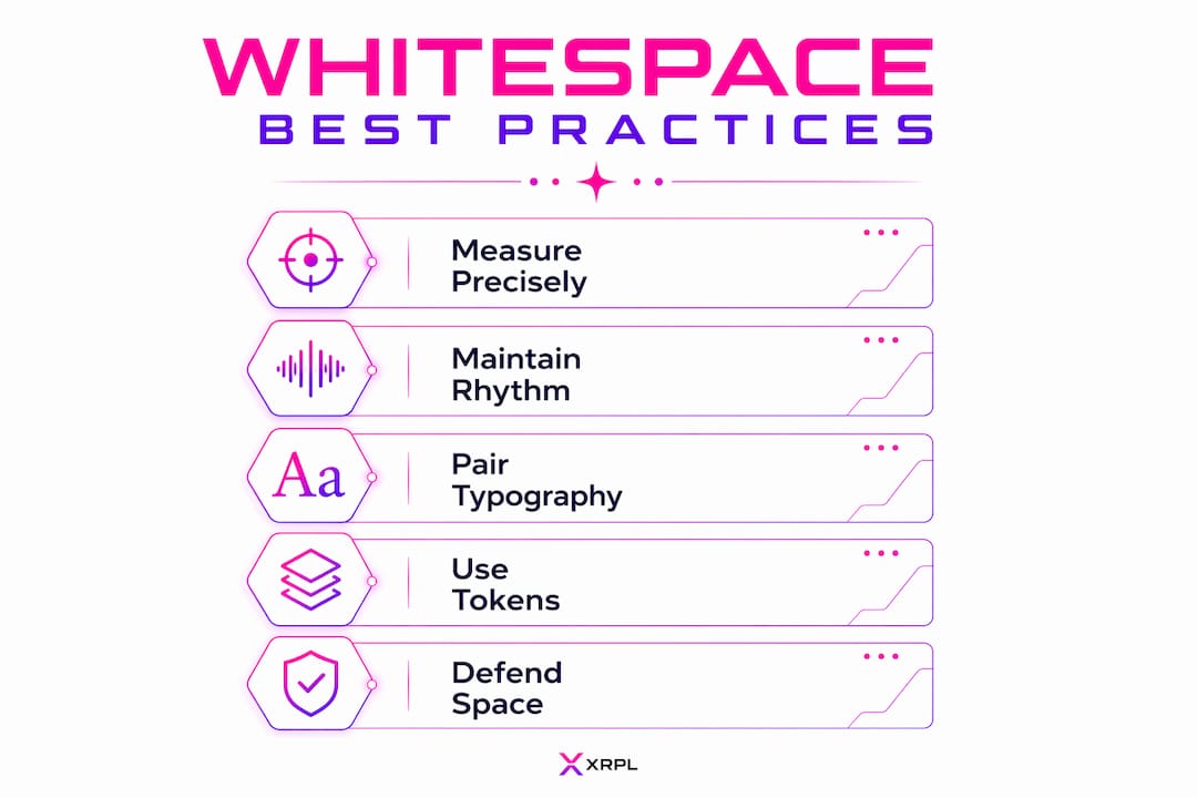
The current technical recommendations for body text are clear: a line height of 1.5–1.75 and a line length of 50–75 characters produce the best readability on screens. For section spacing, vertical gaps of 80–150px between major content blocks give the layout room to breathe without feeling empty.
Here is a practical framework for spacing implementation:
- Build a spacing scale. Base it on multiples of 8px (8, 16, 24, 32, 48, 64, 96). This creates a consistent visual rhythm that feels intentional across every screen size.
- Use CSS custom properties. Define spacing tokens as global variables (for example,
--space-md: 1.5rem). This makes site-wide adjustments fast and keeps components consistent. - Scale with flexible units. Using rem or em units to define whitespace ensures spacing adapts correctly when users change their browser font size, which is a core accessibility requirement.
- Adjust for mobile. Reduce macro whitespace proportionally on small screens. A 120px section gap on desktop might become 64px on mobile. The rhythm should feel similar, not identical.
- Avoid collapsing margins. CSS margin collapsing on mobile is one of the most common causes of unintended tight spacing. Use padding or gap in CSS Grid and Flexbox layouts to avoid it.
| Spacing element | Desktop recommendation | Mobile recommendation |
|---|---|---|
| Line height | 1.5–1.75 | 1.5–1.75 |
| Line length | 50–75 characters | 45–65 characters |
| Section spacing | 80–150px | 48–80px |
| Base spacing unit | 8px multiples | 8px multiples |
The Coumba Win Design style guide applies these spacing principles directly, with documented tokens and component-level spacing built for consistency across breakpoints.
Pro Tip: Pair your spacing scale with your typographic web design system. Typography and spacing are inseparable. When they share the same scale, the layout feels unified.
How does whitespace influence brand perception and conversion rates?
Whitespace is a brand signal. The amount of space you give your content tells users what kind of brand you are before they read a single word.
Generous whitespace is strongly associated with premium and luxury brand perception. Think of high-end fashion sites, boutique hotels, or premium SaaS products. They use space to say: “We are confident. We do not need to fill every pixel.” Tight, dense layouts signal the opposite. They read as discount, budget, or rushed.
The business case for spacing is not just aesthetic:
- Optimizing whitespace around key calls to action can improve conversion rates by up to 400%.
- A Crazy Egg case study found that adding 20% more whitespace around a call-to-action element increased conversions by 13%.
- Cluttered layouts without adequate whitespace are consistently perceived as less credible and professional by users.
Those numbers are not small. A 13% lift in conversions from spacing alone is the kind of result that justifies a full design audit.
“Whitespace is not just aesthetic; it is a strategic tool to build clarity, trust, and brand positioning. The brands that treat space as a design asset consistently outperform those that treat it as a problem to fill.”
The key is isolation. When a call-to-action button sits inside a dense block of text and competing elements, it disappears. When it has space around it, it becomes the obvious next step. For more on this, the CTA design guide from Coumba Win Design covers the spacing and hierarchy principles that drive click-throughs.
How does whitespace support accessibility and inclusive design?
Whitespace is a critical accessibility feature, not a visual preference. The W3C Web Accessibility Initiative explicitly recommends clear spacing to reduce cognitive load and improve content legibility for users with disabilities. This includes users with dyslexia, ADHD, low vision, and cognitive processing differences.
Here is what adequate spacing does for accessibility:
- Separates content areas so users with cognitive disabilities can identify where one section ends and another begins.
- Increases tap target size on mobile. A button with generous padding is far easier to tap accurately than one with tight spacing, which matters for users with motor impairments.
- Reduces visual noise for users with low vision who rely on screen magnification. Dense layouts become unreadable when magnified. Spaced layouts stay navigable.
- Supports readability at scale. When users increase their browser font size, flexible spacing units (rem/em) expand proportionally. Fixed pixel spacing breaks the layout.
Whitespace also has indirect SEO benefits. Pages with strong spacing tend to have lower bounce rates and higher time-on-page. Search engines read those engagement signals as quality indicators. The accessibility in UX guide from Coumba Win Design goes deeper on how inclusive design choices, including spacing, affect both usability and search performance.
What practical strategies help defend whitespace in real projects?
The biggest threat to whitespace is not bad design. It is stakeholder pressure. Someone always wants to add more content, more banners, more links. Defending space is a communication skill as much as a design skill.
Here are the strategies that actually work:
- Frame whitespace as a conversion tool. When a stakeholder wants to add a third promotional banner to the homepage, show them the data. Whitespace around CTAs directly increases click-through rates. Empty space is not lost opportunity. It is the mechanism that makes the opportunity work.
- Use a spacing scale as your defense. A documented spacing system gives you an objective standard. “This violates the spacing scale” is a stronger argument than “it looks too crowded.”
- Test across devices. What feels balanced on a 1440px desktop can feel cramped on a 375px phone. Always review spacing at every breakpoint before sign-off.
- Respect cultural context. Whitespace perception varies across cultures. What reads as elegant and minimal to a Western audience may feel sparse or unfinished to users accustomed to denser East Asian or RTL script layouts. Adjust proportionally for your audience.
- Apply editorial discipline. Whitespace only works when content is tight. If every section is packed with text, spacing cannot save the layout. Cut copy ruthlessly and let the space do the work.
Pro Tip: Build a one-page spacing reference doc for your project. Show stakeholders the scale, the rationale, and the conversion data. It turns a subjective conversation into an objective one.
Key Takeaways
Whitespace is the single most underused conversion and clarity tool in web design, and the data on its impact on readability, brand perception, and click-through rates makes the case better than any aesthetic argument.
| Point | Details |
|---|---|
| Whitespace improves comprehension | Research shows up to a 20% increase in reading comprehension with proper line height and margin spacing. |
| Use an 8px spacing scale | Building spacing on multiples of 8px creates consistent visual rhythm across all screen sizes. |
| Space drives conversions | Whitespace around CTAs can improve conversion rates by up to 400% according to industry case studies. |
| Accessibility requires spacing | W3C WAI guidelines cite whitespace as a critical tool for users with cognitive and visual disabilities. |
| Defend space with data | Frame whitespace as a conversion asset to win stakeholder buy-in and protect design decisions. |
Why I think whitespace is the most misunderstood design decision you will make
Every project I work on hits the same moment. The design is clean, the spacing is right, and then someone in the room says, “Can we add something here? It feels empty.” That comment is the design battle royale, and it happens every single time.
Here is what I have learned: whitespace is not a style choice. It is a communication decision. The space around your headline tells users how important that headline is. The gap between your sections tells users a new idea is starting. The padding around your CTA tells users where to look next. When you fill that space, you are not adding information. You are removing signals.
The measurable results back this up. Sites that protect their spacing consistently outperform cluttered ones on time-on-page, scroll depth, and conversion rate. That is not a coincidence. It is cause and effect.
My honest advice: treat whitespace like a line item in your design budget. It has a value. It produces a return. When someone asks you to fill it, ask them what they are willing to give up in exchange. That reframe changes the conversation entirely.
— Coumba Evelyn
Coumba Win Design and the spacing systems that actually ship
Good spacing decisions are easy to make in theory and hard to maintain across a real project with multiple components, breakpoints, and contributors.

Coumba Win Design builds spacing systems that hold up under pressure. The style guide documents every spacing token, line height standard, and section rhythm used across projects. The component library ships with whitespace baked in, so designers and developers are not making spacing decisions from scratch on every screen. If you are building a site that needs to perform, not just look good, Coumba Win Design is where that work starts.
FAQ
What is whitespace in web design?
Whitespace in web design is the intentional empty space between and around design elements. It includes margins, padding, line height, and section gaps, and it functions as an active design tool for guiding attention and improving readability.
How does whitespace affect conversion rates?
Whitespace around calls to action can improve conversion rates by up to 400%. A Crazy Egg case study found that adding 20% more whitespace around a CTA increased conversions by 13%.
What line height and line length should I use for body text?
A line height of 1.5–1.75 and a line length of 50–75 characters per line are the current best-practice recommendations for body text readability on responsive web pages.
Is whitespace an accessibility requirement?
The W3C Web Accessibility Initiative includes whitespace as a recommended pattern for reducing cognitive load and improving content legibility, particularly for users with cognitive, visual, and learning disabilities.
How do I defend whitespace when stakeholders want to fill it?
Frame whitespace as a conversion tool, not an aesthetic preference. Show stakeholders the data on CTA click-through rates and comprehension improvements, then use a documented spacing scale as an objective standard for design decisions.
Recommended


