WCAG 2.2 Checklist: 12 Fast Checks, Test Steps, and Templates
WCAG 2.2 Checklist: 12 Fast Checks, Test Steps, and Templates
This is a practical WCAG 2.2 checklist (A/AA) with downloadable templates and testing guidance to help teams assess, track, and fix accessibility issues. We built it around the normative WCAG 2.2 criteria, W3C’s technique guides, and testing practices from Section508.gov. You’ll get a quick-check list for fast triage, a full checklist mapped to each guideline, templates for tracking, and a testing workflow that actually catches real problems instead of just the easy ones.
TL;DR:
- Automated scanners catch only 30 to 50 percent of accessibility issues, so manually test keyboard access, focus visibility, reading order, and screen reader task completion.
- WCAG 2.2 adds Level AA checks for obscured focus, targets at least 24 by 24 CSS pixels, and accessible authentication; test all three directly.
- Validate each scanner rule with passing, failing, and not applicable cases, then compare results with an experienced manual reviewer and adjust mismatches.
- Run component checks in continuous integration, manually test checkout, registration, and navigation before every release, and involve assistive technology users periodically.
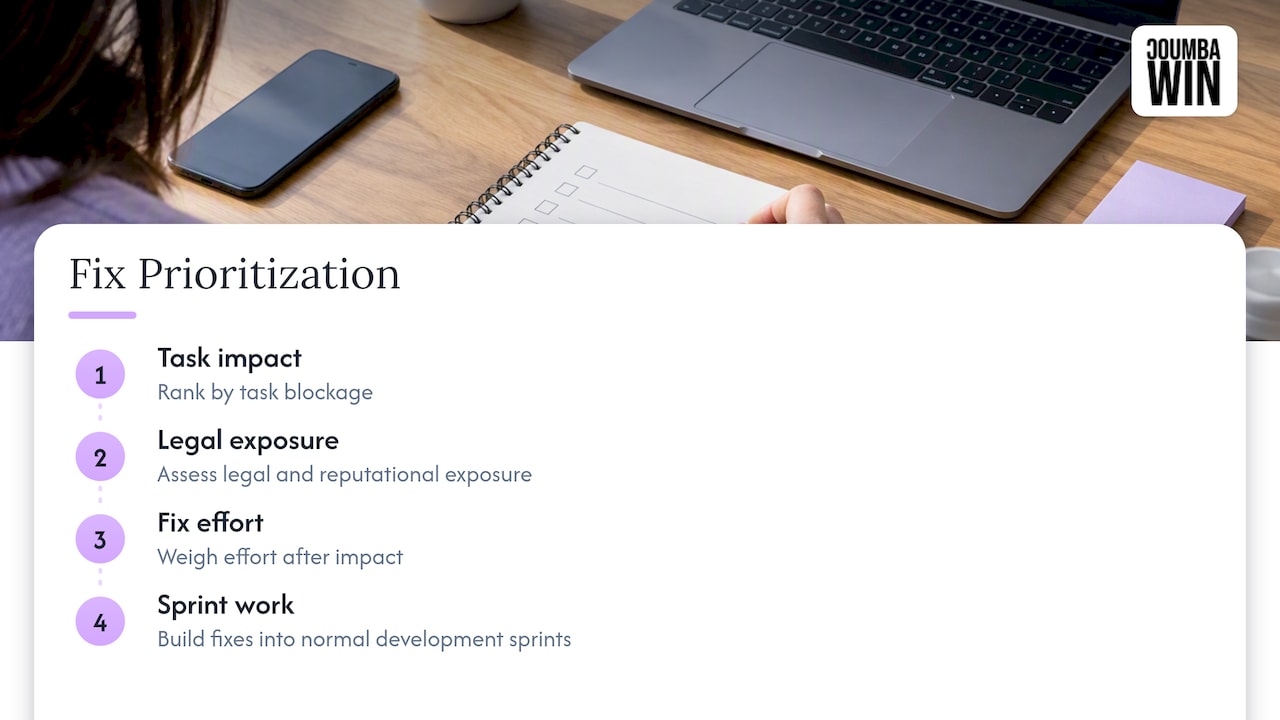
- Prioritize defects by task impact, then legal risk, and only then repair effort; a checkout keyboard trap outranks a rarely watched video transcript.
Table of Contents
- Quick-Check One-Page Checklist for Fast Triage
- The Full WCAG 2.2 Checklist Organized by Principle
- How to Test and Validate Accessibility Without Guessing
- Building the Checklist Into Your Design and QA Workflow
- Using the Checklist Template: Fields, Filters, and Reports
- What Audits Actually Turn Up, and How to Prioritize Fixes
- What the Checklist Hype Gets Wrong
- How We Approach Accessibility Audits and Fixes
- FAQ
- Sources
Quick-Check One-Page Checklist for Fast Triage
Before you run a full audit, you need the version that takes fifteen minutes and tells you if something’s on fire. This is the pre-release gut check: the one you run before a launch, a redesign, or a client handoff, when you don’t have time for a deep dive but you absolutely cannot ship broken forms or invisible focus states.
Here’s the fast-triage list, with a note on whether a scanner can catch it or whether you need eyes and a keyboard:
- Headings follow a logical order (no skipped levels): automatable, most scanners flag this instantly.
- Every image has meaningful alt text (or is marked decorative): partially automatable, tools catch missing alt but not bad alt.
- Links describe their destination, not “click here”: manual check only.
- Every interactive element is reachable by keyboard: manual, this is non-negotiable.
- Focus is always visible when tabbing through the page: manual, scanners almost never catch this reliably.
- Videos have captions, audio has transcripts: partially automatable, presence is detectable, accuracy isn’t.
- Text contrast meets minimum ratios against its background: automatable with the right tool.
- Every form field has a visible, programmatic label: partially automatable.
- Reading order matches visual order for screen reader users: manual.
- Skip links exist to bypass repeated navigation: automatable to detect presence.
- No keyboard traps anywhere in the interface: manual, and critical.
- Page titles are unique and descriptive per page or view: automatable.
Automated scanners reliably catch roughly 30 to 50 percent of accessibility issues, according to Section508’s lifecycle testing guidance, which is why this quick list leans so heavily on manual checks rather than scanner output alone.
Each item here maps to a row in the full checklist template below, so when something fails, you’re not starting a new tracking sheet. You’re just flipping the status column.
The Full WCAG 2.2 Checklist Organized by Principle
WCAG 2.2 organizes every success criterion under four principles: Perceivable, Operable, Understandable, and Robust, commonly shortened to POUR. The normative text is the final word on what each criterion requires, and the Understanding Techniques documentation gives you sufficient and advisory ways to meet them, though techniques are informative, never mandatory. You’re free to meet the outcome a different way as long as it genuinely satisfies the criterion.
Here’s the checklist broken down by principle, with what to check, how to test it, and whether automation helps.
- Alt text on non-text content (1.1.1, Level A). Check that every image, icon, and graphic conveys its purpose through text. Test by turning images off or reading the alt attribute directly. Automation flags missing alt text but can’t judge whether it’s meaningful.
- Captions for prerecorded audio and video (1.2.2, Level A) and audio description (1.2.5, Level AA). Check that videos carry accurate captions and that visual-only information gets a spoken equivalent. Test by watching with sound off and checking caption accuracy. This is manual work, full stop.
- Contrast minimum (1.4.3, Level AA). Check that normal text hits at least a 4.5:1 ratio against its background and large text hits 3:1. Test with a contrast checker tool. Fully automatable, and one of the highest-value quick wins in the whole list.
- Reflow (1.4.10, Level AA). Check that content reflows without horizontal scrolling at 320px width equivalent. Test by resizing the browser or using device emulation. Partially automatable.
- Text spacing (1.4.12, Level AA). Check that increasing line height, letter spacing, and word spacing doesn’t break the layout or clip content. Test with a browser extension that overrides spacing. Automatable.
- Keyboard accessible (2.1.1, Level A). Check that every function works with a keyboard alone. Test by unplugging your mouse and tabbing through the entire interface. Manual, and one of the most commonly failed criteria on startup sites we’ve reviewed.
- No keyboard trap (2.1.2, Level A). Check that focus can always move away from any component using only the keyboard. Test the same way, watching for places where Tab stops responding. Manual.
- Focus not obscured (2.4.11, Level AA, new in WCAG 2.2). Check that the focused element is never completely hidden behind a sticky header, modal, or cookie banner. Test by tabbing through pages with fixed-position elements. Manual, and a genuinely new failure mode many teams haven’t tested for yet.
- Focus appearance (2.4.13, Level AAA, though worth tracking even for AA-targeting teams). Check that the focus indicator has sufficient size and contrast to be clearly visible. Test visually while tabbing. Manual.
- Target size minimum (2.5.8, Level AA, new in WCAG 2.2). Check that clickable targets are at least 24 by 24 CSS pixels, with some exceptions for inline links and essential small targets. Test by measuring tap targets, especially on mobile layouts. Partially automatable.
- Consistent navigation (3.2.3, Level AA). Check that repeated navigation components appear in the same relative order across pages. Test by comparing header and footer structure site-wide. Manual but fast.
- Labels or instructions (3.3.2, Level A). Check that every form field has a clear label or instruction describing what’s expected. Test by reviewing each field without relying on placeholder text alone. Partially automatable.
- Error suggestion (3.3.3, Level AA). Check that form validation errors tell the person what to fix, not just that something’s wrong. Test by submitting a form with deliberate mistakes. Manual.
- Accessible authentication (3.3.8, Level AA, new in WCAG 2.2). Check that login doesn’t rely solely on a cognitive function test like remembering a password, unless an alternative exists (password managers, copy-paste, biometrics). Test the login flow directly. Manual.
- Name, role, value (4.1.2, Level A). Check that custom components (sliders, tabs, dropdowns) expose their name, role, and state to assistive technology. Test with a screen reader like NVDA or VoiceOver. Mostly manual, though some automated tools catch missing ARIA roles.
- Parsing and valid markup (4.1.1 historically, now largely folded into robust testing practice). Check that HTML is well-formed and doesn’t rely on broken or duplicate IDs. Test with an HTML validator. Fully automatable.
That’s sixteen criteria covering the highest-impact checks across all four principles, and it deliberately leans on the items most likely to break real user journeys rather than listing every success criterion that exists. For contrast specifically, our color contrast accessibility workflow walks through how designers and engineers can catch these issues before they ever reach a build.
How to Test and Validate Accessibility Without Guessing
Running a scanner once and calling it done is how real problems slip through. Automated tools are good at catching structural issues, contrast failures, and missing attributes, but they can’t judge whether alt text is meaningful or whether a screen reader user can actually complete a checkout flow. Section508’s testing overview puts it plainly: automated tools need validated rulesets, and they cannot fully replace manual testing.
Here’s the honest breakdown of what each method is good for:
- Automated scanning catches contrast failures, missing alt attributes, invalid markup, and duplicate IDs reliably.
- Ruleset validation confirms that your scanner’s specific rules match your actual technology stack and don’t flag irrelevant false positives.
- Manual keyboard and screen reader testing catches focus traps, reading order problems, and whether ARIA roles behave the way they claim to.
- Testing with people who use assistive technology catches the gap between “technically passes” and “actually usable.”
Validating your ruleset isn’t optional once you’re relying on tool output for anything beyond a quick scan. Section508’s guidance lays out a process: build small, targeted test cases for each rule (a clear pass, a clear fail, and a not-applicable case), run your tool against them, then compare the results to a manual evaluation from someone experienced in accessibility testing. Where the tool and the manual result disagree, you adjust the rule, either disabling it or customizing its sensitivity, and document why. Repeat this for every rule that matters to your stack, and you end up with a ruleset tuned to your actual application instead of generic defaults.
For an ongoing testing program, we’d structure it in three layers. Component-level unit tests run in continuous integration and catch regressions on every pull request, flagging things like missing labels or broken ARIA states before code merges. Scheduled full manual audits, maybe quarterly or before major releases, catch the things automation misses entirely. Periodic sessions with people who use assistive technology, even informally, surface friction that no checklist fully predicts.
Pro Tip: Run your ruleset validation once per major framework or component library update, not just once at project kickoff: component libraries change behavior, and a rule that was accurate six months ago can start generating false positives after a dependency upgrade.
Building the Checklist Into Your Design and QA Workflow
A checklist that lives in a spreadsheet nobody opens doesn’t fix anything. The goal is to make accessibility checks a normal part of shipping work, not a separate audit that happens once a year if someone remembers.
- Insert checks at design handoff. Before a component goes to development, confirm contrast ratios, target sizes, and focus states in the design file itself, not after it’s built. Our component library approach treats this as part of defining the component, not an afterthought.
- Write component-level accessibility tests and gate pull requests on them. Tools that check for missing labels, invalid ARIA attributes, or contrast failures can run automatically in CI, and a failing accessibility test should block a merge the same way a failing unit test does.
- Run a pre-release smoke test on critical paths. Checkout, sign-up, and primary navigation get a manual keyboard pass before every release, regardless of what automated tests report.
- Assign a checklist owner per project. Someone needs to hold the tracking sheet, triage new issues by severity, and confirm fixes with evidence, not just a closed ticket.
- Require verification evidence before sign-off. A screenshot of a passing contrast check or a short screen recording of keyboard navigation is enough. The point is that “fixed” means someone actually confirmed it.
This turns accessibility from a one-time project into a repeatable gate, which is exactly how Section508 recommends structuring lifecycle testing: accessibility planned at design time, verified at build time, and confirmed again before release.
Using the Checklist Template: Fields, Filters, and Reports
A good tracking template has exactly enough structure to stay useful without becoming its own project. Each row should carry a criterion ID, a short plain-language description, the conformance level (A or AA), whether the check is automation-friendly, current status, severity, who owns the fix, a link to test evidence, and the date it was last verified.
- Filter by severity when you’re deciding what to fix before a launch versus what can wait for the next sprint.
- Filter by owner to generate a punch list for a specific designer or engineer without them scrolling past everyone else’s rows.
- Export a status report for stakeholders who just want to know how many Level AA criteria are passing.
| Field | Purpose |
|---|---|
| Criterion ID | Ties the row to a specific WCAG 2.2 success criterion |
| Level | Shows whether it’s A or AA, for prioritization |
| Status | Tracks pass, fail, or in progress |
| Severity | Ranks urgency independent of conformance level |
| Owner | Assigns accountability for the fix |
| Evidence link | Proves the fix was verified, not just claimed |
Keep this sheet as the single source of truth and sync it with whatever issue tracker your team already uses, rather than running two parallel systems that inevitably drift apart.
What Audits Actually Turn Up, and How to Prioritize Fixes
Across accessibility reviews, the same handful of issues show up again and again on startup sites: content editors adding images without alt text, custom components that never got proper focus styles, and forms where a placeholder is doing the job a real label should be doing.
The prioritization framework we lean on is simple: rank by how badly an issue blocks someone from completing a task, then by how much legal and reputational exposure it creates, and only then by how much effort the fix takes. A keyboard trap on a checkout page outranks a missing transcript on a rarely watched video, even though the transcript might take longer to produce. Fixing the cheap, high-impact items first (contrast, labels, focus visibility) usually clears the majority of real user friction before the harder structural fixes even start.
We build these fixes into sprint-based work rather than treating them as a separate accessibility phase, which keeps remediation moving alongside normal feature development instead of stalling behind it.
What the Checklist Hype Gets Wrong
Most advice about WCAG 2.2 treats the checklist itself as the finish line: tick every row, hit Level AA, done. That’s backwards. A checklist tells you what to check, not whether the result actually works for someone using a screen reader or navigating by keyboard alone. We’ve seen sites pass every automated scan and still trap keyboard users on a modal, because the scanner checked for an ARIA role and never checked whether focus actually moved where it claimed to.
The bigger miss is treating accessibility as a pre-launch cleanup instead of a design decision. Fixing contrast and labels after the fact is cheap. Retrofitting a component library that was never built with focus management in mind is not. If you take one thing from this checklist, make it this: use it to catch problems early, in design review and component builds, not as a last-minute audit before a release you can’t afford to delay.
— Coumba Evelyn
How We Approach Accessibility Audits and Fixes
We treat accessibility the same way we treat every other design decision: as something to build in, not bolt on. When we run an accessibility audit, we work from a checklist mapped to the specific pages and components in your product, so you get a prioritized report instead of a wall of generic scanner output.

What that looks like in practice:
- A checklist-driven report that flags exactly which WCAG 2.2 criteria are failing and where.
- Prioritized fixes ranked by user impact and effort, so your team knows what to tackle first.
- Verification testing after fixes ship, confirming the issue is actually resolved, not just closed in a ticket.
If you’re already working with us on a web design or Webflow build, accessibility gets folded into that same engagement rather than billed as a separate afterthought project. And if you just want to see how we approach this kind of work before committing to anything, our accessibility audit guide walks through a full sample process and deliverables. When you’re ready, reach out through our services page and we’ll scope an audit around your actual product, not a generic template.
FAQ
What are the WCAG 2.2 requirements?
WCAG 2.2 requirements are organized into success criteria under four principles: Perceivable, Operable, Understandable, and Robust, each rated Level A, AA, or AAA. The normative WCAG 2.2 text defines each criterion, and most organizations target Level AA as their compliance baseline.
Can you provide a checklist for the WCAG 2.2 guidelines?
Yes, this article includes a quick-check list for fast triage and a full checklist organized by the four WCAG principles, covering alt text, captions, contrast, keyboard access, focus visibility, target size, labels, and semantic markup. Each item notes whether it’s automation-friendly or requires manual testing.
What are the new WCAG guidelines for 2026?
WCAG 2.2 itself was finalized by W3C in 2023 and remains the current version going into 2026, with no newer numbered release published since. The notable additions in 2.2 include focus not obscured (2.4.11), target size minimum (2.5.8), and accessible authentication (3.3.8), all covered in the full checklist section above.
Can you provide a list of WCAG guidelines?
WCAG guidelines are grouped under Perceivable, Operable, Understandable, and Robust, with specific success criteria under each, detailed in the W3C’s normative documentation. The checklist in this article lists the highest-impact criteria from each group along with practical test steps.
How do I validate automated accessibility testing tools?
Validating a tool’s ruleset means building small pass, fail, and not-applicable test cases for each rule, running the tool against them, and comparing results to a manual review, as described in Section508’s testing guidance. Rules that disagree with manual findings get adjusted or disabled to match your actual testing methodology.
Sources
These are the primary references behind this checklist, worth bookmarking if you’re building out your own testing process. The W3C’s WCAG 2.2 normative text is the definitive source for every success criterion, while the Understanding Techniques documentation offers practical, non-mandatory ways to meet them. For testing methodology specifically, Section508’s testing overview and its lifecycle integration guidance cover ruleset validation and where to insert checks across design, development, and release. For how accessibility work connects to visibility, our partner piece on web accessibility and SEO is worth a read, and for teams handling captions or multilingual audio, structured multilingual TTS production covers that workflow in more depth.