
What Is Innovative Web Design? A 2026 Guide

What Is Innovative Web Design? A 2026 Guide
Innovative web design is the deliberate fusion of modern aesthetics, optimized functionality, and user-centered strategy to build websites that perform as well as they look. If you’ve been treating design as a coat of paint slapped on top of a working site, this guide is going to feel like a wake-up call (a friendly one, I promise). We’re talking about a dual-layer design approach that combines classic principles like typography and color hierarchy with 2026 functional requirements such as dark-mode native layouts, AI-readable markup, and content-first grids. Tools like Elementor, Radix UI primitives, and Core Web Vitals are now shaping what “good design” actually means.
What is innovative web design in 2026?
Innovative web design is the strategic practice of combining advanced aesthetics, user experience psychology, and technical performance to create websites that are visually compelling and future-proof. The industry term you’ll hear alongside it is human-centered design, and both concepts are now inseparable from performance engineering.
The biggest mindset shift? Layout now follows content, not the other way around. Bento-style grids adapt their structure dynamically based on what the content actually needs. That’s a fundamental departure from the fixed-template thinking that dominated web design for the past decade.

Here’s a quick comparison of where design principles stood versus where they are now:
| Classic Principle | 2026 Principle |
|---|---|
| Fixed grid templates | Content-first Bento grids |
| Flat or textured aesthetics | Physical-style depth with layered shadows |
| Desktop-first responsive design | Mobile and desktop at full parity |
| Animation for decoration | Motion that conveys information |
| Accessibility as an add-on | Accessibility as a core design constraint |
| SEO metadata as an afterthought | AI-readable markup built into structure |
The shift from “accessibility as an add-on” to “accessibility as a design constraint” is the one that trips most designers up. It means you’re not retrofitting ARIA labels at the end of a project. You’re building with screen readers, keyboard navigation, and color contrast ratios in mind from day one.
What makes web design genuinely forward-thinking right now comes down to a few non-negotiables:
-
Dark mode native design: Not a toggle. A full, intentional color system built for dark environments from the start.
-
AI-readable markup: Structured HTML that search engines and AI crawlers can parse without guessing.
-
Responsive parity: Your mobile experience should be just as rich as your desktop experience, not a stripped-down version of it.
-
Motion with meaning: Animations that communicate state changes, hierarchy, or transitions rather than just looking cool.
How does technical performance shape web design outcomes?
Performance is not a developer problem you hand off after design is done. Performance optimization is an architectural decision that belongs in the design phase. Treating it as an afterthought is how you end up with a beautiful site that users abandon in three seconds.
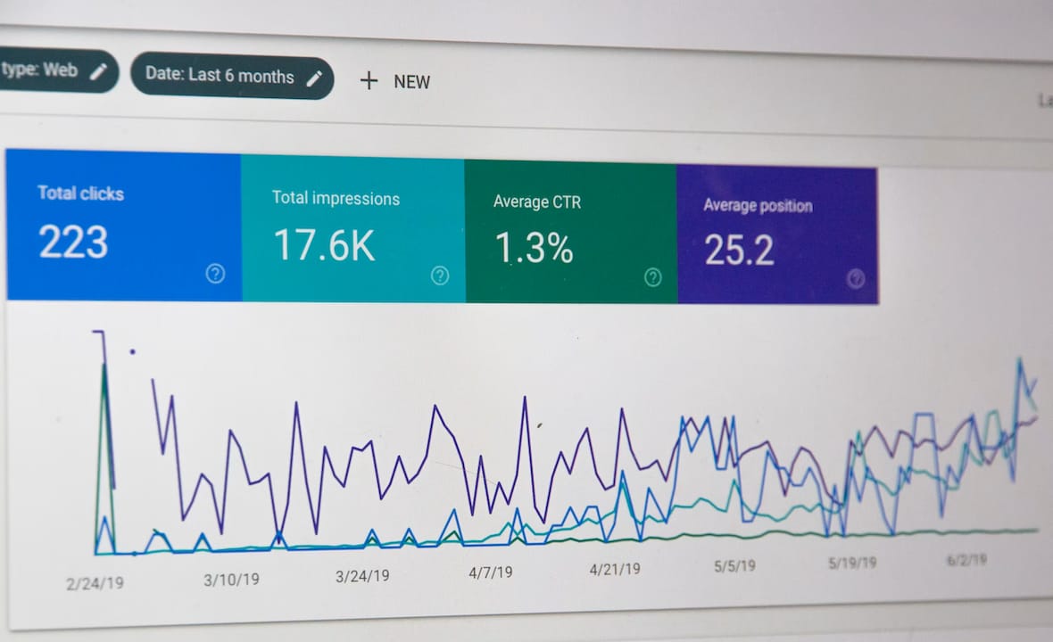
Core Web Vitals are Google’s framework for measuring real-world user experience. They track loading speed (LCP), interactivity (INP), and visual stability (CLS). Strong Core Web Vitals scores directly influence both search rankings and user retention.
Here’s where it gets specific and genuinely useful:
-
fetchpriority=‘high’ on hero images: This single attribute can reduce LCP by 300–600 milliseconds. That’s not a rounding error. That’s the difference between a user staying and a user bouncing.
-
scheduler.yield(): This browser API offloads main-thread work, making complex interactions feel instant rather than sluggish. Think of it as giving your browser a chance to breathe between heavy tasks.
-
Image dimensions declared in HTML: Prevents layout shift as images load, which directly protects your CLS score.
-
Metadata automation: Structured Open Graph and schema markup ensures your pages render correctly across AI platforms, social previews, and search snippets without manual intervention on every page.
Pro Tip: Start your performance audit at the wireframe stage, not after launch. Identifying which images need fetchpriority treatment or which interactions risk blocking the main thread is far cheaper to fix in a Figma file than in production code.
The practical implication here is that designers and developers need to be in the same room (or Slack channel) from the very first wireframe. Performance is a design decision.
What CSS and layout techniques define modern web projects?
CSS in 2026 is genuinely exciting, and I say that as someone who spent years writing media queries for every possible screen size like it was a full-time job. Intrinsic sizing and container queries have replaced the fixed-breakpoint model, and the result is layouts that respond to their actual container rather than the viewport.
CSS Grid combined with container queries is now the standard for both page-level and component-level responsiveness. A card component built with container queries will reflow correctly whether it’s sitting in a two-column sidebar or a full-width hero section. No extra breakpoint rules. No overrides.
On the component side, composable UI primitives like Radix are replacing monolithic component libraries. Radix ships unstyled, accessible components that you wire up to your own design system. The result is full customization without bundle bloat. Compare that to importing an entire UI library just to use one modal. The Coumba Win Design component system is built on exactly this philosophy.
For visual depth, the move away from flat design is real but subtle. Stacking two to three shadows with varying blur radii creates a physical-style depth that feels grounded without reverting to the skeuomorphic clutter of the early 2010s. Pair that with soft gradients used for hierarchy rather than decoration, and you get interfaces that feel premium without screaming “I tried too hard.”
Pro Tip: Use scroll-linked animations tied to user scroll progress rather than auto-playing timelines. Scroll-driven animations keep the experience feeling alive and responsive to the user rather than running on a loop they didn’t ask for.
The CSS Animations API and the new scroll-driven animation spec in modern browsers make this achievable without heavy JavaScript libraries. Less code, better performance, more intentional motion.
How does pre-design planning improve web design success?
Here’s the part most designers skip because it feels like homework before the fun starts. Structured pre-design planning is the single biggest lever for reducing wasted effort on a project.
Wireframing before visual design reduces revisions by up to 43%. That number represents real hours, real budget, and real frustration avoided. When you lock in structure before you touch color or typography, you prevent the classic scope creep spiral where a client says “can we just move this section” and suddenly you’re rebuilding three pages.
The workflow that actually works looks like this:
-
Generate a sitemap first. Modern planning tools can produce complete sitemaps in about 20 minutes, giving you a full content architecture before a single pixel is placed.
-
Build a design system with global variables. Define your color tokens, spacing scale, and type ramp as variables before designing any screens. When a client changes the brand color, you update one token, not 47 components.
-
Wireframe at low fidelity. Use grayscale layouts to validate information hierarchy and user flows. Tools like Figma make this fast. The goal is structural integrity, not beauty.
-
Document design decisions. A style guide that captures rationale prevents future teams from undoing intentional choices because they didn’t know why they were made.
The Coumba Win Design Recurate case study is a solid example of what structured pre-design planning looks like in practice for a fast-moving startup. Getting the architecture right before visual execution saved significant redesign cycles.
Key takeaways
Truly forward-thinking web design requires combining content-first layouts, performance as a design constraint, composable components, and structured pre-design planning to build sites that hold up in 2026 conditions.
| Point | Details |
|---|---|
| Performance is a design decision | Treat Core Web Vitals and fetchpriority as architectural choices, not developer afterthoughts. |
| Content-first layouts win | Bento grids that adapt to content outperform fixed templates in flexibility and user experience. |
| Wireframe before you design | Pre-design planning reduces revisions by up to 43%, saving real time and budget. |
| Composable components beat monoliths | Radix-style primitives give full customization without the bundle bloat of large UI libraries. |
| Accessibility is structural, not cosmetic | Building for screen readers and keyboard navigation from day one prevents expensive retrofits. |
What i’ve learned about design that actually lasts
By Coumba Evelyn
Okay, real talk. I’ve watched designers (myself included, in earlier years) chase every new trend like it was a limited-edition sneaker drop. Dark mode! Glassmorphism! Bento grids! And honestly? Most of those trends are fine. The problem is when the trend becomes the whole strategy.
The designers I’ve seen produce work that genuinely holds up are the ones who treat performance and accessibility as creative constraints rather than compliance checkboxes. A constraint forces you to be smarter. When you know your animation can’t block the main thread, you design a better animation. When you know your color palette has to pass WCAG contrast ratios, you build a more disciplined color system.
The other thing I’d push back on is the idea that innovative design means complex design. Some of the most impressive sites I’ve reviewed recently are almost aggressively simple. They load in under two seconds, every interaction feels intentional, and the typography does all the heavy lifting. That’s not a lack of ambition. That’s confidence.
The 2026 web is also being read by machines as much as humans. AI crawlers, social platform scrapers, and search engines are all parsing your markup. If your HTML structure is a mess of divs with no semantic meaning, you’re invisible to half your audience before a human even sees your site. That’s a design problem, not just a dev problem.
My honest recommendation: stop asking “does this look cool?” and start asking “does this work for a user on a slow 4G connection who’s using a screen reader and found the page through an AI search result?” If the answer is yes, you’ve got something worth shipping.
— Coumba Evelyn
Build something worth visiting with coumba win design
Ready to put these principles into practice without starting from scratch every time?
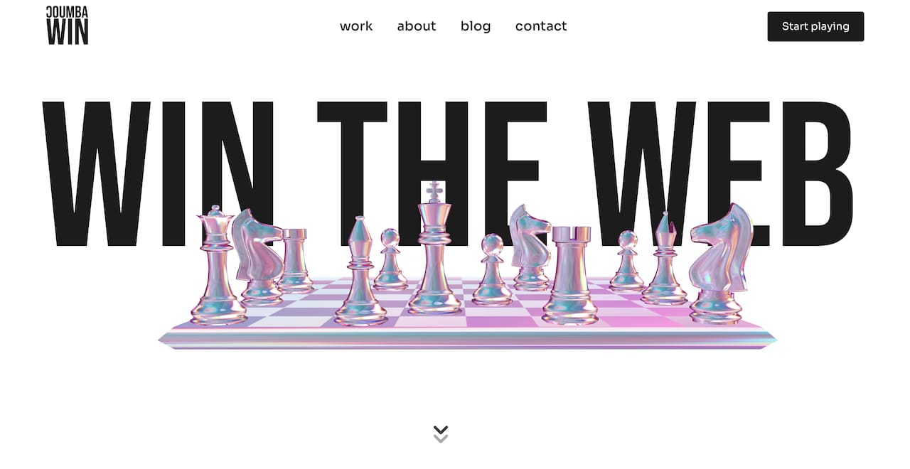
Coumba Win Design builds design systems that make the principles in this article feel less like a checklist and more like a natural workflow. The Style Guide gives you a complete system of global variables, color tokens, and type scales so your visual decisions stay consistent across every screen. The Components library is built on composable primitives, meaning you get accessible, customizable UI without the bundle bloat. And if you’re a founder sprinting toward a pitch or demo event, the Demo Day Kit gets you a polished, modern presence in 14 days. No bloated agency process. Just design that works.
FAQ
What is innovative web design in simple terms?
Innovative web design is the practice of combining strong visual design, user experience principles, and technical performance to build websites that are both beautiful and fast. It goes beyond aesthetics to include accessibility, AI-readable structure, and content-first layouts.
What features define modern web design in 2026?
Modern web design in 2026 is defined by content-first Bento grids, dark-mode native color systems, composable UI components, Core Web Vitals optimization, and scroll-driven animations. Accessibility and performance are treated as core design requirements, not optional enhancements.
How does wireframing help create better web design?
Wireframing before visual design reduces revisions by up to 43% by locking in structure and user flows before aesthetics are introduced. It prevents scope creep and ensures the information hierarchy is validated before any visual decisions are made.
What makes a website’s performance part of its design?
Performance metrics like LCP, INP, and CLS directly affect how users experience a site, making them design concerns as much as developer concerns. A single attribute like fetchpriority=‘high’ on a hero image can reduce load time by 300–600 milliseconds, which is a design decision with measurable user impact.
What are composable UI primitives and why do they matter?
Composable UI primitives like Radix are unstyled, accessible components that designers and developers customize to fit their own design system. They prevent bundle bloat compared to monolithic libraries and give teams full control over visual output without sacrificing accessibility.
Recommended