How to Design Website Calls to Action That Convert

How to Design Website Calls to Action That Convert
A call to action (CTA) is a short, direct prompt that tells website visitors exactly what to do next, whether that’s signing up, buying, downloading, or booking. When you design website calls to action well, they are the single biggest lever you can pull to turn passive browsers into paying customers. Get them wrong, and even the most beautiful site leaks conversions like a bucket with no bottom. Tools like Figma for prototyping and platforms like Optimizely for testing have made it easier than ever to build and validate effective website CTAs, but the fundamentals of contrast, copy, and placement still do the heavy lifting.
What are the key design principles for effective website CTAs?
Visual hierarchy is more important than brand color fidelity. Your CTA should be the highest-contrast, most tactile element on the entire page. That is the rule. Everything else is a footnote.
Here is what that looks like in practice:
-
Use solid, filled buttons. Solid buttons boost CTR by over 32% compared to ghost or border-only buttons. Ghost buttons look sleek in a Dribbble portfolio. They underperform in the real world because they lack the visual weight that signals “click me.”
-
Prioritize contrast over brand palette. A CTA that blends into your hero section because it matches your brand’s navy blue is a CTA that gets ignored. High-contrast buttons attract more clicks than buttons that match the surrounding design.
-
Size for mobile first. Buttons should meet a minimum touch target of 44x44 pixels. On mobile, stacking CTAs vertically and hitting that minimum prevents mis-taps that quietly kill your conversion rate.
-
Add whitespace around the button. Breathing room focuses the eye. A button crammed between a headline and a paragraph of body copy competes for attention. Give it space to breathe and it becomes the natural next stop for the eye.
-
Keep it to one primary CTA per viewport. Limiting CTAs to two or fewer per viewport reduces choice overload and decision paralysis. One primary action, one optional secondary, and that is it.
Solid, tactile buttons with rounded corners and subtle drop shadows also create the perception of a real, clickable object. That psychological cue builds trust before the user even reads the label.
Pro Tip: Run a quick squint test on your design. Blur your screen or squint at it. If the CTA button is not the first thing your eye lands on, your contrast or size needs work before you write a single word of copy.

How does copywriting make or break your CTA?
Copy is where most designers leave money on the table. The button color gets obsessed over (we’ve all been there), while the actual words get a lazy “Submit” or “Learn More” and call it a day. That is a mistake.
The best CTA copy follows a simple formula: strong verb plus specific outcome. Start with action words like “Get,” “Start,” “Join,” or “See.” Then tell users exactly what they are getting. “See my report” outperforms “Learn more” because it frames the outcome, not the action. “Start my free trial” outperforms “Sign up” because first-person pronoun copy can increase click-through rates by up to 90% compared to second-person forms. That is not a small difference. That is the difference between a CTA that funds your next product sprint and one that just sits there looking pretty.
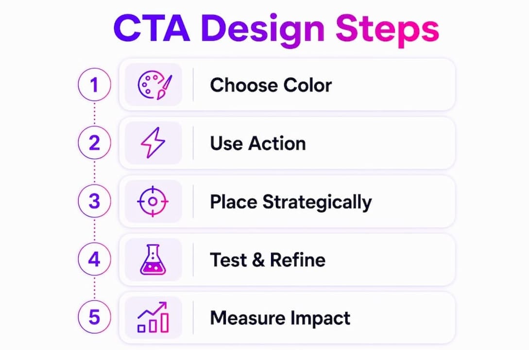
Microcopy is the unsung hero of the whole operation. A single reassurance line placed directly below the button, something like “No credit card required” or “Cancel anytime,” lifts conversions by 3 to 7%. That consistently outperforms many color-based A/B tests. Specific, promise-driven microcopy like “Start 14 days free, no card required” delivers 24% higher click-through rates and 11% more conversions compared to generic copy. Users in 2026 are skeptical. They have seen too many dark patterns and bait-and-switch offers. Your CTA needs to pass the “one breath” test: a visitor should immediately understand what happens the moment they click, with zero ambiguity.
Stack your CTA elements in this order for maximum impact:
-
Headline that states the value proposition
-
Button with a strong verb and specific outcome
-
Reassurance line that removes the biggest objection
-
Optional trust cue such as a customer count, security badge, or star rating
Pro Tip: Before finalizing any CTA, read the button label out loud and ask: “What exactly happens when I click this?” If you hesitate even for a second, rewrite it. Clarity beats cleverness every single time.
Where and when should you place CTAs for maximum conversion?
Placement is strategy, not decoration. Where you put your CTA signals what you expect from the user at that exact moment in their journey. Misread the moment and even perfect copy falls flat.
| Placement | Best use case | Conversion impact |
|---|---|---|
| Above the fold | High-intent pages: landing pages, pricing pages | Captures immediate decision-makers |
| Mid-page (after features or testimonials) | Long-form pages, product pages | Up to 220% better conversion than hero-only CTAs |
| Embedded in content | Blog posts, resource articles | 121% higher conversion vs. bottom-only placement |
| Sticky header or footer | Mobile-heavy traffic, long scroll pages | 17% boost in mobile conversions without raising bounce rate |
| Footer or bottom of page | Last-chance capture for engaged readers | Catches users who read everything before deciding |
The mid-page placement finding is the one that surprises most designers. Putting a CTA after a feature section or a testimonial block, rather than only in the hero, converts dramatically better because the user has just consumed evidence. They are warm. They are ready. Hitting them with the CTA at that exact moment is like asking for the sale right after the demo, not before it.
Sticky CTAs deserve a special mention for mobile. A sticky footer button that stays visible as the user scrolls keeps the conversion path open without being aggressive. It does not interrupt reading. It just waits patiently, which is exactly the right energy for mobile UX.
Avoid aggressive exit-intent popups on mobile entirely. They are technically difficult to trigger accurately on touch devices and they frustrate users who are just switching apps. Save exit-intent for desktop, and even there, use it sparingly.
What common mistakes should you avoid when designing website CTAs?
Even experienced designers repeat the same CTA mistakes. Here are the ones worth actively checking for on every project:
-
Vague labels. “Submit,” “Click here,” and “Learn more” tell users nothing about what they are getting. Replace every generic label with a specific outcome.
-
Ghost buttons as primary CTAs. Border-only buttons look minimal and modern. They also get skipped. Reserve ghost buttons for secondary or tertiary actions only.
-
Too many competing CTAs. Three or four equal-weight buttons in the same viewport create a visual battle royale where nobody wins, least of all your conversion rate. One primary, one secondary, done.
-
Poor contrast. A CTA that blends into the page is invisible. Test your button color against the background using a contrast checker before shipping.
-
No microcopy. Skipping the reassurance line is leaving a free 3 to 7% conversion lift on the table. Add it.
-
Copy-to-content mismatch. If your headline promises “Double your revenue” and your CTA says “Sign up for our newsletter,” users feel deceived. The CTA must deliver on the headline’s promise.
-
Ignoring mobile tap targets. A button that looks fine on a 27-inch monitor can be a nightmare to tap on a phone. Always test on real devices, not just browser dev tools.
-
Skipping A/B testing. Gut instinct is a starting point, not a strategy. Test copy variations first, then design tweaks, then placement. In that order.
Key takeaways
Effective CTA design combines high-contrast visuals, first-person outcome-driven copy, strategic placement after social proof, and reassurance microcopy to maximize conversions.
| Point | Details |
|---|---|
| Contrast beats brand color | Use the highest-contrast button color on the page, even if it breaks your palette. |
| First-person copy wins | “Start my free trial” outperforms “Start your free trial” by up to 90% in CTR. |
| Mid-page placement converts | Placing CTAs after testimonials or features lifts conversions by up to 220%. |
| Microcopy does heavy lifting | A single reassurance line below the button lifts conversions 3 to 7% consistently. |
| Test copy before design | Run A/B tests on button labels first, then colors and placement, for the fastest gains. |
Why I think most designers are solving the wrong CTA problem
Here is my honest experience after working on CTAs for startups across e-commerce, SaaS, and education platforms: most teams spend 80% of their CTA energy debating button color and maybe 20% on copy and placement. That ratio should be flipped.
The single biggest lift I have seen on any project came from changing “Get Started” to “See my personalized plan” and adding “No credit card required” underneath. Not a redesign. Not a new color. Just words. The color debate is fun (I get it, orange vs. green is a classic), but microcopy and specificity are where the real gains live.
I also want to push back on the idea that one big hero CTA is enough. Embedding CTAs contextually throughout a page, after a case study, after a feature explanation, after a testimonial, consistently outperforms the single-hero approach. Users need multiple on-ramps at different points of conviction. Not everyone is ready to click after the headline. Some need to read the whole page first.
The other thing I will say: trust is the meta-skill here. Every CTA decision, from copy to placement to microcopy, is really a trust decision. Does this button feel honest? Does it deliver on what the page promised? If the answer is yes, you are probably close. If there is any ambiguity, that is where you lose people. Build CTAs like you are making a promise you intend to keep, and you will be ahead of 90% of what is out there.
— Coumba Evelyn
Ready to build CTAs that actually convert?
At Coumba Win Design, we have seen firsthand how the right CTA system transforms a startup’s website from a pretty brochure into a conversion engine. If you are tired of guessing which button color wins and want a design system that makes every CTA decision easier, we have got you covered.
Our style guide gives you a full visual system built around contrast, hierarchy, and accessibility so your CTAs always stand out. Need to prototype and test fast? The Demo Day Kit gets you from concept to clickable in days, not weeks. And our UI components include pre-built, accessible CTA elements ready to drop into any project. Bold design that converts is not a luxury for funded startups. It is a decision you can make today.
FAQ
What makes a CTA button design effective?
An effective CTA button uses high-contrast color, a solid fill (not a ghost style), and a minimum touch target of 44x44 pixels. Paired with specific, outcome-driven copy and a reassurance line, it consistently outperforms generic designs.
How many CTAs should a webpage have?
Limit each viewport to one primary CTA and one optional secondary CTA. Two or fewer CTAs per visible screen area reduces decision paralysis and improves overall conversion rates.
Does CTA copy really matter more than button color?
Yes. First-person, outcome-specific copy can increase CTR by up to 90%, while specific microcopy lifts conversions by 11%. Color contrast matters for visibility, but copy drives the actual decision to click.
Where is the best place to put a CTA on a landing page?
Place your primary CTA above the fold on high-intent pages, then repeat it mid-page after testimonials or feature sections. Mid-page CTAs convert up to 220% better than a single hero placement alone.
Should I use sticky CTAs on mobile?
Sticky header or footer CTAs increase mobile conversion rates by 17% without raising bounce rates, making them one of the highest-ROI placement choices for mobile-heavy traffic.
Recommended