
The Role of Accessibility in UX: A Designer's Guide

The Role of Accessibility in UX: A Designer’s Guide
Accessibility in UX is defined as the practice of designing digital products so every person, regardless of disability, situation, or context, can use them fully and without friction. This isn’t a niche concern for a small slice of users. It’s the foundation of genuinely good design. The role of accessibility in UX touches everything from color contrast and keyboard navigation to semantic HTML and screen reader compatibility. Tools like WCAG (Web Content Accessibility Guidelines), Stark for Figma, and axe DevTools give designers and product managers a real framework to work from. Get this right, and you don’t just serve users with disabilities. You build better products for everyone.
Why does accessibility matter in UX design?
Accessibility is a business strategy, not just a moral checkbox. Accessible design unlocks a $13 trillion global disability market that most products currently underserve. That’s not a rounding error. That’s a massive, loyal audience actively looking for products that work for them.
The financial case is just as strong on the UX side. 91% of organizations report improved user experience and 90% report higher customer satisfaction after prioritizing accessibility. Those numbers reflect a real shift in how users engage with products that remove friction. And the ROI? Studies show a potential $100 return for every $1 invested in UX. That math is hard to argue with.
“Accessibility should be viewed as a business strategy, unlocking access to a $13 trillion disability market alongside moral and legal benefits.” — BISM
The ethical dimension matters too. Designing products that exclude people with visual, motor, auditory, or cognitive disabilities isn’t neutral. It’s a choice. Inclusive design is a commitment to equal opportunity, and it signals to your users, your team, and the market that you take that seriously. For startups especially, that reputation compounds fast.
Legal exposure is real as well. The Americans with Disabilities Act (ADA) and Section 508 of the Rehabilitation Act both create legal obligations for digital accessibility. Ignoring them isn’t just an ethical miss. It’s a liability.

What are the core accessibility best practices for UX?
WCAG organizes accessible design around four principles, often called POUR: Perceivable, Operable, Understandable, and Robust. These aren’t abstract ideals. They map directly to design decisions you make every day.
Here’s how each principle translates to practice:
-
Perceivable means users can access all information through at least one sense. This includes alt text for images, captions for video, and sufficient color contrast (WCAG recommends a minimum 4.5:1 ratio for normal text).
-
Operable means every function works without a mouse. Full keyboard navigation, visible focus indicators, and no time-limited interactions are the baseline. Missing keyboard navigation can increase task completion time by 200–300%. That’s not a minor inconvenience. That’s a broken product.
-
Understandable means content and UI behavior are predictable. Clear labels, consistent navigation, and plain language all fall here. Cognitive accessibility is often the most overlooked dimension.
-
Robust means your product works across assistive technologies like JAWS, NVDA, and VoiceOver. Semantic HTML is the foundation. Div soup breaks screen readers.
Pro Tip: Run Stark’s contrast checker inside Figma before handing off any design. Catching contrast failures at the wireframe stage takes minutes. Fixing them after development takes days.
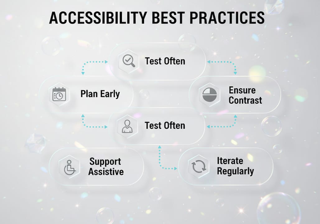
For teams designing across visual, motor, auditory, and cognitive disabilities, the key is to test with real assistive technology, not just automated scanners. Stark, axe, and Lighthouse are great starting points, but they don’t replace manual testing with actual screen readers.
How do accessibility and usability reinforce each other?
A lot of designers treat accessibility and usability as separate tracks. They’re not. Accessibility and usability are mutually reinforcing pillars of UX. Accessibility removes barriers. Usability ensures the experience is frictionless once those barriers are gone. You need both.
Think about captions on video. They exist for users who are deaf or hard of hearing. But they also help someone watching a video on a crowded subway, a non-native English speaker, or anyone in a noisy environment. That’s the curb cut effect in action: a feature designed for one group ends up helping everyone.
The same logic applies across the board:
-
High contrast text helps users with low vision and also helps anyone reading on a phone in bright sunlight.
-
Clear, simple navigation reduces cognitive load for users with ADHD and also reduces bounce rates for everyone else.
-
Descriptive link text helps screen reader users and also improves SEO and scannability for sighted users.
-
Consistent UI patterns support users with cognitive disabilities and reduce learning curves for new users across the board.
Designing for situational constraints like glare, stress, or divided attention improves UX universally by reducing cognitive load and friction. Many designers underestimate this. A user holding a baby with one hand, navigating your app with the other, has a temporary motor impairment. Your accessible design just saved that interaction.
The misconception that accessibility only serves a small subset of users is one of the most expensive mistakes a product team can make. Accessibility features like captions and high contrast enable better usability for all users, including those under situational constraints. Design for the edges, and the middle takes care of itself.
What are the biggest challenges in implementing accessibility?
The gap between knowing accessibility matters and actually shipping accessible products is real. Here’s where teams get stuck, and what to do about it.
| Challenge | Common Mistake | Better Approach |
|---|---|---|
| Automated testing | Treating scanner results as complete | Use axe or Lighthouse as a starting point only |
| Timing | Adding accessibility as a final QA step | Integrate from discovery and wireframing |
| Ownership | Leaving it to developers alone | Involve designers, writers, and legal early |
| Scope | Focusing only on visual disabilities | Design for motor, auditory, and cognitive needs too |
Automated accessibility scanners detect only 30–40% of issues. The rest require manual audits, especially for complex problems like tab order, focus management, and screen reader compatibility. Relying on automation alone is like spell-checking a legal contract and calling it reviewed.
The single biggest lever teams have is timing. Including accessibility from the discovery and wireframing phase reduces costs and technical debt compared to retrofitting after development. Shifting left on accessibility isn’t just good practice. It’s cheaper, faster, and less painful for everyone involved.
Pro Tip: Add an accessibility review checkpoint to your design system’s component sign-off process. If a component doesn’t pass keyboard and contrast checks, it doesn’t ship. This makes accessibility a team habit, not a last-minute scramble.
Collaboration is the other piece. Accessibility isn’t a designer’s job or a developer’s job. It’s a shared responsibility across design, engineering, content, and legal. Build that shared language early, and you’ll spend a lot less time fixing things later.
How can designers and pms champion accessibility?
Championing accessibility doesn’t require a complete process overhaul. It requires consistent, deliberate choices at every stage of the product lifecycle.
Here’s where to start:
-
Embed accessibility in your style guide. Color tokens, typography scales, and spacing systems should all meet WCAG standards by default. Check out how accessible style guides can anchor this practice across your whole team.
-
Build accessible components from the start. Your component library should include focus states, ARIA labels, and keyboard interaction patterns as standard, not optional add-ons.
-
Test with real users. Include people with disabilities in your user research. Their feedback will surface issues no automated tool or internal review will catch.
-
Measure what matters. Track task completion rates, error rates, and time-on-task for users with assistive technologies. Accessibility improvements show up in these numbers.
-
Advocate in sprint planning. When accessibility issues get logged, push for them to be prioritized alongside performance and functionality bugs. They are bugs.
For product managers, the most powerful move is making accessibility a launch criterion, not a backlog item. If your product doesn’t meet WCAG 2.1 AA standards, it’s not ready to ship. That framing changes the conversation fast.
For mobile UX specifically, accessibility considerations like touch target size, gesture alternatives, and dynamic text sizing add another layer of complexity. Mobile teams need to build these into their design systems early.
Key takeaways
Accessibility is not a feature you add later. It’s a design principle that makes every product better, more usable, and more commercially viable from day one.
| Point | Details |
|---|---|
| Accessibility drives business results | 91% of organizations report improved UX after prioritizing accessibility, with up to $100 return per $1 invested. |
| WCAG POUR principles are your framework | Perceivable, Operable, Understandable, and Robust map directly to daily design decisions. |
| Automated tools aren’t enough | Scanners catch only 30–40% of issues; manual keyboard and screen reader testing is required. |
| Shift left to save time and money | Integrating accessibility in discovery and wireframing costs far less than retrofitting after development. |
| Accessibility benefits all users | Features designed for disabilities, like captions and high contrast, reduce friction for every user. |
Accessibility isn’t a constraint. it’s a design superpower.
I’ll be honest with you. Early in my career, I treated accessibility like a compliance checklist. Something you tacked on at the end, ran through an automated scanner, and called done. (Spoiler: that approach does not hold up in production, or in a legal review.)
What changed my thinking was watching a user with low vision navigate a product I’d designed. She wasn’t struggling because of her disability. She was struggling because I hadn’t done my job. That’s a different feeling. And it sticks with you.
Here’s what I’ve learned from working on products across education platforms, apparel brands, and startup tools: accessibility decisions made early are almost always invisible to the end user. That’s the goal. When you get it right, nobody notices the contrast ratio or the focus indicator. They just use the product and it works. When you get it wrong, the friction is loud and it costs you users, conversions, and trust.
The teams that treat accessibility as a core design principle, not a niche concern, build better products. Full stop. They catch usability problems earlier, they serve a wider audience, and they spend less time in reactive fix mode. Inclusive design isn’t a constraint on creativity. It’s a forcing function for clarity. And honestly? The products that come out of that process are just… better.
If you’re a designer or PM reading this, my ask is simple: put accessibility in the room from day one. Not as a checklist item. As a design value.
— Coumba Evelyn
Build accessible products faster with coumba win design
At Coumba Win Design, we’ve seen firsthand how accessibility baked into a design system from the start changes everything for a product team. No more last-minute scrambles, no more retrofitting, and no more shipping components that fail keyboard tests.
Our style guide resource is built with accessibility standards woven into every token, typography choice, and color decision. Pair that with our accessible UI components and your team has a foundation that works for every user, right out of the gate. If you’re building a product that needs to scale and actually serve people, let’s talk. That’s exactly what Coumba Win Design is here for.
FAQ
What is the role of accessibility in UX design?
Accessibility in UX ensures digital products are usable by people with disabilities and situational limitations. It removes barriers, improves usability for all users, and is guided by frameworks like WCAG.
How does accessibility improve user experience?
Accessible design reduces friction for every user, not just those with disabilities. Features like captions, high contrast, and clear navigation lower cognitive load and improve task completion across the board.
What are the WCAG principles every UX designer should know?
WCAG is organized around four principles: Perceivable, Operable, Understandable, and Robust (POUR). These map directly to design decisions like color contrast, keyboard navigation, plain language, and semantic HTML.
Why aren’t automated accessibility tools enough?
Automated scanners like axe and Lighthouse detect only 30–40% of accessibility issues. Manual testing with keyboard navigation and screen readers like JAWS or VoiceOver is required to catch the rest.
When should accessibility be integrated into the design process?
Accessibility should be integrated from the discovery and wireframing phase. Retrofitting after development costs significantly more time and money than building it in from the start.
Recommended