What Is Brutalist Web Design? A 2026 Guide

What Is Brutalist Web Design? A 2026 Guide
Brutalist web design is the practice of intentionally exposing a website’s bare structure through minimal styling, default fonts, and visible HTML elements, creating an unpolished aesthetic that prioritizes honesty and function over decorative form. The style borrows its name and philosophy from mid-20th-century brutalist architecture, which celebrated raw concrete and exposed structural materials rather than hiding them behind ornamental facades. On the web, that same philosophy translates to default browser styles, visible grids, and zero decorative assets. If you’ve ever landed on a site that looked almost unfinished but felt weirdly intentional and refreshing, you’ve met brutalism in web aesthetics.
What is brutalist web design and where did it come from?
Brutalist web design is defined by structural honesty: content first, links look like links, the back button works, and performance is treated as a design decision. The philosophy predates the visual style itself. It’s a refusal to override browser defaults unless absolutely necessary for clarity. Think of it as the anti-polish movement of the web, where the wireframe ships as the finished product.
The architectural roots run deep. Mid-20th-century brutalist buildings like the Barbican Centre in London or the Yale Art and Architecture Building exposed raw concrete as a statement of material honesty. Web brutalism does the same thing digitally. It reveals the web’s bare framework by stripping away the CSS layers that most designers spend hours perfecting. The result feels confrontational to some and deeply authentic to others.

This approach gained traction in the mid-2010s as a reaction to the rise of polished, template-driven design. Designers frustrated with every site looking identical started asking: what if we just… didn’t? That question produced some of the most memorable and polarizing sites on the internet.
What are the defining characteristics of brutalist design?
The visual markers of brutalist design are specific and consistent. You recognize them immediately once you know what to look for.
- System or monospace fonts displayed without custom kerning, sizing, or font-loading. Think Courier, Arial, or Times New Roman in their raw browser defaults.
- 1px–2px solid black borders with zero border-radius and no box shadows. Every element sits in a hard-edged box.
- Default blue underlined links that look exactly as a browser renders them without CSS interference.
- Visible grid layouts where the structural skeleton of the page is part of the visual experience, not hidden behind background colors.
- Stark black, white, and high-contrast accents with no gradients, no soft shadows, and no decorative imagery.
- Minimal CSS overrides and deliberate exposure of HTML structure, so the page reads almost like a document.
- Asymmetrical layouts and unconventional placements that support raw aesthetics through intentional imperfection.
These characteristics work together to create a site that feels like it was built by someone who understood the web at a structural level and chose to show that understanding rather than hide it.
Here’s a quick comparison of how these features stack up across design approaches:
| Feature | Brutalism | Neobrutalism | Mainstream web |
|---|---|---|---|
| Borders | 1px–2px solid black | Bold, offset shadows | Rounded, subtle |
| Fonts | System defaults | Bold custom fonts | Custom web fonts |
| Colors | Black, white, raw | Candy-bright accents | Gradients, pastels |
| Shadows | None | Hard offset (4px 4px 0) | Soft, blurred |
| Grid | Visible, exposed | Structured but playful | Hidden, polished |
How does brutalist design differ from neobrutalism and mainstream styles?
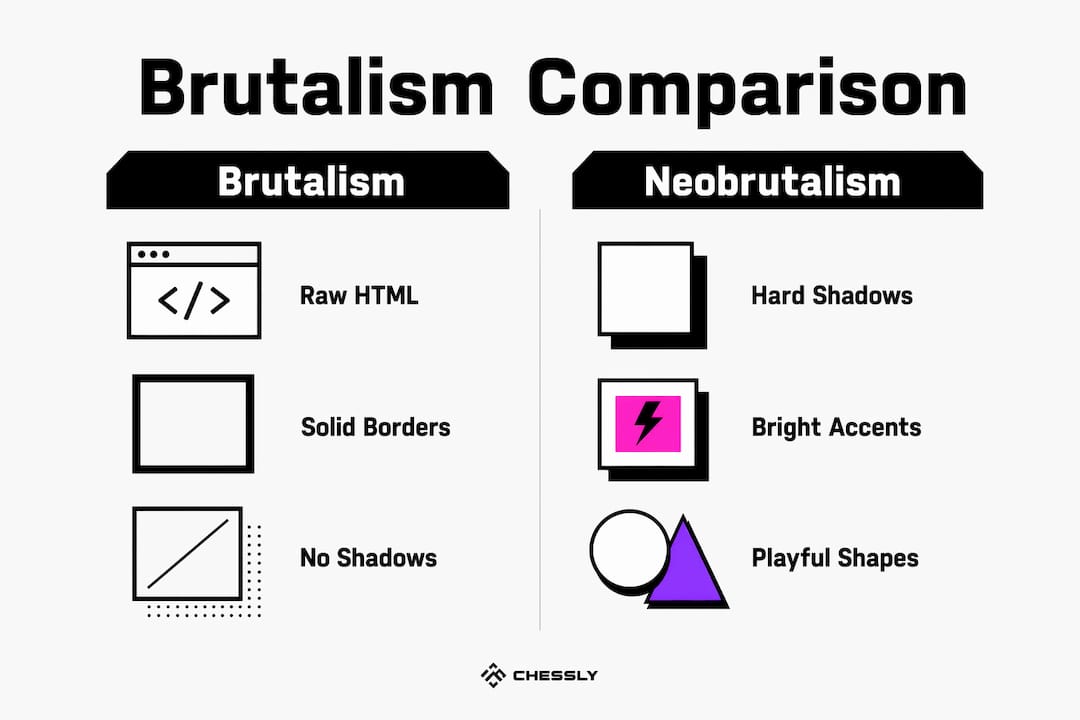
Pure brutalism refuses to override browser defaults. That’s the line. The moment you add a drop shadow or a rounded corner, you’ve crossed into neobrutalism territory, and that’s a meaningful distinction.
Neobrutalism adds hard zero-blur offset shadows, candy-bright accent colors, and playful shapes while keeping brutalism’s blocky borders and raw structure. A classic neobrutalist shadow looks like 4px 4px 0 #000, sitting flat and hard against the element with no blur. It’s brutalism with a personality upgrade. Sites using neobrutalism feel bold and energetic rather than austere and academic.
Mainstream web design sits at the opposite end. It favors smooth animations, hidden grids, rounded corners, gradients, and polished microinteractions. Every rough edge gets sanded down. Every interaction gets a transition. The goal is frictionless, and the result is often forgettable. Brutalism and neobrutalism both reject that frictionlessness as a kind of dishonesty.
The branding implications are real. Choosing raw versus polished aesthetics sends a signal about your values. A brutalist site says: “We care about content and speed, not appearances.” A mainstream polished site says: “We want you to feel comfortable and trust us.” Neither is wrong. They’re just different conversations with your audience.
Pro Tip: If you want the boldness of brutalism without the austerity, start with neobrutalism. Add hard offset shadows and a single bright accent color to a clean semantic HTML structure. You get the attitude without the learning curve.
How to create brutalist websites: practical steps for 2026
Building a brutalist site is less about adding things and more about resisting the urge to add things. That restraint is harder than it sounds.
- Start with semantic HTML. Use proper heading hierarchy,
<nav>,<main>,<article>, and<footer>tags. The semantic structure is the design. Don’t skip it. - Avoid UI frameworks with heavy default styling. Bootstrap and similar frameworks fight against brutalism’s core principle. Write your own minimal CSS or use a reset that preserves browser defaults.
- Use system fonts. Set your font stack to
system-ui, Arial, sans-serifor go full monospace withCourier New. Skip Google Fonts entirely. - Frame interactive elements with solid black borders. Buttons, inputs, and cards get
border: 1px solid #000andborder-radius: 0. Nothing more. - Keep links looking like links. Default blue underlines signal interactivity without any CSS. Removing them breaks the philosophy and hurts usability.
- Limit your CSS file. If your stylesheet exceeds 100 lines, audit it. Every line should justify its existence.
- Test with real users. Brutalist sites can feel broken to users expecting conventional interfaces. Run usability tests early and often.
Accessibility deserves special attention here. Dense link walls and high contrast can overwhelm new visitors and raise bounce rates. Softer ink colors, clear typographic hierarchy, and logical reading order all help. The goal is raw, not broken. Those are very different things.
Performance is a genuine benefit. Minimal styling and few JavaScript dependencies produce fast-loading pages that score well on Core Web Vitals. That’s not a side effect. It’s a feature of the philosophy.
Pro Tip: Pair your brutalist layout with a solid typographic system. Understanding web typography principles helps you use system fonts with intention rather than by accident.
Why do brands and creatives choose brutalist web design?
Brutalism is a branding statement as much as a design choice. It signals authenticity, non-conformity, and confidence. Those qualities resonate with specific audiences in specific contexts.
- Creative portfolios use brutalism to signal that the designer understands the web at a structural level. It’s a flex, honestly.
- Experimental startups use it to stand out from the sea of polished SaaS landing pages. When everyone looks the same, looking different is a competitive advantage.
- Editorial and content-heavy sites use it because the aesthetic puts content front and center. No decorative noise competes with the writing.
- Art and culture projects use it because the confrontational aesthetic matches their subject matter.
The trade-off is real, though. Brutalist sites polarize users. Visitors expecting a conventional interface may interpret the raw aesthetic as a sign of low quality or neglect. That’s why selective use of brutalist elements within a structured framework works better than wholesale application for most commercial projects. You can borrow the attitude without committing to every convention-breaking choice. For startups especially, pairing bold aesthetics with clear information architecture is the move. Check out how bold design differentiates startups to see that balance in action.
Key Takeaways
Brutalist web design works because it prioritizes structural honesty, semantic HTML, and content-first thinking over decorative styling, making it fast, memorable, and philosophically distinct.
| Point | Details |
|---|---|
| Core definition | Brutalism exposes raw HTML structure using system fonts, solid borders, and default browser styles. |
| Brutalism vs. neobrutalism | Neobrutalism adds hard offset shadows and bright accents; pure brutalism refuses all decorative overrides. |
| Performance benefit | Minimal CSS and no JavaScript dependencies produce fast-loading pages with strong Core Web Vitals scores. |
| Accessibility risk | Dense link walls and high contrast can overwhelm users; softer colors and clear hierarchy mitigate this. |
| Branding signal | Brutalism communicates authenticity and boldness, making it effective for portfolios, startups, and editorial projects. |
Brutalism as a statement, not a shortcut
By Coumba Evelyn
I’ll be honest: the first time I saw a brutalist site, I thought someone had forgotten to finish it. That reaction lasted about 30 seconds before I realized the whole point was to make me feel exactly that way, and then reconsider.
What I’ve come to believe after working on bold, unconventional web projects is that brutalism is the most honest design philosophy available to us. It refuses to dress up the web as something it isn’t. The grid is there. The links are blue. The content is the product. There’s something genuinely refreshing about that in a world where most sites spend enormous energy hiding their own structure.
My caution is this: brutalism is a statement, not a shortcut. I’ve seen teams reach for it because it seems easier than “real” design. It isn’t. Getting raw aesthetics to feel intentional rather than broken requires meticulous semantic HTML, careful typographic decisions, and real accessibility work. The role of accessibility in UX doesn’t disappear just because your borders are 1px solid black.
Use brutalism when you have something to say and want the design to get out of the way. Use it selectively when you want the attitude without the full commitment. But never use it because you ran out of time.
— Coumba Evelyn
Bold design built for founders who mean it
Brutalist and neobrutalist aesthetics demand a solid technical foundation. The philosophy only works when the underlying structure is clean, fast, and semantically correct.

At Coumba Win Design, we build for founders who treat design as a competitive edge, not a checkbox. Our modular web components are built for flexibility, whether you’re going full brutalist, neobrutalist, or something entirely your own. Clean semantic markup, fast load times, and zero unnecessary dependencies are baked in. If you’re ready to build a web presence that actually stands out, explore what we do and let’s make something worth looking at.
FAQ
What is brutalist web design in simple terms?
Brutalist web design is a style that intentionally exposes a website’s raw HTML structure using default fonts, solid borders, and minimal CSS. It prioritizes content and function over visual polish.
Is brutalist design user-friendly?
Brutalist design can be user-friendly when implemented with clear navigation, readable typography, and accessible contrast. The common mistake is confusing “raw” with “broken,” which are very different outcomes.
What are the main characteristics of brutalist design?
The core characteristics include system fonts, 1px–2px solid black borders, zero border-radius, no box shadows, default blue underlined links, and visible grid layouts with minimal CSS overrides.
How does brutalism differ from neobrutalism?
Pure brutalism refuses all decorative CSS overrides, while neobrutalism adds hard offset shadows (typically 4px 4px 0 #000) and candy-bright accent colors to the same blocky structure.
What are the benefits of brutalist web design?
The main benefits are fast load times from minimal assets, strong content focus, and a memorable brand identity that stands out from polished mainstream web design.
Recommended


