Website QA Checklist: What to Check Before Your Startup Launches
Website QA Checklist: What to Check Before Your Startup Launches
A website QA checklist is a list of everything you verify before real people (and real investors) land on your site: that it looks right, works on every device, reads cleanly, loads fast, is accessible and is safe. Run it on a staging copy, log what breaks, and set the rule for what blocks launch before you start. Below is the whole routine, in the order we’d run it, with the places founders usually trip. 🙂
TL;DR
- Website QA means testing that a site works as intended across the conditions your users and your business care about, and it keeps going after launch.
- Prepare first: a staging site, test accounts, a browser and device list, and written launch criteria.
- Then check visuals and responsiveness, functionality (forms above all), content, accessibility, performance and security.
- Decide in advance which severity levels block launch, and who can accept a known risk.
- Re-run the critical paths every time you ship a meaningful change.
Table of Contents
- What website QA is, and why founders skip it
- Step 0: Set up before you test anything
- Visual, responsive and cross-browser checks
- Functionality: links, forms, navigation
- Content checks
- Accessibility checks
- Performance checks
- Security basics before launch
- Logging bugs and deciding what blocks launch
- Keep QA going after launch
- Where we come in
- Our perspective
- FAQ
- Sources
What website QA is, and why founders skip it
Website quality assurance is the systematic process of verifying that a site works as intended across the conditions that matter to users and to the business. CXL’s guide lists the territory: critical journeys, visual implementation, content and links, forms and error states, analytics and tracking, performance, accessibility, browsers and devices, technical SEO, integrations and security. It also makes the point that QA is ongoing, not a one-time pre-launch chore.
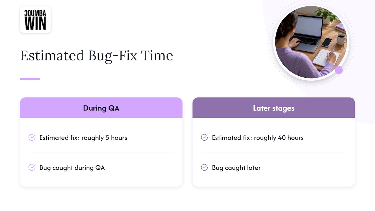
Why bother when the launch date is looming and the deck still needs a tweak? Because the cost curve is brutal. One estimate cited in a 2025 write-up on QA puts a bug caught during QA at roughly 5 hours to fix, versus an estimated 40 hours if it is caught in later stages. And visitors rarely tell you what went wrong: one industry glossary reports that 91% of visitors who hit a frustrating experience just leave without giving feedback.
For a startup, the broken form is not an abstract risk. It is the investor who tried to book a demo and got a blank screen. So let’s make sure that never happens.
Step 0: Set up before you test anything
The most common QA mistake is starting to click around before agreeing on what “done” means. Spend an hour on this and every later step gets faster.
- Define scope. List the pages in scope with their final URLs, and which are public and which are private or noindex. A pre-launch guide also asks for a named final launch decision-maker. Pick one person. Committees don’t ship websites.
- Use a staging site that mirrors production. BrowserStack’s setup guidance calls for realistic data and the same feature flags as the live site. Document any differences.
- Prepare test accounts. Valid users, invalid users, an admin, test cards and sandboxed payments.
- Build a browser and device matrix. Use your analytics if you have them. If the site is brand new, start with the major browsers and a handful of real phones.
- Write acceptance criteria. Marker.io’s guide gives a good model: a user can add items to a cart and complete payment without errors, and confirmation emails are sent. Plain sentences, agreed with stakeholders.
- Freeze changes during the pass. One launch checklist recommends recording the build, environment and test data so two testers can’t seem to disagree while looking at different code. If something must change mid-pass, log it.
Visual, responsive and cross-browser checks
Start with what people see first.
- Compare to the design. Layout, color, typography and spacing should match the approved files, on every key page, not only the homepage.
- Check every breakpoint. One visual QA checklist tests 375px (mobile), 768px (tablet, where it says most responsive bugs hide), 1440px (desktop) and 1920px and wider, plus orientation changes and 150% and 200% browser zoom.
- Test the combinations people actually use. The same checklist suggests prioritizing browser combinations that represent about 90% of your audience: Chrome, Firefox, desktop Safari, Safari on iOS and Chrome on Android.
- Use real devices. A resized desktop window doesn’t reproduce mobile font rendering, touch behavior or pixel density, as this testing guide points out. Safari deserves extra attention because WebKit diverges most from Chromium.
- Look at the interactive bits. Menus, modals, sticky headers, hover states that have no equivalent on touch screens, and horizontal scrolling that shouldn’t exist.
A tip from the trenches: do the mobile pass with your thumb, not your mouse. Tiny tap targets are invisible until a human with a phone tries to hit them.
Functionality: links, forms, navigation
This is where launches quietly lose money.
Links. Run a link checker for 404s, then spot-check by hand. BugHerd’s checklist recommends exactly that pairing. Check internal links, external links, the footer, and anything in your email signature or deck that points to the site.
Forms. Blur Test’s usability checklist calls forms the most common point of conversion failure and says to test them end to end in production. Submit valid data. Submit garbage. Then confirm that:
- error messages appear next to the offending field,
- entered data survives a failed validation,
- the success state is clear,
- the submission actually arrives in your CRM, inbox or database (this is the one everyone forgets).
Navigation. Important pages should be reachable within about three clicks of the homepage, and the current page should be highlighted in the menu.
Beyond the happy path. The launch checklist mentioned above suggests trying existing accounts, expired links, duplicate submissions, insufficient permissions, canceled third-party flows, back-button navigation and retries after failure. Real users do all of these before lunch.
Analytics and tracking. Confirm your events fire, your conversion goals record, and your tags aren’t double-counting. If you plan to run experiments, this is mandatory: CXL’s Shanelle Mullin notes that a tracking problem in one variation means you’re no longer measuring the change you intended.
Content checks
Content bugs are embarrassing precisely because they are so easy to avoid.
- Search the site for placeholder strings: “lorem,” “ipsum,” “TBD,” “TODO” and “FIXME,” as BugHerd suggests.
- Read body text at a minimum of 16px with line lengths under 75 characters, per the usability checklist.
- Make sure every meaningful image has descriptive alt text.
- Check titles, meta descriptions, canonical tags and redirects. If you’re replacing an old site, our SEO site migration checklist covers how to keep rankings intact.
- Proofread names, prices, legal pages and every “Book a call” button label.
Accessibility checks
Accessibility belongs in QA, not in a someday-backlog. The HubSpot piece cited earlier notes that 18.9% of America’s population has a disability, so passing accessibility testing can support conversions as well as compliance.
A solid first pass, drawing on BrowserStack’s accessibility checklist and the WCAG 2.2 criteria it follows:
- Every interactive element is reachable and usable by keyboard, with a visible focus state and no keyboard traps.
- Forms have proper labels and errors that are announced.
- Text contrast meets WCAG AA. The standard ratio for normal text is 4.5:1. Our color contrast workflow walks through it for designers and engineers.
- Meaningful images have alt text, and information is never conveyed by color alone.
- Text resizes to 200% without losing content, and touch targets are at least 24 by 24 CSS pixels.
- Animations and autoplay can be controlled.
Tab through every page once, start to finish. If you lose track of where you are, so will your users. For the full test steps, use our WCAG 2.2 checklist. If your site handles sign-ups, payments or anything legally sensitive, a formal website accessibility audit goes deeper than a self-check, and accessibility audits are one of the services we offer.
Performance checks
Speed is part of quality, not a nice-to-have. BrowserStack sets the Core Web Vitals targets many teams use: Largest Contentful Paint (how fast the main content appears) at 2.5 seconds or less, Interaction to Next Paint (how quickly the page responds to taps and clicks) at 200 milliseconds or less, and Cumulative Layout Shift (how much things jump around) at 0.1 or less.
How to test it:
- Test several pages, not just the homepage, and throttle the connection to simulate slower networks.
- Compare lab results against a real device.
- Validate lazy loading, caching and image compression.
- Set explicit image width and height so the layout doesn’t shift as images load.
- Open the browser console and make sure there are no JavaScript errors.
Most speed wins start in design: image choices, font loading, and how much motion you ask the browser to handle. We wrote about that in improving load speed through design and about how it affects rankings in Core Web Vitals and SEO. For a wider look at how faster speed lifts conversions, that page is worth a read.
Security basics before launch
You don’t need to be a penetration tester to cover the fundamentals. A pre-launch checklist on GitHub treats these as must-haves:
- no secrets (API keys, passwords) in source code or git history, and any committed secret revoked and rotated,
- HTTPS enforced with no mixed content,
- working authentication and authorization,
- updated dependencies,
- security headers such as CSP, HSTS, X-Frame-Options and X-Content-Type-Options.
If your site has logins, also test password reset, logout, session timeouts, role-based access, and that error pages don’t leak technical details, per BrowserStack’s security checklist. For anything involving payments or sensitive user data, bring in your developer or a security professional for a proper review.
Logging bugs and deciding what blocks launch
Finding issues is half the job. The other half is not arguing about them at 11 p.m. the night before launch.
Before testing, set a launch gate: which severity levels block release, who can accept a known risk, and what evidence is needed for a retest. Then triage by impact and reproducibility, not by how dramatic a bug looks, as the launch checklist advises. A simple version:
| Severity | Example | Launch decision |
|---|---|---|
| Critical | Contact form doesn’t deliver, checkout fails, site not on HTTPS | Blocks launch |
| High | Broken layout on iPhone Safari, key page fails keyboard access | Blocks launch unless the decision-maker signs off |
| Medium | Slow secondary page, minor contrast miss on a footer link | Fix in first sprint after launch |
| Low | Small spacing inconsistency | Log and schedule |
For every blocker, keep the original evidence (screenshot, steps, browser), note the build that fixes it, rerun the smallest reproduction first, then the full critical journey. Once the logic is stable, automate it so future passes can focus human attention on new risks.
Keep QA going after launch
Launch day is a checkpoint, not a finish line. Every new page, content edit or plugin update can break something. The glossary cited earlier argues that every content update or new link needs re-testing, and that errors should be caught in days or hours rather than discovered by users.
A light routine that works for a growing startup:
- Automate regression checks on the paths that make money: homepage load, navigation, form submission.
- Re-run the accessibility pass whenever you add new components.
- Keep a staging environment for content and design changes, and never push placeholder content live. This mirrors Sitecore’s guidance on dedicated environments and a QA gate before production.
- Review analytics monthly for pages with sudden drop-offs.
Where we come in
QA is much easier when the site was designed with testing in mind: clear components, sensible contrast, lean pages and tidy forms. That is how we approach custom web design and development for startups, with Webflow development and UX design available when you want a site built around your growth goals rather than a generic template. We also run accessibility audits and SEO optimization, two of the areas this checklist touches most.
If you’re planning a launch or a redesign, take a look at our web design and development services or see our Webflow work.
Our perspective
Here’s the confession: the best QA happens before anyone opens a testing tool. When a site starts from a custom design system instead of a patched-together template, half of this checklist gets easier. Consistent components mean fewer visual surprises. Thoughtful contrast means fewer accessibility fixes. Lean layouts mean fewer speed headaches.
We’re nerds about this. We work with founders who treat design as a competitive advantage, and we don’t believe in generic templates or AI-generated design. A site your investors, customers and users trust is built on deliberate choices, then verified with a checklist like this one.
So print it, steal it, tweak it for your product. And if you’d rather hand the whole thing to design partners who care about the details, that’s exactly what we’re here for.
Coumba Evelyn
FAQ
How long does a website QA process take?
It depends on the size of the site and how many integrations it has. One UX QA guide estimates 15 to 20 minutes per feature for a visual and accessibility pass. A small marketing site can be covered in a few days, while a platform with logins and payments needs longer.
Should I test on a staging site or the live site?
Do your deep testing on a staging site that mirrors production, with differences documented. Forms and critical journeys should then be confirmed once more in production after launch, since that is where real integrations live.
What are the most important things to check if I’m short on time?
Cover the money paths first: forms and their delivery, mobile layout, navigation, HTTPS, and page speed on your key pages. Then add keyboard access and color contrast. Anything that stops a visitor from contacting you or buying is a blocker.
Who should do website QA?
Ideally someone who didn’t build the page, because builders see what they meant to make. Pair a tester with the launch decision-maker, and bring in your designer and developer to fix issues quickly.
Sources
- CXL: Website Quality Assurance guide
- Website quality assurance: how to QA a website for maximum results
- Website quality assurance testing glossary
- Website QA testing: a detailed guide
- Website launch QA checklist for SaaS, landing pages and more
- A practical guide to website QA testing
- Website QA checklist before launch: critical paths
- Visual QA checklist: what to verify before every release
- How to test a website: step-by-step guide
- Website QA checklist: free interactive tool
- Usability testing checklist: what to test before your website goes live
- Pre-launch checklist on GitHub
- Planning test strategy: Sitecore developer portal
- UX QA: quality-checking UX before launch
- Boost SEO and conversions with faster website speed