6 Step Color Contrast Accessibility Workflow for Designers & Engineers

6 Step Color Contrast Accessibility Workflow for Designers & Engineers
Text needs a 4.5:1 contrast ratio against its background for normal type and 3:1 for large text to meet WCAG AA. AAA bumps that to 7:1 and 4.5:1. Buttons, icons, and other interactive elements need 3:1 too. Grab a hex code or eyedropper tool right now and test your body text, your hover states, and your icons against these numbers, because WCAG and Section 508 both treat them as the floor, not a suggestion. I’m Coumba Evelyn, and here’s how to actually apply them.
TL;DR:
- Teams often overlook the importance of testing all states and components, risking contrast failures in hover, focus, and disabled modes.
- Automated contrast checks integrated into the build pipeline can prevent regressions and ensure ongoing compliance across all UI states.
- Brightness-based luminance calculations, not hue, determine contrast success, so pairing colors with similar luminance levels can cause accessibility issues.
- Using a tokenized color system with pretested pairs helps maintain consistent, accessible contrast ratios across multiple components and modes.
- Regular, comprehensive testing over images and gradients is crucial, as low-luminance pixels often cause contrast failures that static checks miss.
Table of Contents
- What Are the Required WCAG Contrast Ratios?
- How Do You Test Color Contrast the Right Way?
- Why Do Contrast Checks Still Fail After Launch?
- How Do You Pick Colors That Meet Contrast and Still Look Good?
- What Does an Accessible Color Checklist Look Like in Practice?
- What Are the Best Resources for Contrast Standards and Testing?
- The Gap Between Knowing the Numbers and Shipping Them
- Get Your Color Palette Audited Before It Costs You Users
- Sources
- FAQ
What Are the Required WCAG Contrast Ratios?
Here’s where most teams get tripped up: they know “4.5:1” as a number but never learn where it applies and where it doesn’t.
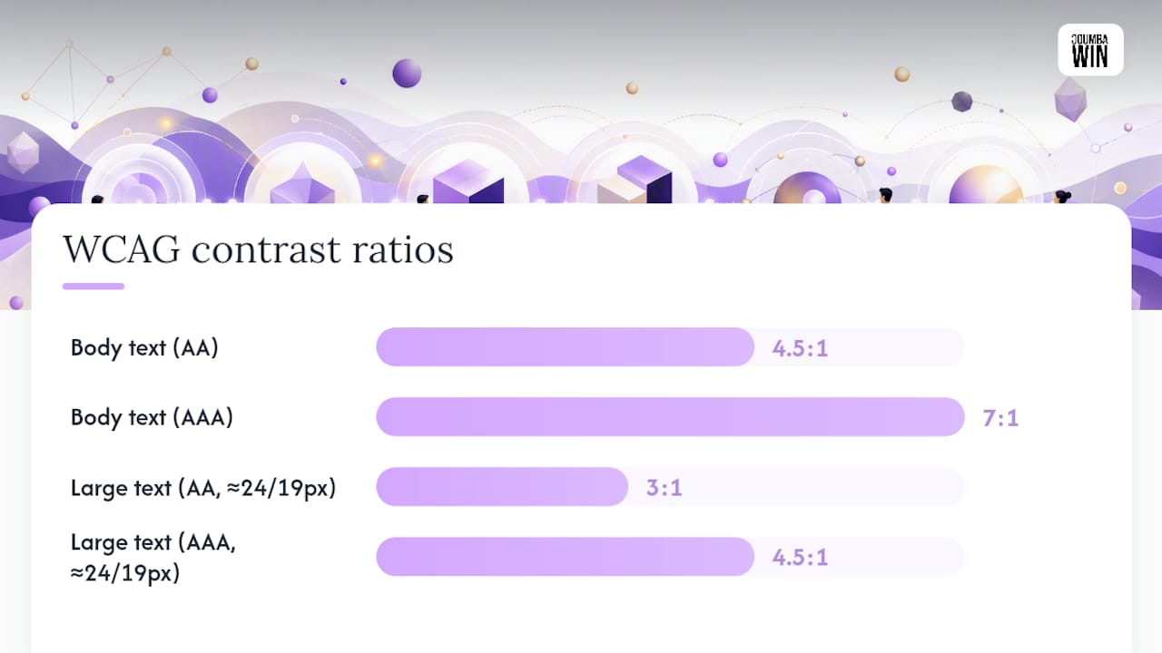
Normal text needs 4.5:1 contrast ratio at AA level and 7:1 at AAA level. Large text is allowed lower contrast ratios because bigger letterforms stay legible at lower contrast, with a required ratio of 3:1 at AA and 4.5:1 at AAA. WCAG 2.2 defines “large” using point size, which trips people up in CSS. Translate it to pixels and it’s roughly 24px regular weight, or about 19px if the text is bold.
Non-text elements get their own rule. Success Criterion 1.4.11 requires 3:1 for user interface components (think button borders, form field outlines, toggle switches) and graphical objects that carry meaning, like icons or chart lines. That’s separate from the text ratios and gets skipped constantly.
A few thresholds to keep on hand:
- Body copy, labels, paragraph text: 4.5:1 minimum (AA), 7:1 for AAA
- Headlines at 24px+ or bold 18.7px+: 3:1 minimum (AA), 4.5:1 for AAA
- Buttons, input borders, icons that convey state: 3:1 minimum
- Disabled or decorative elements: exempt, but check your definition of “decorative” carefully
Contrast is a luminance calculation, not a hue comparison. Two colors can look wildly different and still fail if their relative brightness sits too close together, which is exactly why pure blue on black fails so often despite looking bold on screen.
How Do You Test Color Contrast the Right Way?
Testing one static swatch and calling it done is the single most common way teams pass an audit and still ship an inaccessible product. Here’s a workflow that actually catches problems.
Your toolkit:
- A contrast checker that accepts hex input (WebAIM’s is the standard reference most auditors use)
- Your browser’s dev tools eyedropper, for pulling exact colors straight off a live page
- A color blind simulator to preview how palettes degrade under different types of vision
- An automated site scanner to catch regressions across pages you can’t manually check one by one
The six-step check:
- Pick the token pair. Grab the exact text color and exact background color from your design system, not an approximation.
- Compute the ratio. Drop both hex values into a checker and confirm against the AA or AAA threshold for that text size.
- Test every interactive state. Hover, focus, active, and disabled states each need their own contrast check. A button that passes at rest often fails on hover if someone lightened the background for a “subtle” effect.
- Test non-text components. Borders, icons, and focus rings need the 3:1 non-text ratio, measured against whatever sits directly next to them.
- Test over images and gradients. Find the lowest-luminance pixel under the text and test there, not at the brightest point in the image.
- Log every failure. A ratio of 4.3:1 isn’t “close enough.” Record it, fix it, and retest.
Pro Tip: Turn on your operating system’s high-contrast or forced-colors mode and click through your product before you ship. It surfaces state and hover failures that a static contrast checker will never catch, because it forces the browser to render your actual CSS, not a screenshot.
Why Do Contrast Checks Still Fail After Launch?
Passing a contrast checker on your first pass tells you almost nothing about whether the finished product holds up. Real interfaces fail in the gaps between the states you tested.
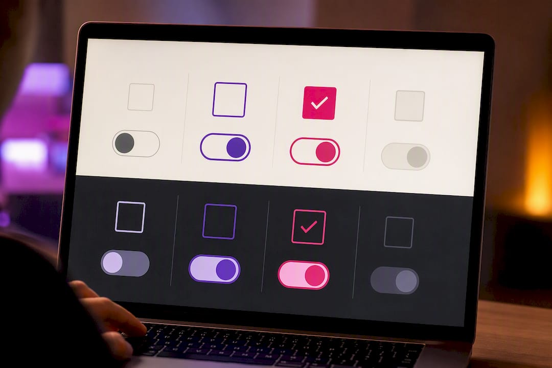
Non-text contrast is the biggest blind spot. WCAG 2.2 requires 3:1 for interface components and graphical objects, and that rule catches teams who nailed their text ratios but shipped a checkbox border that vanishes on a white background.
Links create a second failure point. If you remove the underline, WebAIM’s guidance requires the link text to hit 3:1 against surrounding body text and 4.5:1 against the page background, including on hover and focus. Skip the underline without checking both numbers and you’ve made links invisible to anyone who can’t rely on color alone to spot them.
Common pitfalls worth checking today:
- Thin, light-weight fonts that read fine at 16px but drop below threshold at smaller sizes
- Text laid over photos or gradients where only the darkest pixel was ever tested
- State changes (hover, error, success) that swap in a lighter or more saturated color without rechecking the ratio
- Pure blue (#0000FF) on dark backgrounds, which measures worse than it looks because of how blue’s luminance behaves
How Do You Pick Colors That Meet Contrast and Still Look Good?
Contrast compliance and good design aren’t opposing forces. The fix is treating color as a system, not a series of one-off decisions made in Figma at 11 p.m.
Tokenize your palette. Define named pairs for text, surface, and accent colors, pretest every pair against AA (or AAA where the content matters more), and store the approved combinations in your style guide so nobody reinvents a failing pair six months later. When a new component gets built, the designer pulls from proven tokens instead of eyeballing a new gray.
A few things worth building into that system:
- Aim above the AA minimum where you can. MDN’s guidance treats WCAG minimums as a floor, and pushing toward AAA on body copy pays off for anyone with low vision.
- Never use hue alone to signal meaning. Error red and success green need contrast differences too, not just a color swap, because color blind accessibility depends on more than picking “different-looking” colors.
- Add redundant cues. An icon, a label, or a pattern next to a color-coded status means the information still lands for someone who can’t distinguish the hue.
Dark mode complicates all of this because flipping a light palette to dark rarely preserves your ratios. Bumping text luminance or softening pure black backgrounds usually fixes it, and it’s worth testing responsive type sizes separately since a ratio that passes at desktop can shift at mobile breakpoints. Coumba Win’s guide to dark mode walks through the adjustments in more depth.
Pro Tip: Build your dark-mode palette from a separate luminance baseline instead of inverting your light palette. A straight invert almost always breaks at least one ratio you already fixed once.
What Does an Accessible Color Checklist Look Like in Practice?
A checklist only earns its place if a team actually uses it before every release, not after a complaint comes in.
- Tokenize text, surface, and accent colors, and pretest every pair before it reaches a component library
- Wire automated contrast gates into your build or CI pipeline so a failing pair blocks a merge
- Test hover, focus, active, and disabled states individually, not just the resting state
- Add a redundant cue (icon, label, pattern) anywhere color alone carries meaning
- Document approved pairs in your component library so the next designer doesn’t start from zero
On a recent education-platform project, our team found that the biggest hidden problem wasn’t the body text at all. It was a set of secondary buttons that passed AA at rest but dropped below 3:1 the moment a user hovered or tabbed to them with a keyboard, because the focus ring reused a light accent color against a light card background. Adding a persistent, high-contrast focus outline across every interactive component fixed it site-wide instead of one component at a time. That’s the kind of fix that a token system catches early and a one-off audit almost always misses. If you want more on how design systems catch this kind of thing before launch, the Coumba Win blog has more implementation notes.
What Are the Best Resources for Contrast Standards and Testing?
Go to WCAG 2.2 for the actual normative language behind every ratio in this article, and to Section 508’s color guidance if you’re building for a US government contract or want a design-system-first framing of the same rules. MDN’s accessibility docs are the fastest place to understand luminance math without wading through spec language, and WebAIM’s contrast article is the sharpest resource on state testing and link pitfalls specifically. For quick day-to-day checks, keep a hex-based contrast checker and your browser’s eyedropper open in a tab. For the “why does this matter for my traffic, not just my conscience” argument, Babylovegrowth’s piece on accessibility and SEO is worth the five minutes.
The Gap Between Knowing the Numbers and Shipping Them
Most teams don’t fail contrast because they don’t know the ratios. They fail because they treat contrast as a design-phase checkbox instead of an engineering-phase gate, and the two produce completely different outcomes.
A Figma file can pass every ratio and still ship broken, because the moment a developer swaps in a CSS variable, adds a hover state, or drops text over a hero image, the math changes. That’s the part conventional advice glosses over. It talks endlessly about picking the right blue and almost never about what happens to that blue once it’s inside a button component with four different states and three breakpoints.
If I had to pick one priority for a team with limited time, it wouldn’t be chasing AAA everywhere. It would be automated contrast gates in the build pipeline, because that’s the one change that keeps a compliant palette compliant six months and forty pull requests later. Tokenize first. Automate the check second. Chase AAA on your most critical content third, not first.
— Coumba Evelyn
Get Your Color Palette Audited Before It Costs You Users
Our accessibility service is an alternative to a slow, after-the-fact accessibility fix. Instead of retrofitting contrast issues after launch, we build tokenized, pretested color systems into your brand and product from the start, so every button, link, and headline passes AA (or AAA where it counts) before it ever ships.
That matters most for startups moving fast. You don’t have months to audit every screen manually, and you shouldn’t need to. Our accessibility audits catch contrast failures buried in hover states, icon sets, and dark-mode variants that most design reviews miss entirely, then provide a working style guide and component library built to hold up as your product scales. If your platform, pitch deck, or brand refresh is coming up soon, get in touch through Coumba Win Design and let’s build the color system right the first time.
Sources
- Web Content Accessibility Guidelines (WCAG) 2.2
- Contrast and color accessibility - WebAIM
- Section508
FAQ
What Is Color Contrast Accessibility?
It’s the practice of choosing text, background, and UI colors with enough luminance difference that people with low vision, color blindness, or aging eyesight can read and use an interface, measured against WCAG ratio thresholds.
What Colors Provide the Best Contrast for Accessibility?
There’s no fixed “best” color pair. What matters is the luminance gap between your specific text and background colors, which is why black on white or white on dark navy consistently score high while pastel-on-pastel combinations almost always fail.
What Are the ADA Color Guidelines for Accessibility?
The ADA doesn’t set its own numeric contrast standard. In practice, US courts and federal agencies point to WCAG 2.2 AA as the benchmark for digital accessibility compliance, including the 4.5:1 and 3:1 ratios.
What Is a Good Contrast Ratio for Accessibility?
For normal text, 4.5:1 meets AA and 7:1 meets AAA. For large text and UI components like buttons and icons, 3:1 meets AA and 4.5:1 meets AAA for large text specifically.