Visual Identity System: What It Is and How to Build One
Visual Identity System: What It Is and How to Build One
A visual identity system is the set of design decisions and rules that make your brand look like itself on a website, a pitch deck, a booth banner and a tiny app icon. It goes well beyond a logo and a color palette. A logo and a palette are ingredients. A system is the recipe that lets anyone on your team (or any designer you hire next year) cook the same dish every time. 🍳
If you’re a founder, you probably feel this problem before you can name it. The deck looks one way, the website another, and the conference swag looks like it belongs to a cousin of your company. This guide explains what goes into a system, shows how the pieces fit, and walks you through building one that survives fast growth.
TL;DR
- A visual identity system is your brand’s visual rules: logo, color, type, imagery, graphic elements, layout and motion, plus the decisions about how they combine.
- The word that matters is “system.” Assets are a kit; rules are what let other people make new assets that still look like you.
- Visual identity is one layer of your wider brand identity, which also covers voice, values and positioning.
- Build for your hardest use cases first (tiny icons, dark backgrounds, a deck slide), then write down only the rules people will actually use.
- Custom beats template here: a system is only worth having if it looks like nobody else.
Table of Contents
- What a visual identity system actually is
- The components of a visual identity system
- A real example: when a symbol does all the work
- Why a startup should care (besides looking cool)
- How to build a visual identity system, step by step
- Your website is where the system gets tested
- Common mistakes founders make
- Where we come in
- Our perspective
- FAQ
- Sources
What a visual identity system actually is
Strip away the jargon and a visual identity system answers one question: when someone sees something from your company, how do they know it’s yours?
HubSpot describes it as a guide that shows the full visual experience of a brand, including color, texture, photography, videography and type, built so internal teams can communicate the brand consistently to outside audiences. That last part is the key. A system exists so the brand doesn’t depend on one person’s taste or memory.
Here’s a quick gut check. Cover your logo with your hand and look at your homepage. Can you still tell it’s your company from the colors, the typography, the spacing and the way images are treated? If yes, you have a working system. If it could be any one of a thousand startups, you have a logo with some decoration around it.
Visual identity vs. brand identity vs. logo
These three terms get mashed together, so here is the clean version:
- Logo: one mark, one element. Usually the smallest part of the whole picture.
- Visual identity (system): everything you can see that represents the brand, plus the rules for using it.
- Brand identity: the bigger umbrella. It includes the visual identity and also your name, positioning, voice, values and how you behave.
So your visual identity is how the brand looks. Your brand identity is also how it sounds and what it stands for. If you want the broader picture first, our founder’s guide to brand identity design covers the umbrella.
The components of a visual identity system
Most systems share the same building blocks. What separates a good one from a pile of files is that each block comes with a decision attached.
| Component | What it includes | The decision a system adds |
|---|---|---|
| Logo | Primary mark, wordmark, icon, reversed and one-color versions | Which version goes where, minimum size, clear space |
| Color | Primary, secondary and neutral colors with exact values | Which color is for text, which for backgrounds, which for buttons |
| Typography | Headline and body typefaces, weights, sizes | How big a headline is relative to body copy, and what never gets set in a fallback font |
| Imagery | Photography, illustration, video style | What a product photo may show, how images are cropped and treated |
| Graphic elements | Icons, patterns, shapes, textures | When decoration is allowed and when white space wins |
| Layout | Grids, spacing, alignment | How a deck slide, a landing page and a poster share the same bones |
| Motion | Transitions, animation timing, loading states | How things move, so the brand feels consistent in a product, not just in a PDF |
Color values deserve a note. Write each color down in the formats your team will actually need: HEX and RGB for screens, CMYK for print. Print and screen are different worlds, and the same blue can look quite different in each unless you specify it.
Why the pieces have to work together
No single element carries the identity. A distinctive color with a generic typeface looks half finished. A beautiful logo dropped into an inconsistent layout looks borrowed. The recognition comes from the combination repeating until people stop needing the name.
That is also the reason motion matters more than it used to. Your brand now lives in product interfaces, social video and animated sites, not just print. If you want to see how movement supports identity, we wrote about motion design and brand engagement.
A real example: when a symbol does all the work
The cleanest proof that a system can carry recognition is Mastercard. In 2019 the company dropped its name from its brand mark and let the interlocking red and yellow circles stand alone on cards, acceptance marks and sponsorships. Its release says more than 80 percent of people spontaneously recognized the symbol without the word “mastercard.”
You are not Mastercard, and you don’t need decades of circles to get there. The lesson for a startup is smaller and more useful: recognition is built from a few consistent visual choices repeated everywhere. Two colors, one shape language and one typographic voice, used the same way again and again, beat a dozen clever ideas used once.
What do examples look like at startup scale? Think about the touchpoints you already have:
- A homepage where the hero, buttons and illustrations all follow one color and type logic.
- A pitch deck whose slides share a grid, so investors see a company that pays attention to details.
- A booth banner and swag that match the website, so someone who meets you at an event recognizes you when they Google you that night.
- A favicon and social avatar that still read at the size of a thumbnail.
If you want to see how others document these rules, our post on brand guidelines examples for startups shows what a usable document looks like.
Why a startup should care (besides looking cool)
Research on visual identity is thinner than the blog posts suggest, so here is the grounded version. Academic work backs the basic idea that context shapes how people respond to a logo and a corporate visual identity: a University of South Carolina thesis looked at how visual context shapes initial responses to logos and identity systems. First impressions are formed by what surrounds the mark, not the mark in isolation.
For a founder, that translates into three practical payoffs:
- Trust at a glance. Investors and customers read consistency as competence before they read a single word.
- Speed. When rules exist, a new landing page, a hiring graphic or an event flyer stops being a design project and becomes an assembly job.
- Delegation. Your first marketer, a freelancer or an agency can produce on-brand work without asking you for approval on every pixel.
We go deeper on the last point in our guide to online brand consistency best practices.
How to build a visual identity system, step by step
Here is the routine, with the places where it usually goes sideways.
1. Start with the brand, not the colors
Before anyone opens a design tool, get clear on who you serve, what you do differently and how you want people to feel. Pick three or four words for the personality (warm, sharp, playful, serious) and treat them as a filter. Skipping this step is how startups end up picking a color because it was trending on a Tuesday.
Where it goes wrong: the brief is “make it look modern.” Everything looks modern. Nothing looks like you.
2. Collect references, then cut hard
A mood board turns vague taste into shared language. Gather plenty, then edit ruthlessly so the direction is obvious. Our mood board rules for branding explain how many references to collect and how many to keep.
Where it goes wrong: a board with 80 images and no point of view. If the board contradicts itself, the identity will too.
3. Design the core elements for the hardest cases first
Test the logo at favicon size, on a dark background, in one color, and on a crowded slide. If it fails there, fix it now. A mark that only works large and on white is a liability the first time it lands in an app store. A responsive approach helps, and we cover it in responsive logo design for startups.
Then choose colors with jobs: one or two that carry the brand, a few supporting tones, and neutrals for everything else. Meaning varies between audiences, so if you serve people across cultures, read up on the role of color in cultural design.
Where it goes wrong: ten colors, none of them assigned a job. People then pick whichever feels right, and consistency dies.
4. Separate what never changes from what can flex
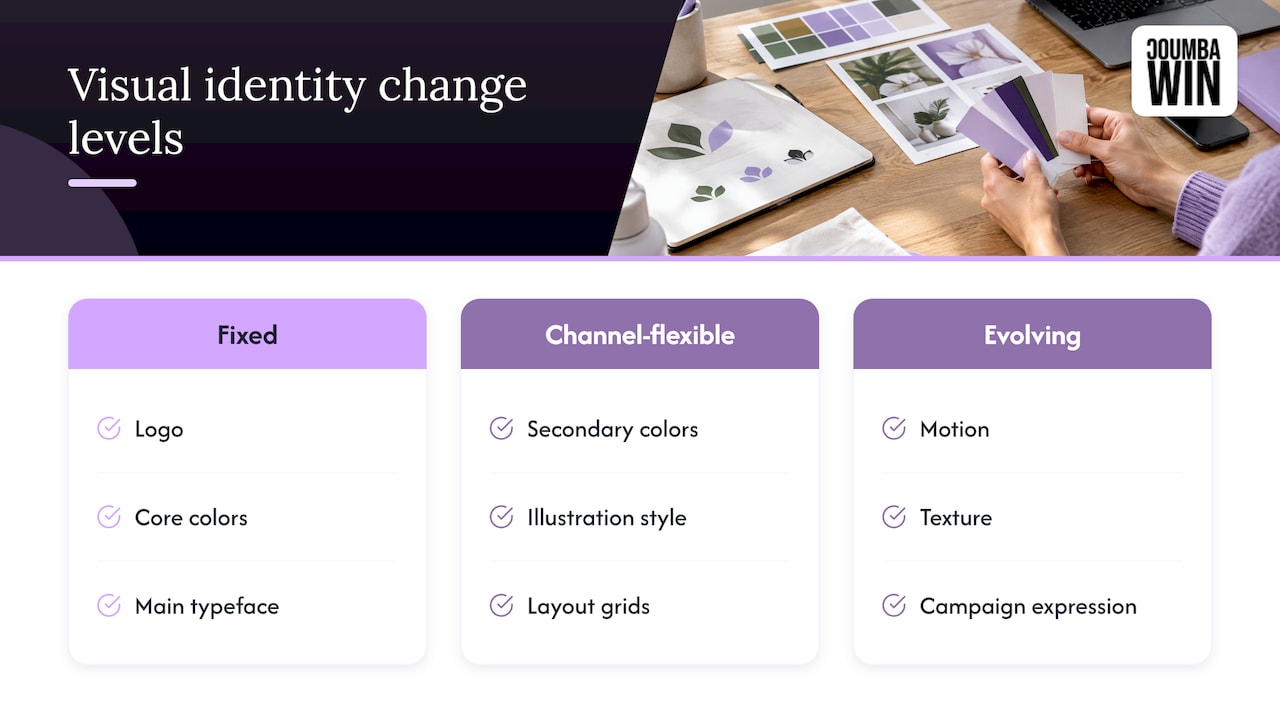
A useful way to think about scale: some elements are fixed (logo, core colors, main typeface), some flex by channel (secondary colors, illustration style, layout grids), and some can evolve as you grow (motion, texture, campaign expression). Deciding this up front tells your team where they have freedom and where they don’t.
Where it goes wrong: everything is locked, so people break the rules out of frustration, or nothing is locked, so there are no rules to break.
5. Write the rules down, small
You don’t need a hundred-page manual. You need the minimum for each element, written clearly enough that someone who wasn’t in the room can use it: logo versions and spacing, exact color values, type sizes, image dos and don’ts, and a few templates for the things you make weekly (decks, social posts, one-pagers). Add a short “never do this” list with visual examples. People learn faster from a wrong example than from a paragraph.
Where it goes wrong: the guide is beautiful and unusable, or it lives in one designer’s laptop.
6. Apply it to real work immediately
A system isn’t proven by the guide. It’s proven by the first deck, the first landing page and the first event handout. Build those early and note every moment someone has to guess. Each guess is a missing rule.
7. Give it an owner and review it
Someone needs to decide edge cases: which logo appears next to a partner’s, whether a sub-product follows the core typography. Without an owner, every team member interprets the rules differently. Schedule a check-in every few months, because your product, audience and channels will change faster than a PDF can.
Your website is where the system gets tested
For most startups, the website is the most visible expression of the identity, and also the place it breaks first. Buttons, forms, error messages, empty states and mobile layouts are all moments the logo and palette alone can’t cover. That is why we treat identity and interface as one job: the type scale, spacing and color roles in your brand rules should map directly onto your UI components.
A few things to check on any site:
- Do text and background color pairs stay readable for everyone, including people with low vision?
- Do headline and body styles match the ones in your deck?
- Do images follow one treatment, or does each page feel like a different photo shoot?
- Does motion feel like your brand, or like a default template?
On the storytelling side, a good primer on visual storytelling tips shows how imagery choices shape what a brand communicates. And if your channels include social, a creative branding strategy is easier to apply when your visual rules are already written.
Common mistakes founders make
- Treating the logo as the identity. The logo is usually the smallest piece of the system.
- Starting from a template. Templates are fast and look like everyone else. A system’s job is to make you distinct.
- Too many rules. If nobody reads it, it doesn’t exist.
- Designing only for the website. Decks, print, events and email also carry your brand.
- Never updating. A system built for a five-person team will creak at fifty.
Where we come in
We design custom identities for startups, and then carry them across the places founders actually need them: the website (including Webflow builds), UI and UX, pitch decks, print and graphic design, and the materials for events like Demo Day. We don’t work from generic templates or AI-generated design, and we work closely with founders because the best identities come from the founder’s real point of view about the business.
If you’re building a system from scratch or redesigning one that has drifted, our design services are the place to start, and our Webflow development work shows how an identity becomes a live site.
Our perspective
Here’s our honest take: most startups don’t have a logo problem, they have a consistency problem. The logo is fine. It’s the third version of the deck, the website built by a different freelancer and the booth banner printed in a slightly-off blue that make a company look like it isn’t quite sure who it is.
We think a visual identity system should be custom, collaborative and built for use. That means sitting down with founders to understand what makes the company worth remembering, then turning that into rules a busy team can follow on a Tuesday afternoon. It means designing the identity and the website together, so the brand isn’t a PDF that the site politely ignores.
It also means saying no to templates and AI-generated shortcuts. A system built from what everyone else uses will look like what everyone else has. For a startup trying to be remembered by investors, customers and future hires, that’s the one outcome you can’t afford.
So get the system right once, write down the minimum, apply it everywhere and let it grow with you. Your future self (and your future marketing hire) will thank you. 🙌
Coumba Evelyn
FAQ
What are the main components of a visual identity?
The core components are the logo, color palette, typography, imagery, graphic elements such as icons and patterns, layout and motion. A system adds rules for each: which logo version to use where, exact color values, type sizes and what images may show.
What is the difference between a visual identity and a brand identity?
Visual identity is how your brand looks. Brand identity is the larger whole, which also includes your name, positioning, voice and values. The visual identity is one layer inside it, and the layer people notice first.
How do I create a visual identity for my startup?
Start with who you serve and the personality you want, collect and edit references, design the core elements for the hardest use cases, then write short rules and apply them to your real deck and website. Assign an owner and review the system every few months as you grow.
Do I need a full brand guidelines document?
You need the minimum for each element, written clearly enough for someone new to use it. A short, practical set of rules with templates for your most common assets will serve a startup better than a long manual nobody opens.