The Role of Motion Design Websites in Brand Engagement

The Role of Motion Design Websites in Brand Engagement
Motion design in websites is defined as the purposeful use of animation and movement to communicate interface state, guide user attention, and reinforce brand identity. This is not about slapping a parallax scroll on your hero section and calling it a day (we’ve all seen that go sideways). The role of motion design websites play in modern digital products is fundamentally strategic: tools like Framer, GSAP, and CSS animations give designers the power to create movement that works, not just movement that looks cool at 2am during a design sprint. When you get it right, motion becomes the invisible hand that makes your site feel alive, trustworthy, and unmistakably yours.
How motion design improves user experience and brand engagement
Motion design is the difference between a site that feels responsive and one that just technically functions. Strategic motion decreases cognitive load and improves navigation clarity, which directly impacts how users perceive your brand’s quality within seconds of landing on your page. That’s not a small thing. That’s your first impression, your handshake, your “hi, we’re serious people who care about details.”
Here’s what purposeful motion actually does for your UX and brand:
-
Signals state changes without extra copy. When a button pulses on hover or a form field highlights on focus, users understand the interface without reading a single instruction. Motion communicates interface relationships and state changes intuitively, reducing the mental effort required to navigate your product.
-
Builds trust through speed. Interactive feedback within 100ms creates a sense of direct manipulation, making users feel in control. Anything slower than 500ms starts to feel broken. That window is tiny, and motion is your best tool for filling it.
-
Conveys brand personality at a neurological level. Motion operates faster on the brain than copy or color, establishing a brand “pulse” in fractions of a second. A startup using bouncy, elastic easing reads differently than one using crisp, linear transitions. Both are valid. Neither is accidental in a well-designed system.
-
Signals product maturity. A website that uses motion with intention signals care and investment in details, positively shaping user perceptions of your product’s quality before they’ve read a single word of your copy.
Pro Tip: Before adding any animation, ask yourself: “What information does this movement convey?” If the answer is “it looks cool,” go back to the drawing board. Motion earns its place by communicating something.
Motion design vs. UI animation: what’s actually the difference?
This is where a lot of teams (including some very talented ones) get tripped up. Motion design and UI animation are not synonyms, and treating them as such is one of the most common design mistakes in 2026.
| Motion design | Decorative animation | |
|---|---|---|
| Purpose | Communicates state, hierarchy, and feedback | Adds visual interest without functional intent |
| Rooted in | Usability principles and design systems | Aesthetic preference or trend-following |
| User impact | Reduces errors, guides attention, builds trust | Can distract, overwhelm, or confuse |
| Accessibility | Honors "prefers-reduced-motion` settings | Often ignores user preferences entirely |
| Example | Skeleton loading screen during data fetch | Infinite looping background video with no pause option |
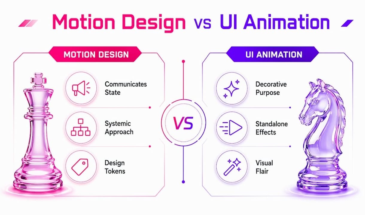
Motion design is systemic. It lives in your design tokens alongside your color palette and type scale. Decorative animation is a one-off decision that often gets added in the final week before launch (you know the one). Confusing or excessive animation reduces usability and can damage brand perception, especially when movement lacks any communicative purpose.
Common misuses that Coumba Win Design sees repeatedly: excessive spring physics that make every element feel like it’s made of Jell-O, scroll-triggered effects that fire on every single section, and loading animations that play so long users bounce before the content appears. These aren’t just aesthetic problems. They’re conversion problems.
Pro Tip: Run your site through Google Lighthouse with animations enabled. If your performance score drops significantly, your motion is costing you more than it’s giving back.
Best practices for implementing motion design on startup websites
Getting motion right on a startup website means thinking in systems, not one-off flourishes. Here’s a practical framework for building motion that actually serves your users and your brand:
-
Start with error prevention, not delight. Begin with motion that directly prevents user errors: button states, form validation animations, toggles, and loading skeletons. These deliver the highest return on investment because they reduce confusion at critical conversion moments.
-
Use skeleton loading screens over spinners. Skeleton loading shimmer reduces perceived load time by up to 30% compared to static spinners. Perceived performance is real performance in the eyes of your users, and this is a quick win that requires minimal engineering lift.
-
Animate cheap properties only. Stick to
opacityandtransform(translate, scale, rotate). Animatingwidth,height,top, orlefttriggers layout recalculation and tanks your frame rate. This is non-negotiable for mobile performance. -
Document your motion tokens. Easing curves, duration values, and delay patterns belong in your design system style guide alongside your colors and typography. Without documentation, every developer makes their own call, and your site ends up feeling like five different products stitched together.
-
Honor
prefers-reduced-motionat every level. Ignoring reduced motion preferences is an accessibility failure that may exclude users with vestibular disorders. Implement this at both the CSS and JavaScript levels. It’s a one-line media query that protects a meaningful portion of your audience. -
Aim for invisible motion first. The goal is not for users to notice your animations. The goal is for users to feel that your site is alive and responsive. Subtle motion that users feel but do not notice is often the most effective way to create a calm, trustworthy experience. Save signature animations for intentional brand moments, not every scroll event.
Motion design website examples and what they teach us
Real-world applications of motion design fall into three distinct complexity tiers, and knowing which tier fits your startup’s stage is half the battle.
Micro-interactions are the foundation. Think button press states, checkbox animations, and input field focus rings. These are the UI components every startup website needs before anything else. They’re low cost, high impact, and directly tied to conversion rates. A form that visually confirms each field as valid reduces abandonment. Full stop.
Signature animations are brand-level moments. A startup in the fintech space might use a precise, linear reveal animation on their dashboard mockup to signal accuracy and control. A creative agency (hi, that’s us at Coumba Win Design) might use a more expressive, elastic entrance to signal personality and craft. These animations are deliberate, documented, and used sparingly.
Immersive experiences are the third tier, and honestly, most startups should wait on these. WebGL scenes, 3D scroll experiences, and particle systems are powerful brand statements, but they require significant performance budgeting and accessibility planning. Over-animated websites lead to user fatigue and lower conversion by flooding visual attention and degrading performance metrics. The brands that pull off immersive motion well (think Linear, Stripe, or Vercel) have dedicated motion design systems behind them.
The testing approach matters as much as the design itself. Run A/B tests on animated vs. static versions of key conversion elements. Watch session recordings to see where users hesitate or scroll past. Motion that looks great in Figma sometimes reads as noise in a real browser at real speeds. Iteration is not optional.
Key takeaways
Motion design websites succeed when movement serves communication, not decoration, and when it is built as a system rather than added as an afterthought.
| Point | Details |
|---|---|
| Motion is functional, not decorative | Every animation should answer: what information does this movement convey to the user? |
| Feedback timing is critical | Interactive feedback within 100ms builds trust; anything beyond 500ms feels broken to users. |
| Skeleton screens beat spinners | Skeleton loading shimmer reduces perceived load time by up to 30%, improving user patience at key moments. |
| Accessibility is non-negotiable | Implement prefers-reduced-motion at CSS and JavaScript levels to protect users with vestibular sensitivities. |
| Document motion as a system | Easing curves and duration tokens belong in your design system, not in a developer’s memory. |
Why I think most startups are thinking about motion completely backwards
Okay, real talk. After working with founders across fintech, edtech, and consumer brands, I’ve noticed a pattern that drives me a little bit crazy (in the most loving way possible). Teams spend weeks debating their hero animation and then ship a form with zero validation feedback. That’s backwards. That’s like obsessing over the restaurant’s neon sign while the kitchen is on fire.
The importance of motion design is not in the wow moments. It’s in the quiet moments: the button that confirms your click, the field that tells you your email is valid, the skeleton screen that says “hang on, we’re loading your data.” Motion design is not a cosmetic afterthought but a systematic layer documented alongside typography and color, critical for usability. When I work with startup founders, I push them to build their motion system from the inside out: micro-interactions first, brand signatures second, immersive experiences only when the foundation is solid.
The other thing I’ll say? The best motion I’ve ever shipped is motion nobody noticed. A founder once told me their new site “just felt more premium” after we rebuilt it. We had added exactly zero flashy animations. What we added was a coherent system of subtle transitions, responsive feedback states, and consistent easing. That’s the impact of motion design done right. It’s not a feature. It’s a feeling.
— Coumba Evelyn
Ready to build motion into your design system?
If you’ve been treating animation as a finishing touch rather than a foundational layer, Coumba Win Design is here to help you flip that script. We work with startup founders and design teams to build motion systems that are purposeful, performant, and unmistakably on-brand.
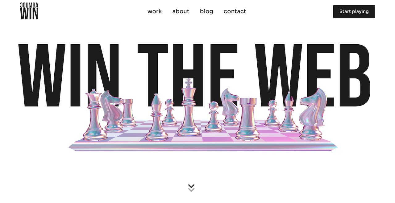
Start with the Coumba Win Style Guide, which includes motion tokens, easing curves, and interaction principles built for scalable startup websites. If you want to see motion design in action across real UI patterns, the component library shows exactly how purposeful animation integrates into accessible, production-ready interfaces. And if you want the full picture of what strategic design can do for your startup, Coumba Win Design is where it all comes together.
FAQ
What is the role of motion design in websites?
Motion design in websites serves as a functional communication layer that guides user attention, signals interface state changes, and reinforces brand identity. It reduces cognitive load and builds trust through responsive, purposeful movement rather than decorative effects.
How does motion design enhance UX on startup websites?
Motion design enhances UX by providing interactive feedback within 100ms, preventing user errors through visual cues like form validation and button states, and reducing perceived load time through techniques like skeleton loading screens.
What is the difference between motion design and UI animation?
Motion design is systemic and rooted in usability principles, documented as part of a design system with defined easing curves and duration tokens. UI animation can be purely cosmetic, added without communicative intent, and often harms accessibility and performance when overused.
What are the best practices for motion design on websites?
Start with micro-interactions that prevent errors, animate only opacity and transform properties for performance, honor the prefers-reduced-motion media query for accessibility, and document all motion values as design tokens in your style guide.
Does too much animation hurt a website’s performance?
Yes. Excessive motion leads to user fatigue and lower conversion rates by degrading performance metrics and overwhelming visual attention. Budget your motion the same way you budget your JavaScript: every addition has a cost.
Recommended