12 Brand Guidelines Examples Designers Can Reuse Today for Startups

12 Brand Guidelines Examples Designers Can Reuse Today for Startups
Great brand guidelines aren’t rulebooks nobody reads. They’re the difference between a brand that holds together across fifty channels and one that looks like it was designed by committee (because it was). Below you’ll find real, live brand guideline examples from Hulu, Netflix, IBM, Google, Dropbox, Mailchimp, Slack, and Starbucks, plus a checklist, a governance system, and the exact things worth stealing for your own guide.
TL;DR:
- Downloadable assets and clear do’s and don’ts are essential for guiding non-designers and preventing common brand violations.
- Keep guidelines scoped and simple for startups, expanding over time as the company’s brand complexity grows and involves more teams or regions.
- Including specific rules for everyday applications like social resizing and co-branding ensures consistent execution at scale.
- Using visual comparisons in the guide accelerates learning and helps teams instinctively apply brand standards.
- Regularly update the guide and assign ownership to maintain relevance as the brand evolves and scales.
Table of Contents
- What Makes Great Brand Guidelines Actually Work
- Brand Guidelines Examples Worth Opening Right Now
- What to Include in Your Own Brand Guidelines
- Making Sure Your Brand Guide Actually Gets Used
- How Coumba Win Builds Brand Guides Startups Actually Use
- How Brand Guidelines Grow Alongside the Company
- Customizing Guidelines for Different Platforms and Regions
- Everyday Applications: Getting the Do’s and Don’ts Right
- Author Perspective: When to DIY and When to Call an Agency
- Ready for a Brand Guide That Actually Gets Used?
- Sources
- FAQ
What Makes Great Brand Guidelines Actually Work
The best brand guidelines aren’t the prettiest ones. They’re the ones people actually open before starting a project.
That sounds obvious, but most guides fail this test. They’re PDFs buried in a Google Drive folder, written for designers by designers, with zero patience for the marketing intern who just needs to know if the logo can go on a red background. Frontify’s curated collection of public brand hubs points to the same handful of traits every time: clarity, easy asset access, and visible governance. Guides that skip any one of those three become shelfware fast.
A few hallmarks separate the guides worth studying from the ones that just look nice:
- Downloadable assets, not descriptions. A guide that tells you the logo exists is useless. A guide that lets you download the logo in five file formats is a tool.
- Explicit do’s and don’ts. Side-by-side visual comparisons (correct lockup vs. stretched, wrong-color version) teach faster than paragraphs of rules.
- A repeatable motif. Hulu’s guide centers everything around a shape it calls “The Vessel,” which shows up in product design and marketing materials alike. That kind of anchor gives non-designers something concrete to reference instead of vague “brand feel” language.
- Governance built in. Who owns updates? Who approves exceptions? The strongest guides answer this on page one, not buried in an appendix.
How deep should yours go? A five-person startup needs a tight, one-page cheat sheet covering logo, color, and voice. A company with distributed regional teams or outside agencies needs something closer to a full design system with tokens and templates. Match the depth to how many hands will touch the brand, not to how impressive the document looks in a portfolio.
Pro Tip: Before you build anything new, open three guides from companies twice your size. You’ll spot the same three or four sections repeating. That’s your minimum viable guide.
Brand Guidelines Examples Worth Opening Right Now
Here’s the working list. Each one is public, each one is worth ten minutes of your time, and each one has a specific detail you can lift directly into your own documentation.
-
Hulu’s Big Green Guide. This is less a rulebook than a tour guide, structured as a roadmap with downloadable toolkits attached. The standout move is The Vessel, a recurring shape motif that unifies everything from app icons to marketing banners. Steal this: build one visual motif that can flex across product and marketing instead of treating them as separate design problems.
-
Netflix Brand Assets. Netflix keeps its public-facing brand hub deliberately narrow. It focuses on logo usage, the “N” mark, and strict spacing rules rather than trying to document an entire visual language. Steal this: a tightly scoped guide covering only the highest-risk assets (the logo, above all) prevents the most common brand violations without requiring a 60-page document.
-
IBM Design Language. IBM runs one of the most technically thorough design systems in enterprise software, complete with grid math, motion principles, and iconography rules that read like engineering specs. Steal this: when your team includes engineers, write your spacing and grid rules with the same precision as a code style guide. Ambiguity is the enemy at that scale.
-
Google’s Material Design. Google didn’t just publish brand guidelines. It open sourced an entire design philosophy that thousands of third-party apps now follow voluntarily. Steal this: publish the reasoning behind a rule, not just the rule. Developers and designers follow guidelines more consistently when they understand the “why.”
-
Dropbox Brand Guidelines. Dropbox’s guide leans hard into personality, using playful illustration and a distinct color story to make a fairly plain product feel warm. Steal this: if your product itself is utilitarian, let the brand guide carry more emotional weight than the product does.
-
Mailchimp Brand Guidelines. Mailchimp’s guide is frequently cited for using conversational language and explaining the reasoning behind quirky choices, like its illustrated mascot, rather than just listing rules. Steal this: write your voice section like you’re explaining the brand to a new hire over coffee, not drafting a legal contract.
-
Slack Brand Guidelines. Slack’s public guide is notably candid about mistakes to avoid, showing specific examples of logo misuse next to the correct version. Steal this: a “don’t do this” gallery teaches faster than three paragraphs of prose ever will.
-
Starbucks Creative Expression. Starbucks documents how its brand adapts across store design, packaging, and digital, treating physical retail space as a brand asset the same way it treats a logo file. Steal this: if your brand lives anywhere beyond a screen, your guide needs a section for physical and environmental applications, not just digital assets.
-
Trustpilot Brand Hub. Trustpilot’s brand portal pairs downloadable logo packs with clear do’s and don’ts, making it a solid template for a mid-size company that needs partners and press to self-serve brand assets.
-
Boy Scouts of America Brand Guide. This one earns its spot for a different reason: it over-explains everything, assuming zero design literacy from the reader. Steal this: if your brand guide serves volunteers, franchisees, or non-marketing staff, write it for the least design-literate person on the list, not the most.
-
Swiggy Brandbook. Swiggy’s guide gets specific about co-branded work, spelling out exact lockup ratios like 70:30 and 50:50 for partner logos, plus exclusion zones that prevent visual crowding. Steal this: if your brand ever appears next to a partner’s logo, document the exact ratio and spacing rule now, before your first co-marketing deal forces you to improvise.
-
HubSpot’s Style Guide Roundup. Not a single brand guide, but a reference collection worth bookmarking for spotting patterns across dozens of companies at once, particularly around how consistently logo, color, and typography sections get structured.
If you want to go deeper on any of these, brandingstyleguides.com archives dozens of downloadable PDFs where you can inspect actual grid measurements and lockup specs instead of guessing from screenshots.
What to Include in Your Own Brand Guidelines
Every solid guide, regardless of company size, tends to cover the same core territory. Here’s the priority order, from must-have to nice-to-have:
- Brand story and purpose. One paragraph on why the company exists and what it’s trying to change. Skip the mission-statement fluff.
- Logo and lockups. Primary mark, secondary marks, minimum sizes, clear space, and every incorrect variation side by side with the correct one.
- Color system. Hex, RGB, and Pantone values, plus accessibility contrast ratios so nobody ships text that fails WCAG standards on a colored background.
- Typography. Primary and fallback typefaces, weight hierarchy, and web font licensing notes if you’re not using a system font.
- Iconography. Style rules (line weight, corner radius, fill vs. outline) so custom icons don’t drift over time.
- Imagery and photo treatment. Color grading, cropping rules, and what subject matter fits the brand versus what doesn’t.
- Motion and interaction. Easing curves, animation duration, and where motion should and shouldn’t be used, especially relevant if your product has any interactive component.
- Voice and tone. How the brand sounds in a tweet versus a support ticket versus an error message.
- Templates and file formats. Ready-to-use slide decks, social templates, and email headers in the formats your team actually opens.
How much detail each section needs depends on who’s reading it. An internal-only guide can compress color and typography into a single page. A guide headed to external agencies or franchise partners needs exact specs, because ambiguity there turns into inconsistent execution you’ll find out about after it’s published.
One more thing: your logo and name likely qualify for trademark protection once you’re using them commercially, and unauthorized third-party use is a real risk as a brand scales. That’s a conversation for a trademark attorney, not a design document, but it’s worth flagging inside your guide so nobody assumes the logo is free to hand out.
Pro Tip: Add a one-line “last updated” date to every page of your guide. It sounds minor, but it’s the fastest way to tell a partner whether they’re looking at a current version or an old link somebody bookmarked two years ago.
Making Sure Your Brand Guide Actually Gets Used
A brand guide only works if people can find it faster than they can guess. That means choosing the right format for your team’s size.
A brand hub or DAM (digital asset management platform) works best once you have more than a handful of contributors, since it centralizes downloads and version control in one searchable place. An interactive web guide suits companies that update frequently and want the guide to feel alive rather than static. A plain PDF still works fine for small teams, but it goes stale fast and nobody enjoys hunting through fifteen pages for one hex code.
Whichever format you pick, build in basic governance; for guidance on maintaining brand consistency across publishing channels, see this practical guide.
- Assign one owner who approves changes and exceptions.
- Set an update cadence, quarterly is reasonable for most startups.
- Version every release so old links don’t point to outdated logos.
- Keep asset permissions simple: view access for most people, edit access for a small core group.
For onboarding, a one-page cheat sheet covering the logo, three main colors, and voice basics gets a new hire further than the full guide ever will on day one.
How Coumba Win Builds Brand Guides Startups Actually Use
Most brand guides fail for one reason: nobody thought about who’d actually open the file six months later. That’s the gap Coumba Win Design closes for founders building fast.
The process runs in four stages: a discovery sprint to nail down brand purpose and pillars, core asset production (logo files, color tokens, type system), practical one-page templates for the formats teams use most, and a governance handoff so the guide doesn’t rot after launch. It’s the same thinking behind Coumba Win’s brand identity checklist for startups.
A starter package typically includes:
- Logo suite in every file format a team actually needs
- Color and type system with accessible contrast built in
- Voice and tone reference sheet
- Ready-to-use templates for social, slides, and web
- A simple governance plan so updates don’t require starting over
How Brand Guidelines Grow Alongside the Company
A ten-person startup’s brand guide and a Fortune 500 company’s brand guide solve different problems, even when the logo hasn’t changed.
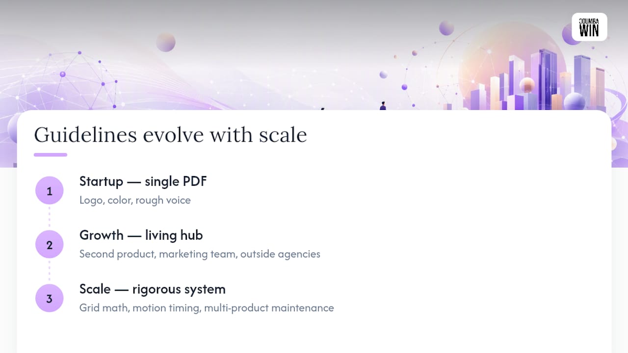
Early on, a guide exists mostly to keep a scrappy team from accidentally shipping five different shades of blue. It’s a single PDF, maybe a Notion page, covering logo, color, and a rough voice description. That’s appropriate. Nobody needs a token-based design system when the whole company fits in one Slack channel.
Growth changes the math fast. Once a company adds a second product line, hires a dedicated marketing team, or starts working with outside agencies, the old one-pager stops being enough. This is usually when companies move from a static PDF to a living brand hub, because updates need to reach dozens of people simultaneously instead of getting emailed around as an attachment nobody reads twice.
At real scale, brand guidelines start looking less like design documents and more like software. IBM’s design language, for instance, documents grid math and motion timing with the same rigor as an engineering spec, because at that size ambiguity isn’t a minor inconsistency. It’s a maintenance problem across hundreds of products.
The pattern holds across nearly every company that’s public about its brand evolution: guidelines expand from “here’s our logo” to “here’s our design system” roughly in step with headcount and product complexity, not on any fixed schedule. The lesson for a startup building its first guide isn’t to over-build now. It’s to structure the guide so it can absorb new sections later without a total rewrite.
Customizing Guidelines for Different Platforms and Regions
A logo that looks sharp on a billboard can break entirely at 16 pixels in a browser tab. That’s why most mature brand guides don’t give one universal rule, they give a rule per context.
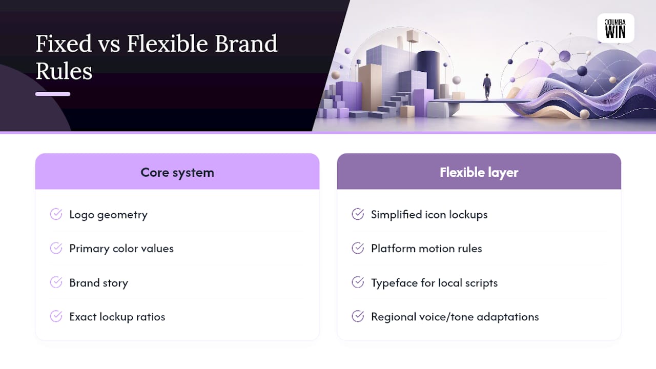
Platform customization usually starts with the logo itself. Many brands maintain a full lockup for wide formats and a simplified icon-only mark for app icons, favicons, and social avatars where detail disappears at small sizes. Motion guidelines split the same way: a brand might allow full animated transitions on a website but restrict social content to static or simplified motion because autoplay environments behave unpredictably.
Regional customization gets more complicated, and it’s where guidelines earn their governance sections. Color meaning shifts across cultures. Typography needs to account for language sets a Latin-alphabet typeface simply doesn’t support, think Cyrillic, Arabic, or CJK character sets, which often require an entirely separate approved typeface paired to the primary one. Voice and tone guidelines frequently get a regional adaptation layer too, since a joke that lands in one market can fall flat or misfire in another.
The companies that manage this well tend to document a core system that never changes (logo geometry, primary color values, brand story) alongside a flexible layer that regional or platform teams are explicitly permitted to adapt. Swiggy’s brandbook handles a version of this problem for co-branded partnerships, spelling out exact lockup ratios so regional partner deals don’t each require a one-off design decision. That split between fixed and flexible is the single most useful thing to copy if your brand operates across more than one market or platform.
Everyday Applications: Getting the Do’s and Don’ts Right
Most brand violations don’t happen in big campaigns. They happen in the small, everyday stuff: a sales deck built at midnight, a social post resized in a hurry, an email header nobody double-checked.
That’s exactly why the do’s and don’ts section carries more weight than its length suggests. A single side-by-side comparison, correct logo spacing next to a squeezed, stretched version, teaches a rule faster than three paragraphs ever could. Slack’s public guide leans on this heavily, showing specific misuse examples rather than describing them in the abstract.
A few everyday scenarios worth covering explicitly in any guide:
- Resizing for social. Specify a minimum logo size for common platforms so nobody scales the mark down until it’s illegible.
- Pairing with partner logos. State the exact spacing or ratio rule, don’t leave co-branding to whoever’s building the slide that week.
- Using brand colors on colored backgrounds. Show the accessible combinations and the ones that fail contrast standards.
- Applying voice in short-form copy. A tagline and a customer support reply shouldn’t sound like two different companies.
- Building internal decks. Sales and fundraising materials often skip the brand guide entirely unless a template already exists, so provide one.
The pattern across every well-regarded guide is the same: don’t just state the rule, show the violation right next to the correct version. It’s the fastest way to make a design decision instinctive instead of something someone has to look up every time.
Author Perspective: When to DIY and When to Call an Agency
The biggest shift I’ve watched is guides moving from static PDFs to interactive hubs with motion baked in, and token-based systems replacing hard-coded hex values. DIY works fine at five people with one product. Once you’re hiring outside help, launching a second product line, or fundraising, the cost of an inconsistent brand outpaces the cost of hiring help. Red flags in any guide: no downloadable assets, no do’s and don’ts, no named owner for updates.
— Coumba Evelyn
Ready for a Brand Guide That Actually Gets Used?
Reading twelve great examples is one thing. Building your own from scratch, on a deadline, while also running a startup, is another. That’s the gap Coumba Win Design closes: a direct design partner instead of a traditional agency retainer, built specifically for founders who need a usable brand system fast, not a 90-page deck that sits unopened.
A starter engagement typically produces a full logo suite, an accessible color and type system, a voice reference sheet, and ready-to-use templates, plus a simple governance handoff so the guide keeps working after launch. For teams that need it, Coumba Win also builds out reusable component libraries so your brand system extends cleanly into your product and website, not just your slide decks.
If your current brand documentation is a scattered folder of old logo files and a Slack thread nobody can find again, visit Coumba Win Design and get a straightforward quote on what a real brand guide would look like for your stage of growth.
Sources
- BIG GREEN GUIDE (Hulu brand guidelines PDF)
- 19 Brand Guidelines Examples To Inspire Your Own (Frontify)
- 8 Examples of Great Brand Guidelines - And How They Can Inspire Your Own (Marq)
FAQ
What Should Every Brand Guide Include at Minimum?
At minimum, cover logo usage and lockups, a color system with accessibility contrast values, typography, and a short voice and tone reference. Everything else can wait until the team scales.
Are Brand Guidelines the Same as a Style Guide?
They overlap heavily, but a style guide usually focuses on editorial and writing rules while brand guidelines cover the full visual and verbal identity, including logo, color, and asset usage.
Where Can I Find Real Brand Guidelines Examples to Study?
Public brand hubs from companies like Hulu, Netflix, Dropbox, and Slack are freely accessible, and archive sites like brandingstyleguides.com collect dozens of downloadable PDFs for closer inspection.
How Often Should a Company Update Its Brand Guidelines?
A quarterly review is reasonable for most growing companies, though any major event, a rebrand, new product line, or new region, should trigger an update regardless of schedule.
Should a Startup Hire an Agency or Build Brand Guidelines In-House?
A small team with one product can often DIY a basic guide, but once outside partners, fundraising materials, or multiple product lines enter the picture, a design partner like Coumba Win Design typically produces a more usable system faster than building it piecemeal internally.