Responsive Logo Design: A Practical Guide for Startups
Responsive Logo Design: A Practical Guide for Startups
A responsive logo is one brand mark drawn in several versions, so it stays readable whether it sits on a billboard, a phone header or a 16-pixel browser tab. You don’t shrink one file and hope. You plan a small family of logos, each built for a specific space, and you decide up front which one shows where. Here’s how to do that without losing your brand (or your sanity) 😅
We’ve watched plenty of founders fall in love with a gorgeous, detailed logo, then see it turn into a gray smudge in a tab. That’s fixable. This guide covers what a responsive logo system includes, how to design one, which favicon files to prepare, and how to test the whole thing before launch.
TL;DR
- A responsive logo is a system of versions (full lockup, stacked or compact alternate, icon, favicon) that keep one brand recognizable at every size.
- Detail is the enemy at small sizes: thin lines and tiny text disappear, so each smaller version drops something on purpose.
- A modern favicon set is small: a favicon.ico, an SVG, a 180×180 Apple touch icon, and 192×192 and 512×512 PNGs in a manifest.
- Test by shrinking, going black and white, flipping to dark backgrounds and checking on a real phone.
- Plan the system during branding, not after the website is built.
Table of Contents
- What responsive logo design actually means
- The logo versions your brand needs
- How to design a responsive logo, step by step
- Favicon formats and sizes: what to prepare
- Examples of what works (and why)
- How to test your responsive logo
- Common mistakes we see
- Our take: design the system once, then let it scale
- Want a logo system that holds up everywhere?
- FAQ
- Sources
What responsive logo design actually means
The idea is simple. Responsive logos can vary in layout, detail and color while the brand stays consistent, moving from a horizontal format to a stacked layout to a simple icon. Think of it like responsive web design, but for your identity. The page changes shape to fit the screen, and so does the mark.
The same Smashing Magazine piece makes the point that the best logos are simple and flexible, with formats and layouts that fit the space they’re given. Adobe’s design team frames it as growth insurance: a logo that adapts to different spaces and situations can grow with the brand instead of getting replaced the first time you hit a new channel.
Why does this matter more for startups? Because you show up everywhere at once. A pitch deck cover, a site header, a social avatar, an email signature, an app icon, a conference banner. Adobe’s guidance notes that a modern logo has to work across print, mobile, digital and social, and that horizontal web bars, vertical spaces and square or circular social placements are genuinely different environments. One rigid logo file can’t do all of that gracefully.
Responsive logo vs. favicon: what’s the difference?
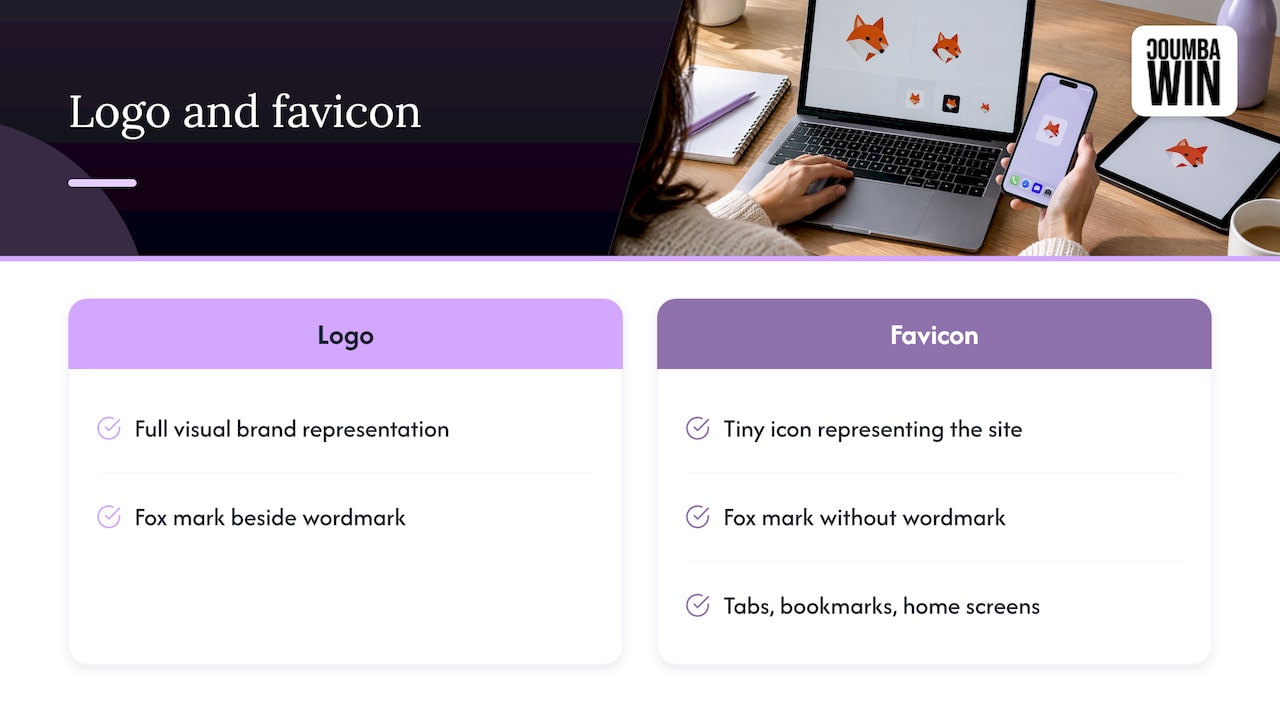
People mix these up constantly, so let’s untangle them. Your logo is the full visual representation of the brand. A favicon is the tiny icon that represents your site in tabs, bookmarks and home screens. Namecheap’s guide on logos versus icons uses Firefox as the example: the icon is just the fox mark, while the full logo adds the wordmark beside it.
So the favicon is the smallest member of your responsive logo family, not a separate project. If your logo has no strong standalone symbol, the favicon becomes the moment you discover that. Better to find out in a design review than after launch.
The logo versions your brand needs
You don’t need twelve variations. Most startups do well with four tiers, each with a clear job.
| Version | What it is | Where it lives |
|---|---|---|
| Primary lockup | Symbol plus wordmark, full detail | Website header on desktop, pitch deck cover, print, signage |
| Secondary or stacked | Same elements, reshaped (stacked or simplified) | Mobile headers, narrow sidebars, square placements |
| Submark or icon | A monogram or the symbol alone | Social avatars, app icons, merch, stickers |
| Favicon | The submark, simplified further for tiny sizes | Browser tabs, bookmarks, home-screen icons |
Design.com’s own take on a full responsive system is similar in spirit: a simplified icon, a wordmark-only version, a social profile icon and a favicon. The exact names don’t matter. What matters is that each version has a job and a rule for when it appears.
Decide what gets cut at each step
The core skill is subtraction. As the space shrinks, you remove things in a set order, and you write that order down:
- Tagline goes first. It’s unreadable small anyway.
- Fine texture, gradients and hairlines go next.
- The wordmark may drop out entirely, leaving the symbol.
- At favicon scale, the symbol itself gets simplified, thicker strokes, fewer shapes.
Well-known brands have walked this road. Smashing Magazine reports that Spotify simplified its earlier detailed treatment, Google moved to a simpler sans-serif identity with a distinctive G, and Twitter reduced its identity to a simplified bird. Recognition survived each simplification because the core idea was strong enough to stand alone.
How to design a responsive logo, step by step
Here’s the process we’d walk a founder through. No magic, just good habits.
1. Start with the idea, not the file
Before anyone opens a design tool, answer one question: if you could keep only one shape, color or gesture, what is the thing people should recognize? That’s your core. Everything else is decoration that can be removed at smaller sizes. If your brand strategy is still fuzzy, our guide to creating a consistent visual brand language is a good place to firm up what that core is.
2. Draw it as vector, from the start
Vector artwork scales cleanly from a favicon to a banner without going soft. Build the master in vector, then create each version deliberately rather than just resizing. A scaled-down primary logo is not a responsive logo. It’s a small, unreadable logo 🙃
3. Design the small versions first
This is the trick that saves projects. Start with the favicon-size icon, make it work, then build outward. When you design big first, you fall in love with detail that can’t survive. When you design small first, every added detail has to earn its place.
4. Build the in-between layouts
Make a horizontal lockup, a stacked lockup and a wordmark-only version. Check each one in the actual places it will live: a mobile nav bar, a square social frame, an email header. Adobe’s guidance mentions these shapes explicitly, and they’re where a lot of logos break.
5. Lock the color rules
Decide which versions appear in full color, one color or black and white, and on light versus dark backgrounds. Logos can adapt in color as well as layout, so write down the approved combinations. A founder with a nice palette and no color rules ends up with six slightly different blues on the internet.
6. Document the system
Create a one-page usage sheet: which version for which space, minimum sizes, clear space and what never to do. This is what keeps your designer, your developer and your intern from improvising. It’s also the thing investors and partners quietly notice when they see consistent materials. For a closer look at how brand values should shape the site itself, see how to align website design with brand values.
Favicon formats and sizes: what to prepare

Now for the part developers ask about: the files. Good news, the list is short.
A widely shared favicon cheat sheet on GitHub recommends a minimum set for modern projects: a favicon.ico at 32×32, a favicon.svg, an apple-touch-icon.png at 180×180, and a manifest with 192×192 and 512×512 icons for progressive web app support. That covers browsers, iPhone home screens and Android installs without a pile of redundant files.
| File | Size | Purpose |
|---|---|---|
| favicon.ico | 32×32 (in the site root) | Legacy browsers and a safe default |
| favicon.svg | Scalable | Modern browsers, crisp at any size |
| apple-touch-icon.png | 180×180 | iOS home screen |
| icon-192.png | 192×192 | Android and manifest |
| icon-512.png | 512×512 | Manifest, splash and install prompts |
SiteGround’s academy guide lists the traditional sizes people still work with: 16×16 for tabs and bookmarks, 32×32 for desktop shortcuts, 48×48 for Windows desktop icons, and 72×72 and up for larger screens. It names ICO, PNG and SVG as the common formats and notes that JPG is rarely used because it loses detail at small sizes.
A neat trick: SVG favicons that follow dark mode
The same cheat sheet notes that SVG favicons can carry embedded CSS with media queries, so the icon adapts to a user’s light or dark mode without JavaScript. That’s responsive logo thinking in its purest form. A dark mark on a dark browser tab disappears, so let the favicon switch colors.
Favicon design tips that save you a redo
- Use one bold shape. One shape, high contrast, thick strokes.
- Skip the text. If your wordmark is long, use an initial or the symbol instead.
- Give it breathing room. Don’t jam the artwork edge to edge, especially for app icons that platforms may crop into circles or rounded squares.
- Check the real tab. A favicon sits beside other tabs, usually on a gray strip. Preview it there.
Examples of what works (and why)
You don’t need famous brand names to see the pattern. Look for these traits in any logo system you admire:
- A symbol that stands alone. Firefox’s fox works without the word. If your symbol needs the name next to it to make sense, it isn’t ready to be a favicon.
- A letterform that carries the brand. Google’s G is a good example of a single character doing the work of a whole identity at tiny sizes.
- Flexibility built in from the start. Spotify’s creative director told Smashing Magazine the system was pressure-tested with tiny mobile ads and designed for screens, print and interactive experiences alike.
Notice what these have in common. None of them rely on thin lines, gradients or small type to be recognized. They keep the memorable idea and drop everything else as the space shrinks.
If your brand is also leaning on storytelling across channels, visual storytelling tips can help you think about how a flexible mark supports a consistent story as your audience grows.
How to test your responsive logo
Don’t trust your big monitor. Run these checks before you sign off, and repeat them every time the logo changes:
- Shrink it. Scale each version down to roughly 16 to 32 pixels. Can you still tell what it is?
- Strip the color. View it in black and white. If it only works because of color, it’s fragile.
- Flip the background. Try dark and light, then a busy photo.
- Hold a phone. Look at it on a real screen, not a browser window resized on your laptop.
- Print it small. Business-card size shows whether hairlines survive ink.
- Blow it up. Signage or a banner shows whether the vector holds up and the proportions still feel right.
- Put it next to your competitors. Is it distinguishable in a lineup?
These mirror the tests Design.com suggests for logo evaluation. For the device side, BrowserStack’s responsive testing guidance recommends choosing your key browser, device and OS combinations from real audience data and validating on real mobile devices before going live. Check your analytics, see what your visitors actually use, and test those first.
One more developer-side habit: after you add your favicon tags, load a page deeper than the homepage. Root-relative paths keep icons working on nested routes, and a broken icon on your pricing page is an avoidable embarrassment.
Common mistakes we see
- Shrinking instead of redesigning. Same artwork, smaller box. It never works.
- Treating the favicon as an afterthought. It’s often the most-seen version of your brand, since it sits in a tab all day.
- No usage rules. Without a one-pager, the system drifts within a month.
- Too many versions. Four well-defined tiers beat a dozen confusing ones.
- Ignoring motion and interactive contexts. Logos now animate in loaders and headers. If that’s on your roadmap, our piece on motion design websites and brand engagement is worth a look, and our notes on mobile UX best practices for startups cover how the header logo behaves on small screens.
Our take: design the system once, then let it scale
We’ll be honest: the first time we hand a founder a favicon-sized version of their beloved logo, there’s usually a small, dramatic gasp. That’s the moment the project gets good.
Our view is that a logo is a working tool, not a trophy. Startups ship fast, show up on a dozen surfaces in the first month, and can’t afford a mark that only looks right on a pitch deck cover. That’s why we build logo systems around real use: the website header, the mobile nav, the social avatar, the tab, the conference banner.
We don’t do generic templates or AI-generated marks, because a responsive system depends on a human deciding what the brand is, and what it can lose, at every size. We work closely with founders on exactly that, and we think it’s one of the highest-leverage design decisions an early-stage company makes.
Get the system right early and everything downstream, the site, the deck, the swag, gets easier and more consistent.
Coumba Evelyn
Want a logo system that holds up everywhere?
If you’re a founder building or refreshing your brand, we design custom branding, websites, UI and UX, pitch decks and print materials that share one consistent visual language, so your logo works from the tab to the booth banner. We also handle the website build, including Webflow development, so the favicon set and logo versions get implemented properly instead of lost in handoff.
See what we do on the Coumba Win site or browse our Webflow work. Pricing is project-specific, so tell us what you’re building and we’ll take it from there.
FAQ
What is a responsive logo?
It’s a set of logo versions, not a single file, designed to adapt to different spaces. The versions vary in layout, detail and sometimes color, but they share one recognizable core. A typical set runs from a full lockup down to an icon and a favicon.
What is the difference between a favicon and a logo?
A logo is your full brand mark, often a symbol plus a wordmark. A favicon is a tiny icon, usually derived from the symbol, shown in browser tabs, bookmarks and home screens. Think of the favicon as the smallest version of your logo family.
What favicon files does my website need?
A compact modern set is a favicon.ico, an SVG favicon, a 180×180 Apple touch icon, and 192×192 and 512×512 PNGs listed in a web manifest. Link them in the page head and confirm each file path and size is accurate. Test on pages below the homepage too.
What size should a favicon be?
Design it to read clearly at 16×16 pixels, since that’s the classic tab size. Then export larger versions, such as 32×32, 48×48, 180×180, 192×192 and 512×512, for desktop shortcuts, iPhone home screens and Android installs.
When should a startup create a responsive logo?
During the initial branding work, before the website and pitch deck are built. Designing the system early means every later asset uses the right version from day one, and you avoid a costly redo when you discover the logo breaks in a tab or an avatar.
Sources
- How To Prepare Your Logo For Responsive Design Systems, Smashing Magazine
- Here’s Why You Should Be Thinking About Responsive Logo Design, Adobe Blog
- Logo vs. Icon: What Is the Difference?, Namecheap
- Favicon cheat sheet, GitHub
- What Is a Favicon? Sizes, Formats and How to Add One, SiteGround Academy
- The Ultimate Responsive Design Testing Checklist, BrowserStack