Dark Mode Web Design: A Developer's Complete Guide
Dark Mode Web Design: A Developer’s Complete Guide
Dark mode web design is defined as a user interface style that uses predominantly dark backgrounds with light-colored text and elements to reduce eye strain and improve device battery life. If you’ve been wondering what is dark mode web design and why it’s suddenly everywhere, the answer is part user demand, part hardware reality. Over 80% of smartphone users use dark mode at least occasionally. That number alone tells you this is no longer a nice-to-have. It’s a design context you need to build for, and build for well.
What benefits does dark mode web design provide?
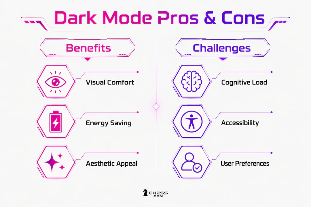
Dark mode delivers three concrete advantages: visual comfort, energy savings, and aesthetic appeal. Each one has real implications for how you design and what you prioritize.
Visual comfort is the most immediate benefit. Dark backgrounds reduce the amount of light your screen emits, which matters most in low-light environments like bedrooms, offices with dim lighting, or late-night coding sessions. Blue light exposure drops significantly, and users report less eye fatigue during extended sessions.
Battery savings are where dark mode gets genuinely impressive on a hardware level:
- OLED and AMOLED screens turn off individual pixels when displaying black. No power consumed. Zero.
- Battery savings reach 30–50% on compatible OLED screens compared to light mode at full brightness.
- LCD screens do not benefit the same way because their backlights stay on regardless of pixel color.
That 30–50% range is significant. For mobile-first products, dark mode is practically a performance feature.
There’s a nuance worth flagging, though. Cognitive performance is generally higher in light mode for complex tasks. A study of 173 participants showed statistically significant higher cognitive scores in light mode. Dark mode suits low-light, low cognitive-load use cases. So for reading-heavy or data-dense interfaces, you may want to give users a real choice rather than defaulting to dark.
Pro Tip: Design your mode toggle to respect system preferences by default, but always let users override it manually. Forcing dark mode on someone doing detailed proofreading is a UX problem, not a feature.
What are the key design principles for effective dark mode?
This is where most teams get it wrong. They invert their light palette, call it dark mode, and ship it. The result looks harsh, neon, and hard to read. Good dark mode design requires intentional decisions at every layer.
Background and surface colors
Avoid pure black (#000000) backgrounds. Pure black creates excessive contrast against white text, causing a halation effect where text appears to bleed or smear. Use dark grays in the range of #0a0a0a to #171717 instead. Both Material Design and Apple’s Human Interface Guidelines recommend this approach.

Surface elevation in dark mode works differently than in light mode. In light mode, you use shadows to show depth. In dark mode, elevation is expressed through lighter surfaces rather than shadows. Each elevation level increases luminance by roughly 5–8%. Your base surface sits darkest. Raised cards, modals, and overlays get progressively lighter. This keeps hierarchy readable without fighting the dark aesthetic.
Typography adjustments
Text on dark backgrounds behaves differently than text on white. Off-white text (#F3F4F6) provides roughly a 15:1 contrast ratio on dark backgrounds and reads more comfortably than pure white for extended sessions. Pure white on pure black is technically high contrast but visually fatiguing.
Typography needs physical adjustments too:
- Increase letter-spacing by 0.01–0.02em to counter optical spreading on dark backgrounds.
- Bump body font weight slightly for better definition.
- Reduce heading weight slightly since headings already have size working for them.
- Increase line-height to give text room to breathe.
These adjustments sound small. On a dark background, they make a measurable difference in reading comfort. For a deeper dive into type choices, typographic web design principles apply directly here.
Color and accessibility
Reduce saturation on accent colors by 10–20%. Saturated colors on dark backgrounds create a neon glow effect that looks amateur and strains the eyes. Desaturated accents feel intentional and polished.
WCAG AA contrast requirements apply equally to dark mode. The minimums are 4.5:1 for normal text and 3:1 for large text and UI components. The most common failure point is secondary text and placeholder text. These often pass on the base surface but fail on elevated surfaces like cards or modals. Test every text color against every surface it appears on, not just the base background.
Pro Tip: Use semantic color tokens like text-secondary and surface-raised rather than hardcoded hex values. When you need to adjust a color across your entire system, you change one token, not 200 component files.
How can developers implement dark mode at scale?
Technical implementation is where dark mode either becomes a maintainable system or a maintenance nightmare. The difference comes down to architecture decisions made early.
-
Treat dark mode as baseline infrastructure. Dark mode should be a primary design system context, not an afterthought toggled on at the end. Build your token system to support both themes from day one.
-
Define semantic color tokens. Create tokens that describe roles, not values.
text-primary,surface-base,border-subtleare role-based tokens. Each token holds a different value in light mode and dark mode. Semantic tokens enable updating all component colors across themes via a single token change. -
Choose your design file strategy. The recommended approach is a mode-based single file where components reference tokens and modes swap token values. The alternative, maintaining separate component files per theme, creates duplication and drift over time.
-
Export tokens to code. CSS custom properties (variables) are the most widely supported method. Tailwind CSS supports dark mode via a
dark:variant class. JSON token exports work well for design-to-code pipelines using tools like Style Dictionary. -
Implement system preference detection. Use the
prefers-color-schemeCSS media query to detect the user’s OS-level preference. Apply dark mode automatically when the system reports dark preference. -
Add a manual toggle. Allow toggling via system preference and manual override, and persist the user’s choice in
localStorage. This respects user autonomy and survives page reloads. -
Build fallbacks for unsupported browsers. Older browsers ignore
prefers-color-scheme. Define a sensible default (usually light mode) and layer dark mode on top using progressive enhancement. -
Test on real hardware. Colors look different on OLED versus LCD screens. What looks great in your browser on a MacBook may look washed out on an Android OLED phone. Physical device testing is non-negotiable.
Pro Tip: Coordinate your token naming conventions between design and engineering before you build anything. A token called surface-2 in Figma that maps to --color-surface-raised in CSS creates confusion. Agree on names first.
What UX and accessibility challenges does dark mode create?
Dark mode is not universally better. It’s contextually better. Understanding when it helps and when it hurts is what separates thoughtful design from trend-chasing.
The ambient lighting context matters most. Dark mode reduces eye strain in dim environments. In bright sunlight or well-lit offices, light mode typically offers better readability because the screen competes less with ambient light. Proofreading accuracy varies between dark and light mode, with error detection rates measured between 78.4% and 86.4% depending on lighting conditions and mode. That gap is real and worth designing around.
Key UX considerations for dark mode interfaces:
- Focus indicators need higher visibility on dark backgrounds. The default browser focus ring often disappears. Use a high-contrast color like a bright teal or yellow with sufficient contrast ratio.
- Interactive element states (hover, active, disabled) require separate dark-mode-specific values. A 10% lightness shift that works on white backgrounds is invisible on dark ones.
- Images and media can create harsh bright spots in dark interfaces. Use dark-mode-specific image variants where possible, or apply a subtle overlay to reduce brightness.
- Form inputs are a common failure point. Placeholder text contrast against elevated input backgrounds frequently fails WCAG AA. Test every input state.
Accessibility under dark mode requires the same rigor as light mode. The role of accessibility in UX does not change based on color scheme. Run your full accessibility audit against both themes, not just one.
Dark color schemes also carry psychological weight. They signal sophistication, focus, and technical depth. Many developer tools, creative apps, and premium products default to dark mode for exactly this reason. That emotional signal is part of your brand communication, so use it deliberately.
Pro Tip: Include users with low vision and color vision deficiencies in your dark mode testing. What passes automated contrast checks can still fail real users. Tools like Stark or manual testing with accessibility settings turned on reveal issues automated tools miss.
Key Takeaways
Dark mode web design requires intentional architecture, not just a color palette swap. Build semantic token systems and test across both themes from the start.
| Point | Details |
|---|---|
| Dark mode adoption is high | Over 80% of smartphone users use dark mode, making it a required design context. |
| OLED battery savings are real | Dark mode saves 30–50% battery on OLED screens by turning off black pixels entirely. |
| Avoid pure black backgrounds | Use dark grays (#0a0a0a to #171717) to prevent halation and reduce eye strain. |
| Semantic tokens enable scale | Role-based color tokens let you update entire themes by changing a single value. |
| Accessibility applies equally | WCAG AA contrast minimums (4.5:1 for text) must be met on every surface in both modes. |
Why I think dark mode deserves more respect than it gets
Okay, real talk: I’ve seen so many teams treat dark mode like a checkbox. “Does it have dark mode?” “Yeah, we just invert the colors.” And I cringe every single time.
Here’s what I’ve learned working on design systems: dark mode is a completely separate design context. It has its own color logic, its own elevation system, its own typography behavior. You cannot shortcut it. The teams that invest in proper semantic token architecture upfront spend maybe 20% more time at the start and save themselves months of painful retrofitting later.
The other thing I’d push back on is the idea that dark mode is purely aesthetic. It’s not. It’s an accessibility and performance feature. For users with light sensitivity or migraines, dark mode is not a preference. It’s a necessity. Designing it well is designing inclusively.
My honest advice: start every new project with both modes in your token system, even if you only ship light mode first. The scaffolding costs almost nothing. Rebuilding your entire component library six months later when the client asks for dark mode costs a lot.
— Coumba Evelyn
How Coumba Win Design approaches dark mode for modern web products

Building dark mode properly takes more than good intentions. It takes a design system that’s built to handle both themes without doubling your maintenance burden. At Coumba Win Design, we build with semantic token architecture and surface elevation systems from the ground up, so dark mode is never a retrofit. Our component library approach gives startups a scalable foundation where theme switching is a configuration, not a rebuild. If your product needs dark mode that actually meets WCAG AA, looks intentional, and holds up across devices, let’s talk about what that looks like for your specific product.
FAQ
What is dark mode web design?
Dark mode web design is a UI style that uses dark backgrounds with light text and elements to reduce eye strain and improve battery life on OLED screens.
Does dark mode actually save battery life?
Yes, on OLED and AMOLED screens, dark mode saves 30–50% battery because black pixels are turned off entirely, consuming no power.
What background color should I use for dark mode?
Use dark grays in the range of #0a0a0a to #171717 rather than pure black (#000000), which causes halation and optical strain.
Does dark mode need to meet WCAG accessibility standards?
Yes. WCAG AA contrast requirements (4.5:1 for normal text, 3:1 for large text) apply equally to dark mode across every surface, including elevated components.
Is dark mode better than light mode for all users?
No. Dark mode suits low-light environments and low cognitive-load tasks. Light mode supports better cognitive performance for complex tasks, so offering both with a user-controlled toggle is the best approach.