Email Design Examples for Startups: Pick a Campaign, Reuse Templates
Email Design Examples for Startups: Pick a Campaign, Reuse Templates
The fastest way to use email design examples is to pick one that matches your campaign type (welcome, newsletter, cart recovery, whatever), then turn it into a reusable template system instead of a one-off copy job. Grab an example, map what makes it work, swap in your brand tokens, run a quick accessibility and cross-client pass, and ship. That’s the whole game.
TL;DR:
- For weekly sends, maintain an HTML template; occasional campaigns can use an ESP builder, while Figma or Sketch kits support review but cannot send emails.
- Use a single column capped at 600px, body text of at least 16px, and mobile stacking for comparison cards or product recommendations.
- Keep the message and CTA in live text, add meaningful alt text, and meet 4.5:1 contrast for normal text and 3:1 for large text.
- Choose three or four leading email clients based on actual opens, then test on iPhone and Android devices with dark mode and images disabled.
Table of Contents
- A Gallery of Email Design Examples, Organized by Job
- Templates and Design Systems Worth Reusing
- Layout Rules That Hold Up Across Email Clients
- Accessibility and Cross-Client Testing, the Unglamorous Part
- How to Turn an Example Into Your Own Reusable Template
- Making Personalization and Dynamic Content Feel Native to the Design
- Designing Email for the Phone in Everyone’s Pocket
- Animation and Interactive Elements Worth Trying (and When to Skip Them)
- Why Reusable Systems Beat One-Off Designs Every Time
- How Our Team Builds Email Systems for Startups
- FAQ
- Sources
A Gallery of Email Design Examples, Organized by Job
Here’s the thing about scrolling through a “best email designs” roundup: it’s fun, but it doesn’t tell you what to do with any of it. So let’s fix that. Below, we’re grouping examples by the job they’re actually doing, because a welcome email and a cart-recovery email are solving completely different problems, even if they both have a button and a logo.
Welcome emails. The best ones skip the “Welcome to our community!” fluff and get straight to one clear action: set up your profile, browse three starter picks, or grab a discount code. What to copy: a single hero image, one headline, one CTA button, no competing links. Adaptation tip: write your headline as if you’re finishing the sentence “Now that you’re here, go…”
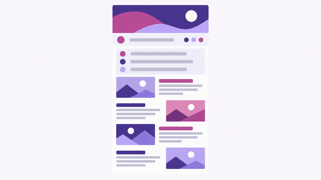
Newsletter and editorial emails. The strongest editorial newsletters use a branded header, a date or issue marker (like “Issue 47”), a short numbered table of contents, and alternating image-and-text blocks that keep a long email feeling scannable instead of exhausting. This modular approach, with a header, issue marker, numbered sections, and restrained card modules, is what lets publications ship a consistent, repeatable issue every single week without starting from scratch, as seen in how Mailtrap’s roundup of design examples breaks down newsletter formats like Litmus and Good American. What to copy: the numbered contents block. Adaptation tip: cap it at five items, because nobody wants a table of contents longer than the newsletter itself.
Promotional and product-drop emails. These live or die on hierarchy. The good ones use one dominant image, a price or offer stated in large live text (not buried in an image), and a CTA button that’s visually impossible to miss. What to copy: the “one offer, one button” discipline. Adaptation tip: if you’re tempted to add a second CTA “just in case,” don’t. Pick one job per email.
Abandoned-cart emails. The best examples show the actual product, the actual price, and a short nudge, urgency without being obnoxious about it. What to copy: a product card module with image, name, price, and “Finish checking out” button. Adaptation tip: build this as a reusable card component once, since you’ll reuse it in post-purchase and recommendation emails too.
Post-purchase and receipt emails. Often the most-opened email in your whole sequence (people really want to know their order went through), so it’s worth making it look intentional instead of like a leftover system notification. What to copy: order summary table, shipping timeline, and a soft upsell below the fold. Adaptation tip: keep the transactional content live text, not an image, so it survives every inbox.
Event and invite emails. The format that works: a date and time treated like a headline (big, bold, unmissable), a one-line value prop, and an RSVP button that doesn’t require three clicks to find. What to copy: the “date as hero” layout. Adaptation tip: repeat the date and time again near the CTA, because people skim.
Product-education emails. These teach a feature instead of pushing a sale, often using a short GIF or annotated screenshot plus a “Try it” link. What to copy: the annotated-screenshot approach. Adaptation tip: swap your own screenshot in, never a stock image of a “happy person using a laptop.”
A few housekeeping notes while you’re collecting inspiration:
- Save examples into folders by campaign type, not by brand, so you’re building a swipe file organized around jobs rather than logos.
- Note the principle you’re borrowing (grid, hierarchy, card pattern), never the brand’s actual colors, copy, or imagery.
- Screenshot the mobile view too. A lot of designs that look great on desktop fall apart at 375px wide.
Common formats worth watching for include welcome, promotional, abandoned-cart, drip, newsletter, event, seasonal, product-education, and post-purchase emails, which Canva’s email design guide uses as a useful shorthand for organizing a swipe file. Borrow the structure, never the branding.
Templates and Design Systems Worth Reusing
A single great example is a snapshot. A template system is what lets you ship fifty more emails that all look like they belong to the same brand. The difference matters more than people think.
A workable email design system needs four pieces: a grid (most newsletter systems run on a six-column grid), reusable components (header, CTA button, product card, footer), tokens (your brand’s colors, fonts, and spacing values defined once and reused everywhere), and variants (the same component in different states, like a CTA button for “primary” versus “secondary” actions).
You’ve got three real options for where this system lives:
- Figma or Sketch UI kits are great for design review and stakeholder sign-off, but they don’t send email on their own; you still need to export working HTML.
- HTML starter templates are production-ready from day one, but they’re harder for non-developers to tweak without breaking something.
- ESP-native templates (built directly inside Klaviyo, Mailchimp, or similar) are the easiest for marketers to edit solo, but they tend to lock your design into whatever that one platform supports.
Free resources make this easier to test before committing. The HTMLEmail design system and UI kit offers reusable components, a six-column grid, and ten starter templates for Figma and Sketch, a solid starting point for mapping out your own component library before you touch code.
Pro Tip: Build your component library in Figma first so stakeholders can approve the look, then export and test the real HTML, because a design that looks perfect in Figma can still break once an ESP mangles the markup.
Choosing between these isn’t really an either-or. Most teams that ship consistently use a design file for planning and sign-off, then a tested HTML template for production. If you only have bandwidth for one, pick the format that matches your sending frequency: occasional sends can get away with ESP-native builders, but anything weekly deserves a maintained HTML template.
Layout Rules That Hold Up Across Email Clients
Email clients are a mess of inconsistent CSS support, which is exactly why a handful of boring, well-tested layout rules outperform anything clever. Here’s what actually holds up once your design leaves Figma and lands in a real inbox:
- Default to a single column capped around 600px wide. This is the safest baseline for every client and screen size, and it’s why most editorial and promotional systems still build around it.
- Reserve two-column or card-grid layouts for sections that benefit from comparison, like a row of three product recommendations, and always stack them into one column at mobile widths.
- Keep body text at 16px minimum. Anything smaller forces readers to zoom, which is a fast way to get your email deleted on a phone screen.
- Use generous, consistent spacing. An 8px spacing unit (used in several design systems) makes it easy to keep padding and margins proportional across every module you build.
- Put your primary CTA above the fold, and repeat it near the bottom if the email runs long, since not everyone scrolls back up to click.
- Use inline styles for anything load-bearing. Gmail supports inline CSS and a useful subset of selectors and media queries, but it doesn’t reliably support everything you’d use on a website, so test your responsive rules in the actual exported HTML rather than trusting the design file.
- Design a resilient baseline first, then layer on decorative enhancements for the clients that support them. A single-column layout with live text and a clear CTA should work everywhere; rounded corners, custom fonts, and subtle animations are the bonus round for clients that render them.
That last rule is the one most people skip, and it’s the one that saves you the most grief. Build the plain version first. Make sure it reads fine with images turned off and dark mode flipped on. Then go add the polish. If you design the polish first, you’ll spend three times as long reverse-engineering a fallback that works.
Accessibility and Cross-Client Testing, the Unglamorous Part
Nobody adapts an email design example because they’re excited about alt text. But skip this step and your gorgeous template turns into an unreadable mess the second someone opens it on an older Outlook client or with a screen reader running.
The non-negotiables:
- Use real heading hierarchy in your HTML, not just large bold text that looks like a heading.
- Write meaningful alt text for every image, not “image1.jpg” or, worse, nothing at all.
- Keep your core message and CTA in live text, never baked into an image, so it survives image-blocking and still gets read aloud.
- Check contrast before you ship, not after a reader complains.
WCAG guidance calls for a 4.5:1 contrast ratio for normal text and 3:1 for large text, alongside a recommended minimum of 16px body copy and 44px touch targets for buttons and links. That’s a low bar to clear, and it’s the difference between an email that’s readable and one that technically “has text” but nobody can comfortably read.
For cross-client testing, build your matrix from your own analytics rather than guessing: identify your top three or four email clients by actual opens, then test on two real devices (an iPhone and an Android phone cover most of it), check dark mode rendering, check how the email degrades with images off, and preview how it summarizes in an AI inbox feature. That last one matters more every year: keep your core offer in live text near the top, because if an AI summary pulls from your email, you want it pulling your actual message, not a caption buried in a banner image.
How to Turn an Example Into Your Own Reusable Template
Here’s the process, start to finish, once you’ve picked an example you like:
- Audit the example and name its job. Is it a conversion email, an informational one, a relationship-builder? The job determines which parts you keep and which you cut.
- Swap in your brand tokens. Replace fonts, colors, and spacing with your own values, and convert every piece of baked-in text or image into live, editable content, including alt text for anything visual.
- Build modular variants. Turn the header, CTA, and product card into components you can reuse across other campaign types, then export working HTML that your ESP can actually render (check our guide to building reusable brand email templates if you’re assembling a small starter set).
- Run the QA checklist and send to a small test segment before it goes to your full list: contrast, alt text, dark mode, images off, and a real-device check on both platforms.
Pro Tip: Build your transactional templates (receipts, shipping confirmations) using the same tokens and components as your marketing templates, so a customer’s inbox feels like one consistent brand instead of two different companies, our transactional email template guidance walks through exactly that handoff.
This process takes a couple of hours the first time and about twenty minutes every time after, once the components exist.
Making Personalization and Dynamic Content Feel Native to the Design
A personalized subject line is nice. A personalized layout is where things get interesting. The strongest examples build dynamic content zones right into the template: a product recommendation card that pulls from browsing history, a greeting block that swaps based on customer tier, or a countdown timer that updates per recipient.
The trick is designing these zones so they look intentional even when the data doesn’t load. A recommendation block needs a sensible fallback (a bestseller, not a blank space) and consistent sizing whether it’s showing one item or four. Build the card component once, with clear rules for what happens in every data scenario, rather than designing a perfect version and hoping the merge fields always populate.
Keep personalization proportional to what you actually know. A first-name greeting and a relevant product block go a long way; an email that tries to reference five different data points at once usually ends up reading like a mail-merge error waiting to happen. Start with one dynamic zone, get it reliable, then add a second.
Designing Email for the Phone in Everyone’s Pocket
Most of your audience is opening email on a phone, which means “mobile-friendly” isn’t an enhancement, it’s the actual design brief. A few things make the difference between an email that works on a 6-inch screen and one that gets deleted:
Stack your layout into a single column at mobile widths, full stop, even if you used a two or three-column grid on desktop. Make buttons big enough to tap without zooming (44px touch targets are the standard to build around). Keep your subject line and preview text short, since both get cut off hard on mobile. And test your font sizes at actual mobile scale rather than trusting how they look on a 27-inch monitor, because 14px body text that looks fine on desktop can feel genuinely cramped on a phone.
The single-column, 600px-capped baseline covered earlier isn’t just a cross-client safety net, it’s also your mobile layout by default, which is exactly why it’s worth building first.
Animation and Interactive Elements Worth Trying (and When to Skip Them)
GIFs, hover states, and live countdown timers show up in plenty of “best email design” roundups, and they can add genuine polish when a client supports them. But it’s worth knowing where the actual leverage is before you invest design hours into something fancy.
Marketers are experimenting more with interactivity, but the ordinary CTA button remains the most effective interactive element according to Validity’s 2025 State of Email report, which tracks broader email marketing trends. That’s worth sitting with for a second: a well-placed, well-designed button is still outperforming the clever stuff for most sends.
That doesn’t mean skip animation entirely. A subtle GIF in a product-drop email or a hover-reveal in a promotional header can add personality when it’s layered on top of a solid baseline, never as a replacement for one. Treat it the way we treat decorative enhancements generally: ship the plain, working version first, then add motion for the clients that render it, and make sure the static fallback still tells the full story on its own.
Why Reusable Systems Beat One-Off Designs Every Time
Here’s an opinion we’ll stand behind: most “inspiring” email designs you see in a roundup are actually bad templates to copy directly, because they were built as one perfect send, not as a system meant to survive fifty more campaigns. The gap between an inspiring screenshot and a production-ready template is almost always in the boring parts: is the headline live text or baked into an image, does the alt text exist, does the layout survive without the hero photo loading.
What we notice most often when turning an inspiring example into something a startup can actually send: baked-in text that needs to become live HTML, missing or lazy alt text, and designs that were never exported and tested before someone fell in love with the Figma mockup. A reusable system fixes all three at once, and it means the fifth campaign takes twenty minutes instead of two hours. Our case studies and templates show what that production discipline looks like once it’s actually shipped.
— Coumba Evelyn
How Our Team Builds Email Systems for Startups
If you’ve read this far and thought “this all makes sense, but I don’t have time to build a component library on top of everything else,” that’s exactly the gap we work in. We build custom email design systems for startups: Figma component libraries, tested HTML templates, and implementation support to get them live in your ESP without the usual back-and-forth.
A typical engagement gives you a working template set (welcome, newsletter, promotional, transactional) built from your actual brand tokens, not a generic kit, tested across the clients your audience actually uses, with accessibility and dark-mode checks built in from the start. We also handle the email marketing strategy around it, from campaign structure to ongoing design support, so the system keeps working after launch instead of drifting into inconsistency by email twelve.
Our services cover the full stack from branding through Webflow development, and our component libraries and style guide work are built for exactly this kind of reuse. Reach out and we’ll scope what a template system looks like for your next send.
FAQ
What’s the fastest way to use email design examples?
Pick an example that matches your campaign type (welcome, newsletter, cart recovery), identify the one or two layout principles that make it work, and rebuild those principles with your own brand tokens rather than copying the design wholesale. Turning it into a reusable template, instead of a one-off, is what actually saves time on every future send.
Should I use a design file or an HTML template for my emails?
Use a Figma or Sketch UI kit for planning and stakeholder approval, then export and test real HTML for production, since a design that looks right in Figma can still break once it’s rendered in an actual inbox. Teams sending weekly benefit most from a maintained HTML template; occasional senders can often get by with an ESP-native builder.
What layout works best across the most email clients?
A single-column layout capped around 600px wide, with 16px minimum body text and a clear CTA above the fold, is the most reliable baseline across clients according to HTML Email Builders’ accessibility guidance. Two-column or card layouts can work for specific sections, like product comparisons, but should always collapse into one column on mobile.
How do I make sure my email design is accessible?
Keep your core message and CTA as live text rather than baked into an image, write meaningful alt text for every visual, and check contrast against the WCAG standard of 4.5:1 for normal text and 3:1 for large text. These checks take a few minutes per email and prevent your template from failing for readers using screen readers or browsing with images off.
Can a design agency build a custom email template system for my startup?
Yes. We build Figma component libraries and tested HTML templates tailored to a startup’s own brand tokens, then support implementation into your ESP so the system works from the first send onward. That’s different from a generic template kit because every component is built around your actual brand and campaign needs rather than a one-size-fits-all layout.
Sources
A few places worth bookmarking if you want to go deeper on any of this: