Asymmetrical Web Layout: What Designers Need to Know

Asymmetrical Web Layout: What Designers Need to Know
An asymmetrical web layout arranges visual elements of unequal weight to create dynamic balance without mirroring. No identical halves. No predictable center axis. Just intentional, deliberate tension that makes a page feel alive. If you’ve been staring at cookie-cutter grid layouts wondering why your site feels like every other site out there, asymmetry might be exactly the shake-up you need.
Table of Contents
- What is an asymmetrical web layout, exactly?
- Why asymmetrical layouts are genuinely worth the effort
- How does asymmetry actually differ from symmetrical design?
- How to actually create asymmetrical layouts that work
- Expert cautions: where asymmetrical design goes wrong
- What asymmetrical layouts look like in the real world
- Responsive design and asymmetrical layouts: making it work on every screen
- Key Takeaways
- FAQ
What is an asymmetrical web layout, exactly?
Okay, let’s get into it. An asymmetrical web layout is a compositional approach where unlike visual elements are arranged without mirroring across an axis, yet still achieve a sense of visual equilibrium. Think of it less like a perfectly folded napkin and more like a well-balanced seesaw with a kid on one end and a backpack on the other. Different weights, same balance.
Here’s what makes an asymmetrical layout tick:
- Unequal visual weight distribution. Elements on opposite sides of the layout carry different visual mass, balanced through contrast, scale, and positioning rather than identical repetition.
- Intentional imbalance. The “off” feeling is the point. Designers use size, color, texture, and placement to create tension that draws the eye through the page.
- No mirror axis. Unlike symmetrical layouts where you could fold the design in half and match both sides, asymmetrical layouts resist that fold entirely.
- Dynamic equilibrium. Balance is still achieved, just through visual weight distribution rather than identical placement on each side.
- Variety of tools. Color contrast, whitespace, typography scale, layering, and overlapping elements all contribute to making asymmetry feel composed rather than chaotic.
The key word here is intentional. Asymmetry is not randomness. It’s not throwing stuff on a canvas and hoping for the best.
Why asymmetrical layouts are genuinely worth the effort
Here’s the honest pitch for asymmetry: it gives you better control over where your users look. Asymmetry directs eye movement along a designed path, whereas symmetrical layouts tend to anchor the eye at the center and leave it there. That’s a big deal when you’re trying to guide someone toward a CTA, a product, or a key message.
The benefits stack up fast:
- Superior focus control. You decide the visual journey. Users follow the path you set, spending more time engaging with the layout’s non-linear arrangement.
- Modern, energetic brand perception. Asymmetrical layouts signal modernity and creativity, preferred by brands that want to convey innovation rather than tradition.
- Content flexibility. Real-world content is messy. Headlines vary in length, images come in different sizes, and rigid symmetric layouts break when variable content enters the picture. Asymmetry adapts.
- Visual surprise. There’s an element of unexpected delight that symmetry rarely delivers. Users remember pages that feel considered and distinctive.
- Engagement depth. Static or unresponsive elements get ignored. Asymmetrical layouts, especially paired with micro-interactions, keep users scanning and interacting longer.
Pro Tip: Balance visual tension deliberately. Too much asymmetry without a clear anchor point tips from “dynamic” into “chaotic.” Pick one dominant focal element per section and let everything else support it.
How does asymmetry actually differ from symmetrical design?
The short version: symmetrical layouts feel like a formal handshake, asymmetrical ones feel like a conversation. Both achieve balance. They just get there differently, and they send very different signals to the people looking at them.
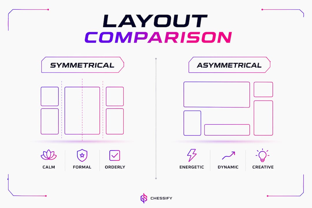
Symmetrical designs feel formal, stable, and predictable, while asymmetrical designs evoke modernity, dynamism, and creativity through visual tension and movement. Choosing between them is really a question of what your brand needs to communicate.
| Aspect | Symmetrical layout | Asymmetrical layout |
|---|---|---|
| Visual feel | Calm, formal, orderly | Energetic, modern, dynamic |
| Eye movement | Anchors to center | Travels along a designed path |
| Content flexibility | Low, requires uniform elements | High, adapts to variable content |
| Brand fit | Traditional, financial, corporate | Creative, startup, entertainment |
| User experience | Predictable, easy to parse | More engaging, slightly more cognitive effort |
| Balance method | Mirror-image repetition | Visual weight distribution |
A financial services site probably wants symmetry. A creative portfolio or a startup landing page? Asymmetry is where the brand perception advantage lives. And honestly, many great sites use both: a symmetrical hero for authority, asymmetrical content sections for energy and interest.
How to actually create asymmetrical layouts that work
This is where designers either nail it or end up with a page that looks like a ransom note. The good news: there are real techniques that make asymmetry feel intentional rather than accidental.
- Use CSS Grid and Flexbox as your foundation. These tools make asymmetrical layouts practical by enabling overlapping elements, uneven column distributions, and content that breaks out of its container without fighting the browser. Most asymmetrical web layouts still use a grid underneath; the asymmetry comes from how content is placed within and across grid cells.
- Manage visual weight deliberately. Balance through scale, color contrast, whitespace, texture, and positioning creates dynamic equilibrium without inducing chaos. A large muted element can balance a small bold one. Empty space can counterweight a dense image block.
- Layer and overlap elements for depth. Subtle drop shadows, overlapping containers, and frosted-glass effects visually stack information, giving users a sense of depth that flat layouts can’t match.
- Establish clear focal points. Varying color, texture, and size within your layout creates areas that capture the viewer’s gaze first. One dominant focal point per section keeps the layout readable.
- Incorporate movement and micro-interactions. If a user hovers over an element and nothing happens, they assume the page is static or untrustworthy. Small color shifts, slight lifts, or state changes keep the eye engaged.
- Respect responsive design from the start. Asymmetrical layouts that look great on desktop can collapse into confusion on mobile if you haven’t planned the breakpoints. Design the mobile experience as a first-class layout, not an afterthought.
- Use whitespace as a design element. Negative space isn’t empty; it’s a counterweight. Pairing a heavy image block with generous whitespace creates movement and prevents the layout from feeling cluttered.
Avoiding common website development mistakes during the build phase, like inconsistent spacing or unplanned breakpoints, saves a lot of painful rework later.
Expert cautions: where asymmetrical design goes wrong
Let’s be real for a second. Asymmetry is genuinely harder to pull off than symmetry. The margin for error is smaller, and the failure mode is ugly. Achieving dynamic equilibrium is essential to prevent cognitive overload and user disorientation, and that equilibrium is easier to describe than to execute.
Here’s what the experts flag as the biggest pitfalls:
- Perceived chaos. Without a clear visual hierarchy, asymmetrical layouts can feel random and overwhelming. Proper balance through contrast and whitespace mitigates this directly.
- Dead zones. Areas of the layout that receive no visual attention because the eye path skips them entirely. This usually happens when focal points compete rather than cooperate.
- Jarring layout shifts. Visual stability during page load is critical. If fonts or images load late and push elements around, the eye-tracking flow breaks and credibility drops fast.
- Ignoring Gestalt principles. Organization, proximity, and white space are what make asymmetrical designs feel comfortable and readable rather than arbitrary. Skip these and the layout feels accidental.
- Forcing asymmetry where symmetry serves better. A gallery page or search results page often needs equal visual weighting. Applying asymmetry there just creates friction.
The smartest move is often combining both approaches: symmetrical layouts for authoritative sections, asymmetry for dynamic content flows. That rhythm of stability and energy keeps users engaged without overwhelming them.
What asymmetrical layouts look like in the real world
You’ve seen asymmetrical web design in action, probably without labeling it. Here are the patterns that show up most often in well-executed sites:
The offset hero. A large image or video on one side, text and a CTA on the other, with intentionally unequal column widths. The visual weight of the image balances the typographic weight of the headline. This is probably the most common asymmetrical pattern on the web right now.

Broken grid layouts. Sites like Sutéra and Beaucoup Studio ditch conventional column alignment entirely, using scattered, overlapping elements that feel considered rather than accidental. Nothing aligns the way you’d expect, yet the composition holds together. These are the sites you remember precisely because they refuse to look like everything else.
The sidebar asymmetry. A 350-pixel sidebar paired with a wider content column creates immediate asymmetry in the page outline. Photo placement off-center within that content area adds another layer. This pattern is everywhere, and most designers don’t even think of it as “asymmetrical design” because it’s so common.
Color blocking. Dividing the viewport into sections of contrasting color, with content placed asymmetrically within each block. Sharp hue contrasts, like a pale background against bold type, create visual tension that guides the eye without needing complex layout structures.
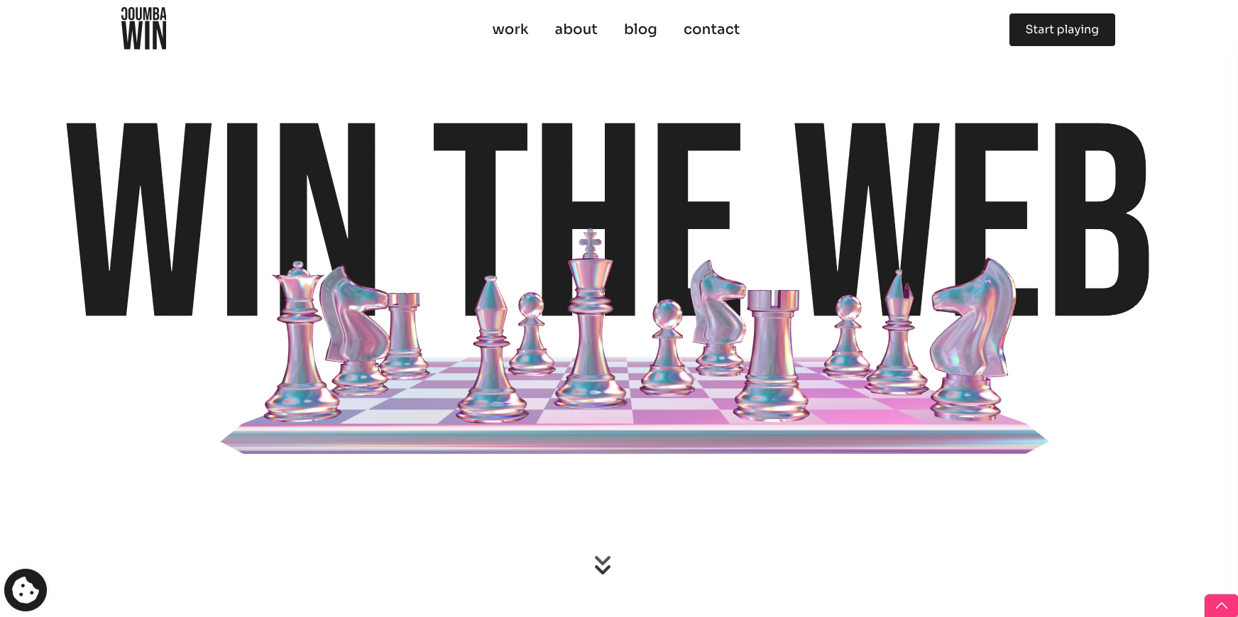
For startups especially, these patterns are worth studying. Coumba Win Design’s work on innovative website layouts shows how asymmetry translates into real brand differentiation for fast-scaling companies.
Responsive design and asymmetrical layouts: making it work on every screen
Asymmetry on a 1440px desktop is one thing. Asymmetry on a 375px phone screen is a completely different design problem. The good news is that CSS Grid and Flexbox, the same tools that make asymmetrical layouts practical in the first place, also give you the flexibility to rethink the layout at each breakpoint without abandoning the design intent.

A few practices that actually hold up:
Design breakpoints as distinct layouts, not just scaled versions. An offset two-column hero might collapse into a stacked single-column layout on mobile. That’s fine. The goal is preserving the visual hierarchy and focal point, not preserving the exact asymmetrical arrangement.
Prioritize site speed and layout stability across devices. Asymmetrical layouts often involve more complex CSS, larger images, and layered elements. All of that adds load time. Optimize images, use aspect-ratio and object-fit to prevent layout shifts, and test on real devices, not just browser dev tools.
Keep focal points consistent across breakpoints. If the desktop layout draws the eye to a product image first, the mobile layout should do the same, even if the surrounding elements rearrange. Losing the focal point in the responsive version is one of the most common asymmetrical design failures.
Test with real content, not placeholder text. Real-world data is asymmetric. Headlines vary in length, user names don’t all have four letters, and product descriptions overflow their containers. Build with variable content from day one and your responsive asymmetrical layout will hold up where others break.
Ready to build something that actually stands out? Coumba Win Design works with founders who treat design as a competitive advantage, not an afterthought. If your site looks like everyone else’s, let’s fix that.
Key Takeaways
Asymmetrical web layouts create dynamic balance through intentional visual weight distribution, making them the stronger choice for brands that need to convey energy, creativity, and modernity in 2026.
| Point | Details |
|---|---|
| Core definition | Asymmetrical layouts balance unlike elements through visual weight, not mirroring. |
| Engagement advantage | Asymmetry directs eye movement along a designed path, increasing user processing time. |
| Best use cases | Creative portfolios, startups, and entertainment platforms benefit most from asymmetry. |
| Key tools | CSS Grid and Flexbox enable practical asymmetrical layouts with overlapping and uneven columns. |
| Biggest risk | Without dynamic equilibrium, asymmetrical designs tip into perceived chaos and cognitive overload. |
FAQ
What is an asymmetrical layout?
An asymmetrical layout arranges visual elements of unequal weight without mirroring across an axis, achieving balance through contrast, scale, color, and whitespace rather than identical repetition on both sides.
What is the difference between symmetrical and asymmetrical web design?
Symmetrical layouts mirror elements equally along a central axis, creating a formal, predictable feel. Asymmetrical layouts distribute unlike elements to create dynamic equilibrium, producing a more energetic and modern visual experience.
What is a real-world example of asymmetrical web design?
An offset hero section with a large image on one side and text with a CTA on the other is one of the most common examples. Sidebar layouts with unequal column widths are another everyday instance of asymmetry in web design.
Which is better: symmetrical or asymmetrical layout?
Neither is universally better. Symmetry suits brands that need to communicate trust, stability, and professionalism. Asymmetry works better for creative, startup, and entertainment brands that want to convey energy and stand out visually.
Recommended