What Does Friction Mean in UX? A Designer's Guide

What Does Friction Mean in UX? A Designer’s Guide
Friction in UX is defined as any point in a digital product where a user slows down, hesitates, or abandons a task due to resistance between their intent and the action required. Think of it as the invisible speed bump between “I want to do this” and “I did it.” Every extra click, confusing label, or sluggish load time is a friction point. User friction is measured by steps, clicks, wait times, and decision points encountered along the way. The industry term you’ll see in UX research is “user friction,” and understanding it is the first step toward building products people actually finish using.
What does friction mean in UX, and where does it come from?
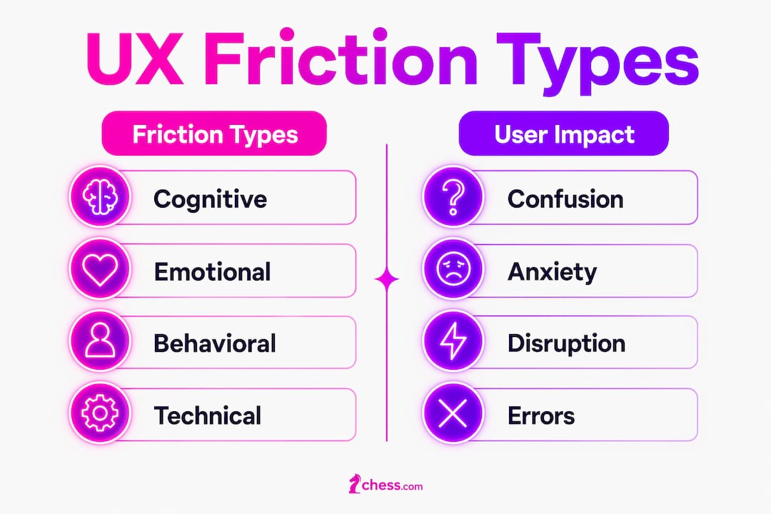
Friction in user experience falls into four distinct categories, and each one hits users differently. Knowing the type helps you fix the right problem instead of guessing.
Cognitive friction is the mental effort required to figure out what to do next. Unclear labels, ambiguous icons, missing onboarding context, and walls of text all pile on mental load. Friction accumulates until user effort exceeds perceived reward, and then they leave.

Emotional friction is the anxiety, uncertainty, or overwhelm a user feels during an interaction. A checkout flow that asks for too much personal information too early triggers emotional friction. Users start wondering, “Do I really trust this?” and that hesitation is enough to kill a conversion.
Behavioral friction happens when an interface breaks a user’s expected pattern. If your app puts the “save” button somewhere unexpected, users pause. That pause is friction. Habits are powerful, and any deviation from them costs attention.
Technical friction is the most obvious kind: slow load times, bugs, broken links, and error messages that don’t explain what went wrong. These are the easiest to measure and often the easiest to fix, yet they remain stubbornly common.
Here’s a quick breakdown of friction types and their typical causes:
| Friction type | Common causes | User response |
|---|---|---|
| Cognitive | Unclear labels, ambiguous icons, dense text | Confusion, hesitation |
| Emotional | Intrusive pop-ups, premature data requests | Anxiety, distrust |
| Behavioral | Unexpected UI patterns, broken conventions | Disorientation, errors |
| Technical | Slow load times, bugs, poor error handling | Frustration, abandonment |
Common interface culprits include long multi-page forms without progress indicators, intrusive pop-ups that appear before users have read anything, and poor error handling that contributes to what researchers call “invisible effort.” Users don’t always know why they feel stuck. They just feel stuck, and they leave.
How does friction impact user behavior and product outcomes?
Friction does not just slow users down. It breaks something deeper. Users drop off because friction interrupts the “invisible cognitive rhythm” that makes digital experiences feel safe and predictable. When that rhythm breaks, users disengage with responses like “maybe later,” which usually means “never.”
The behavioral impact is nonlinear, and that’s the part most product managers underestimate. Small increases in process time cause disproportionately large drops in completion rates. A few extra seconds of load time or one additional form field can tank your funnel in ways that look catastrophic in your analytics.
Here’s what friction does to your product metrics:
- Task completion rates fall as each additional step reduces the probability a user finishes.
- Drop-off spikes at the exact moment friction exceeds the user’s tolerance threshold.
- Retention suffers because users who struggle once rarely return for a second attempt.
- Conversion rates decline when emotional friction (anxiety, distrust) enters the flow before a user commits.
- User satisfaction scores drop even when users complete tasks, because the effort felt disproportionate to the reward.
“Every extra step between intention and action is an interruption point. The relationship between friction and follow-through is asymptotic: small increases in process time cause disproportionately large drops in completion rates.”
UX Magazine and SUE Behavioural Design research on friction and drop-off
Pro Tip: Map your funnel drop-offs against specific interface elements. If users consistently abandon at step three of a form, that step is your friction point. Analytics tells you where. Session recordings tell you why.
Understanding how UX research drives decisions is what separates teams that guess from teams that fix. Friction identification is a research problem before it’s a design problem.
Can friction be a deliberate and beneficial design element?
Here’s the twist most “frictionless UX” evangelists skip: not all friction is bad. Some friction is the whole point. Strategic friction such as confirmation dialogs before deletion aids safety, accuracy, and trust. It slows users down on purpose, at exactly the right moment.
The key distinction is between “good friction” and what behavioral designers call “sludge.” Good friction serves the user’s goal. Sludge serves the organization’s self-interest at the user’s expense. The interest test is simple: ask whether the friction helps the user accomplish something legitimate or whether it obstructs them from a benefit they’re entitled to.
| Feature | Good friction | Sludge |
|---|---|---|
| Purpose | Protects user from mistakes | Protects organizational metrics |
| User benefit | Reduces errors, builds trust | None; creates frustration |
| Timing | Appears at high-stakes moments | Appears to discourage action |
| Example | “Are you sure you want to delete?” | Hiding the unsubscribe button |
| User perception | Helpful, reassuring | Manipulative, annoying |
Good friction examples include confirmation dialogs, cooling-off periods before irreversible actions, and speed bumps that force a moment of reflection before a high-stakes decision. These reduce anxiety in high-stakes actions by signaling that the system takes the user’s action seriously.
Timing is everything. A loading screen is neutral in most contexts. The same loading screen after a user has already waited 10 seconds feels like punishment. Perceived annoyance depends on timing and user expectations, not on friction alone. This is why rigid “remove all friction” mandates fail. They ignore context.
Pro Tip: Before removing any friction point, ask: “Who benefits from this friction?” If the answer is the user, keep it. If the answer is your retention metric, kill it.
For a deeper look at how user dignity in design connects to friction decisions, the ethical dimension is worth your time.
What practical strategies help identify and manage friction effectively?
Friction management is an ongoing practice, not a one-time audit. The best teams build friction identification into their regular product cycle.
-
Analyze funnel drop-offs first. Your analytics already show you where users leave. Map those exit points to specific interface elements. A spike in drop-offs at a particular step is a friction signal, not a mystery.
-
Watch session recordings. Tools like session replay software show you where users hesitate, rage-click, or backtrack. Hesitation before a button is cognitive friction. Rage-clicking is technical or emotional friction. The behavior tells you the type.
-
Run usability tests with think-aloud protocols. Ask users to narrate their experience as they move through a flow. You’ll hear friction before you see it in the data. Phrases like “wait, where do I…” or “I’m not sure if…” are friction markers.
-
Deploy in-app surveys at friction moments. A single question placed right after a user struggles (“Was this step confusing?”) gives you qualitative data at the exact point of friction. Effective friction management improves onboarding and long-term retention when you act on this feedback.
-
Audit for sludge deliberately. Go through your flows and apply the interest test to every friction point. Anything that slows users down without benefiting them is a candidate for removal.
-
Balance speed and safety. Not every friction point you find should be eliminated. High-stakes actions (deleting data, making purchases, changing account settings) often benefit from a moment of deliberate pause. The goal is reducing unnecessary friction while preserving the friction that protects users.
The mobile UX best practices context adds another layer here. Mobile users face additional friction from small screens, fat-finger errors, and interrupted sessions. Friction that’s tolerable on desktop becomes a dealbreaker on mobile.
Understanding user experience in SEO also matters: friction that causes users to bounce quickly sends negative signals to search engines, connecting UX quality directly to organic visibility.
Pro Tip: Create a “friction log” for your product. Every time a user reports confusion or a support ticket references a specific flow, log it. Patterns in that log are your highest-priority friction points.
Key Takeaways
Friction in UX is not a single problem to solve. It is a spectrum to manage, with harmful friction to remove and strategic friction to preserve.
| Point | Details |
|---|---|
| Friction defined | Any resistance between user intent and task completion, measured in steps, clicks, and wait times. |
| Four friction types | Cognitive, emotional, behavioral, and technical friction each require different design responses. |
| Nonlinear impact | Small increases in process time cause disproportionately large drops in completion rates. |
| Good friction vs. sludge | Use the interest test: friction that serves the user is good; friction that serves the organization at the user’s expense is sludge. |
| Identify friction early | Funnel analysis, session recordings, and in-app surveys pinpoint friction before it damages retention. |
Friction is a design tool, not just a design problem
I’ll be honest with you: when I started working in UX, I was firmly in the “remove all friction” camp. It sounded so clean and logical. Less friction equals happier users equals better metrics. Done, right?
Wrong. The first time I watched a user accidentally delete months of work because we’d made the delete button “frictionless,” I rethought everything. That one moment of missing confirmation dialog cost that user real time and real trust. We added the dialog back. Users thanked us for it.
What I’ve learned is that the frictionless design mantra is a blunt instrument. It works great for eliminating pointless form fields and confusing labels. It fails badly when applied to high-stakes, irreversible, or security-sensitive actions. The nuance is in the timing and the stakes, not in the friction itself.
The designers I respect most treat friction like a seasoning. Too much ruins the dish. Too little and the dish has no depth. The skill is knowing when a moment of deliberate pause actually makes the experience feel more trustworthy, more considered, and more human. That’s not a bug. That’s craft.
My honest advice: stop asking “how do we remove friction?” Start asking “which friction is earning its place?” That question will take your product further.
— Coumba Evelyn
How Coumba Win Design approaches friction in product design
Friction decisions are some of the most consequential calls in product design, and getting them wrong costs you users, conversions, and trust.

At Coumba Win Design, we work with startup founders who know their product has friction problems but aren’t sure which ones to fix first. Our approach combines UX research, behavioral design principles, and hands-on interface work to identify where friction hurts and where it helps. From UI components built to reduce cognitive load to design systems that enforce consistency across every interaction, we build products where friction is a deliberate choice, not an accident. If your product is losing users at moments that should be easy, let’s talk about what’s actually happening.
FAQ
What does friction mean in UX design?
Friction in UX is any point where a user slows down, hesitates, or abandons a task due to resistance between their intent and the required action. It is measured by steps, clicks, wait times, and decision points in a flow.
Is all friction in UX bad?
No. Strategic friction such as confirmation dialogs and cooling-off periods protects users from mistakes and builds trust. The distinction is between good friction that serves the user and sludge that obstructs them for organizational benefit.
How does friction affect conversion rates?
Friction reduces conversion rates nonlinearly. Small increases in process time or additional steps cause disproportionately large drops in task completion, making even minor friction points high-priority fixes.
How do I find friction points in my product?
Analyze funnel drop-offs, watch session recordings for hesitation and rage-clicks, run think-aloud usability tests, and deploy in-app surveys at moments where users struggle. Patterns across these sources identify your highest-priority friction points.
What is the difference between friction and sludge?
Friction becomes sludge when it impedes a legitimate user action without benefiting the user. The interest test asks whether the friction serves the user’s goal or the organization’s self-interest. Sludge always fails that test.
Recommended


