User Engagement Design: A Guide for Designers

User Engagement Design: A Guide for Designers
User engagement design is the practice of creating digital experiences that encourage meaningful user interactions and improve retention and satisfaction. HCI research defines it through measurable indicators like time spent, user actions, and self-reports. Think of it as the difference between a product people tolerate and one they actually want to use again. Tools like Google Analytics 4 and frameworks from UXPin give designers concrete ways to measure and act on engagement signals. If you’re a designer, product manager, or founder, understanding what is user engagement design is the first step to building something people genuinely stick with.
What is user engagement design and how does it work?
User engagement design is the structured practice of shaping every touchpoint in a digital product so users interact with purpose, not just by accident. The industry term you’ll hear in HCI circles is “user engagement” (UE), and it covers everything from how fast someone reaches the core value of your app to whether they come back next week. It’s not about trapping people with notifications or dark patterns. It’s about making the experience so clear and rewarding that users want to keep going.
The core idea is that meaningful user interaction is both behavioral and emotional. Behavioral engagement shows up as clicks, scrolls, and form completions. Emotional engagement shows up in satisfaction scores and qualitative feedback. Both matter, and good engagement design accounts for both.

Designers who treat engagement as a single number miss the point. A user who spends 20 minutes on your app frustrated is “engaged” by raw metrics but is actually a churn risk. The goal is interactions that feel worth the user’s time.
How is user engagement measured and what are the key metrics?
Measurement is where engagement design gets real. Without clear metrics, you’re just guessing.
Google Analytics 4 introduced a cleaner standard. GA4 defines an engaged session as one that lasts more than 10 seconds, includes a key event, or includes 2 or more pageviews. That’s OR logic, meaning any one of those conditions qualifies. The engagement rate is then calculated as engaged sessions divided by total sessions, expressed as a percentage. That single shift from bounce rate to engagement rate changed how teams interpret traffic quality.
Here’s what a solid engagement measurement stack looks like in practice:
-
Session duration and depth: How long users stay and how many screens or pages they visit per session
-
Event tracking: Specific actions like button clicks, video plays, or form submissions tracked in GA4
-
Active time: Time spent actually interacting, not just a tab left open in the background
-
Self-reported satisfaction: Post-task surveys, NPS scores, or in-app feedback prompts
-
Return frequency: How often the same user comes back within a defined window
The challenge is that measurement ambiguity is real. Different research studies define engagement differently, and platforms don’t always agree on what counts. A session on mobile behaves differently than one on desktop. Passive video viewing looks like engagement but may not be. The fix is to define your engagement outcomes explicitly before you start measuring, not after.
Pro Tip: Pick two or three engagement metrics that map directly to your product’s core value. If your app helps people learn, track lesson completions, not just time on page.
What is the difference between user engagement and user retention?
These two get mixed up constantly, and confusing them leads to bad product decisions.
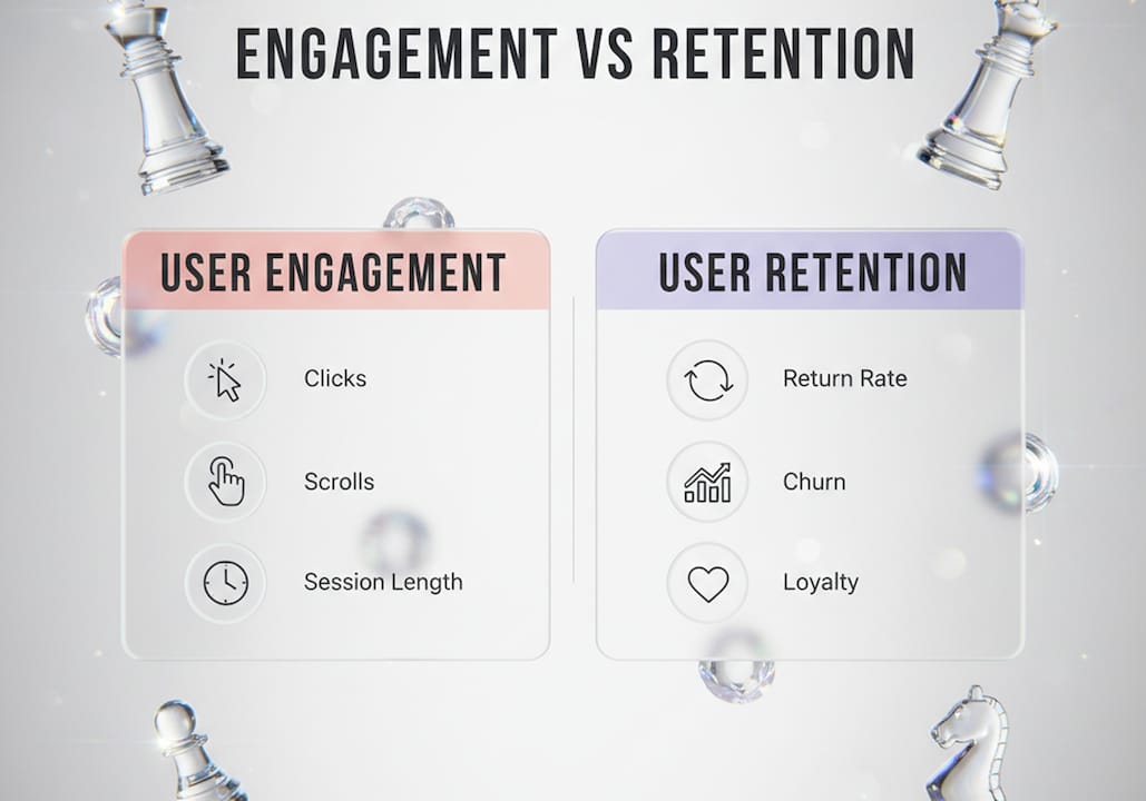
User engagement tracks within-session behavior: clicks, scrolls, explorations, and form completions that happen during a single visit. Retention tracks whether users come back at all over days, weeks, or months. You can have high engagement and terrible retention. A user who spends 30 minutes in your onboarding flow and never returns is engaged but not retained.
| Concept | Focus | Timeframe | Example metric |
|---|---|---|---|
| User engagement | Within-session interactions | Single session | Click-through rate, scroll depth |
| User retention | Repeat visits and continued use | Weeks or months | Day 7 return rate, monthly active users |
| Relationship | Engagement can support retention | Both matter | High engagement + low retention signals friction |
The practical implication is that engagement improvements don’t automatically produce better retention. A slick onboarding animation might boost session depth on day one but do nothing for week-two return rates. Retention requires that users find enough value to come back. Engagement design creates the conditions for that value to land. For a deeper look at customer retention strategies, the two concepts work best when designed together, not in silos.
Align your product goals before you pick your tactics. If your KPI is monthly active users, optimize for retention. If it’s conversion on a single visit, optimize for engagement. Trying to do both at once without a clear priority usually means doing neither well.
What are effective user engagement design strategies?
Good engagement design is not about adding more features. It’s about removing the stuff that gets in the way.
Nail onboarding first
Onboarding is the highest-impact moment for long-term retention. UXPin’s retention guidance points to removing friction, accelerating time to the “aha moment,” and using progressive disclosure as the three biggest levers. Progressive disclosure means showing users only what they need right now, not every feature at once. Think of how Duolingo drops you into a lesson before asking you to create an account. That’s aggressive time-to-value in action.
Interactive walkthroughs beat static tutorials almost every time. Let users do the thing, not just watch someone else do it. And always give power users a way to skip. Forcing an experienced user through a beginner tutorial is a fast way to lose them.
Use microinteractions and visual hierarchy
Microinteractions are the small animations and feedback moments that tell users their action worked. A button that changes color on click, a progress bar that fills as a form completes, a subtle sound when a task finishes. These details signal responsiveness and build trust. Ethical engagement design aligns these microinteractions with genuine user intent rather than using them to manipulate behavior.
Visual hierarchy guides attention without forcing it. Place the most important action where the eye naturally lands. Use contrast, size, and whitespace to make the next step obvious. Accessibility matters here too: color contrast ratios, keyboard navigation, and screen reader compatibility all affect how many users can actually engage with your product.
Design for all three engagement phases
Segment engagement into activation, repeat use, and conversion to tailor your design and measurement for each stage. Activation is the first moment of real value. Repeat use is the habit loop. Conversion is the action that generates revenue or fulfills the product’s core purpose. Each phase needs different design thinking and different metrics.
-
Activation: Clear value proposition, fast setup, immediate reward
-
Repeat use: Notifications done right, personalization, progress tracking
-
Conversion: Minimal friction at the decision point, social proof, clear next step
Pro Tip: Audit your product for the single biggest friction point in each phase. Fix that one thing before adding anything new. Subtraction often beats addition in engagement design.
For teams working on UI design and engagement, the combination of visual hierarchy and phase-specific design thinking produces measurable gains in both session depth and return rates.
What common pitfalls should designers avoid in user engagement design?
The biggest trap in engagement design is optimizing for volume without asking what that volume means.
Increasing engagement metrics without linking them to core user outcomes misleads product teams. If your engagement rate goes up because you added a pop-up that forces users to click before they can continue, that’s not a win. That’s noise dressed up as signal. The fix is a proxy-to-outcome check: for every engagement metric you track, name the real user outcome it’s supposed to represent. If you can’t name it, the metric probably isn’t worth tracking.
Dark patterns are the extreme version of this problem. Infinite scroll designed to prevent stopping, fake urgency timers, hidden unsubscribe buttons. These tactics boost short-term engagement numbers and destroy long-term trust. Ethical engagement design respects user agency. It gives users control over their experience rather than engineering compulsion.
Another common mistake is treating engagement as a single construct. HCI research notes that engagement is fragmented across studies, with inconsistent definitions and operationalization challenges. Teams that copy metrics from a competitor’s case study without adapting them to their own product context end up measuring the wrong things.
Pro Tip: Before your next sprint, run a proxy-to-outcome audit. List every engagement metric on your dashboard and write one sentence explaining the real user value it represents. If you can’t write that sentence, cut the metric.
Key takeaways
User engagement design works when it ties every interaction to a real user outcome, not just a metric that looks good on a dashboard.
| Point | Details |
|---|---|
| Define engagement clearly | Use explicit outcome targets before choosing metrics to avoid measuring meaningless interactions. |
| Use GA4’s engaged session standard | Sessions over 10 seconds, with a key event or 2+ pageviews, give a more accurate picture than raw session counts. |
| Separate engagement from retention | Within-session behavior and long-term return rates require different design strategies and different KPIs. |
| Prioritize onboarding friction removal | Getting users to the core value fast is the single highest-impact move for both engagement and retention. |
| Avoid dark patterns | Manipulative design boosts short-term numbers and destroys user trust, leading to churn. |
Engagement design is about trust, not tricks
I’ll be honest with you: when I started working on digital products, I thought engagement meant making things sticky. More notifications, more gamification badges, more reasons to stay. It took a few projects (and a few very honest client conversations) to realize that sticky and valuable are not the same thing.
The products I’ve seen grow sustainably are the ones where users feel like the product is on their side. That sounds obvious, but it’s genuinely rare. Most products are designed around what the business needs from the user, not what the user needs from the product. Flip that, and engagement follows naturally.
The metric I’ve come to trust most is not session duration or click rate. It’s whether users come back without being prompted. No push notification, no re-engagement email. They just show up because the product earned it. That’s the outcome worth designing for.
The teams that get this right are also the ones who treat their style guide and component library as living documents, not afterthoughts. Consistency in design signals reliability to users. And reliability is the foundation of trust.
— Coumba Evelyn
How Coumba Win Design approaches engagement-driven UX
Coumba Win Design builds products where engagement is baked in from the first screen, not bolted on after launch.
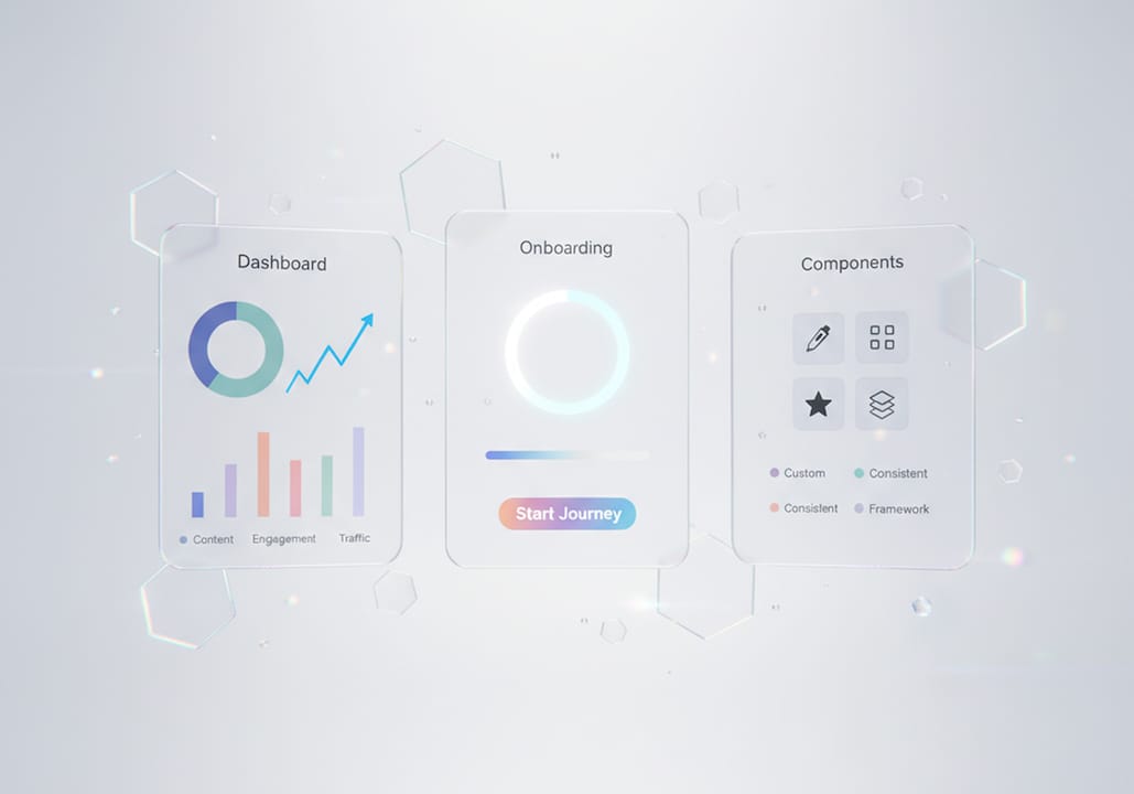
The reusable design components Coumba Win Design uses are built around reducing friction at every phase: activation, repeat use, and conversion. Each component is tested for consistency and accessibility so your users get a clear, trustworthy experience from day one. For founders who need to move fast without sacrificing quality, the Demo Day Kit packages engagement-focused design into a 14-day sprint. It’s the kind of thing that makes your product look like it’s been in market for years, even if you’re still pre-launch. If you want to see how this plays out in a real product, check out the Coumba Win design system and what it looks like when engagement design is done with intention.
FAQ
What is user engagement design in simple terms?
User engagement design is the practice of shaping digital products so users interact with them meaningfully, stay longer, and return more often. It covers everything from onboarding flow to microinteractions and metric tracking.
What metrics measure user engagement?
GA4 measures engagement through engaged sessions, defined as sessions lasting more than 10 seconds, containing a key event, or including 2 or more pageviews. Engagement rate equals engaged sessions divided by total sessions.
How does user engagement differ from user retention?
Engagement tracks what users do during a single session, like clicks and scrolls. Retention tracks whether users come back over days or weeks. High engagement does not guarantee high retention.
What are the biggest mistakes in engagement design?
Optimizing for raw engagement volume without linking metrics to real user outcomes is the most common mistake. Dark patterns and manipulative design also boost short-term numbers while destroying long-term trust.
How do I improve user engagement during onboarding?
Remove friction, get users to the core value as fast as possible, use progressive disclosure, and let experienced users skip tutorials. Interactive walkthroughs outperform static instructions in almost every context.
Recommended