
Product Launch Emails: Templates, Sequence, and UTM Rules

Product Launch Emails: Templates, Sequence, and UTM Rules
Here’s the deal: you need three things to launch well by email, and this article hands you all three. You get copy-ready templates for every stage of a launch, a 3-to-5-email sequence with the KPI to watch on each send, and the UTM tagging rules that keep your analytics honest instead of dumping everything into “direct traffic” purgatory.
What’s actually inside:
- Templates and subject lines for teaser, VIP, pre-order, launch-day, and follow-up emails
- A build-up → drop → closing sequence with timing and metrics
- A UTM naming schema you can copy today
- Design and mobile checklist so nothing breaks in Gmail on an iPhone
Your first move: pick one template below, then tag its link with utm_source, utm_medium, and utm_campaign before you send anything.
TL;DR:
- A staged email sequence of at least three to five messages significantly outperforms single blasts during product launches, especially for SaaS and eCommerce brands.
- Applying consistent UTM parameters in lowercase with hyphens and testing links before sending ensures accurate campaign tracking and reliable analytics.
- Crafting mobile-optimized subject lines between 30 and 50 characters and structuring copy with a clear headline, benefits, and a single CTA boosts open and click rates.
- Design choices like a single prominent hero image, above-the-fold CTA, and alt text for accessibility directly influence email engagement and deliverability.
- Leveraging professional template and asset support from a design service shortens launch timelines and maintains visual brand consistency.
Table of Contents
- Types of Product Launch Emails and When to Send Them
- Templates and Examples for Every Launch Stage
- The Launch Email Sequence: Timing and What to Measure
- Subject Lines and Opening Lines That Actually Get Opened
- How to Structure Email Copy That Converts
- Design Choices That Make or Break a Launch Email
- UTM Tracking: Naming Rules and a QA Checklist Before You Send
- A/B Testing Priorities for Your Launch Sequence
- What Design-Led Launches Taught Us About Email Performance
- Get Launch-Ready Email Assets Without the Agency Scramble
- Key Takeaways
- Sources
- FAQ
Types of Product Launch Emails and When to Send Them
Most launches fail not because the product is weak, but because the email lineup is thin. A single “we’re live!” blast is not a campaign, it’s a whimper. Here’s the full roster and where each one earns its slot.
- Teaser / pre-launch — sent 2 to 4 weeks out, builds curiosity without revealing the full offer. Works best with a countdown or a “something’s coming” hook.
- Waitlist / early access — invites signups to a priority list, usually 1 to 3 weeks before launch. Great for SaaS products where scarcity of onboarding slots feels real.
- Pre-order — asks for a commitment (and sometimes payment) before the product ships. eCommerce brands lean on this heavily to gauge inventory needs.
- Beta / invite — a smaller, quieter cousin of pre-order, aimed at a select segment who gets early hands-on access in exchange for feedback.
- Launch-day — the main event, sent the moment the product goes live. This is your highest-stakes subject line of the whole sequence.
- Feature announcement — for existing customers, spotlighting what’s new inside a product they already use.
- Follow-up / closing — sent 3 to 7 days after launch day, targeting openers who didn’t click or buyers who need a nudge toward a related action.
SaaS companies typically run all seven, since trials and feature rollouts create natural touchpoints. eCommerce brands often skip beta invites and lean hard on pre-order and scarcity messaging instead. Info product launches (courses, guides) tend to compress the timeline, sometimes running teaser through closing in under two weeks because urgency is the whole engine.
Templates and Examples for Every Launch Stage
You don’t need to write these from scratch. Swap in your product name, your value prop, and your deadline, and these are ready to send. A large catalog of product launch email examples confirms the patterns below show up again and again in high-performing campaigns: short hero lines, early-access hooks, and a single obvious CTA.
1. Teaser Email Subject: “Something’s changing on [date]” Body: One sentence hinting at the problem you’re solving, no product name yet. Close with “Mark your calendar” and a soft CTA to a landing page teaser. Swap: the date and the problem statement. Segment: your full list, since this is awareness, not conversion. Expected CTA: landing page visit, not purchase.
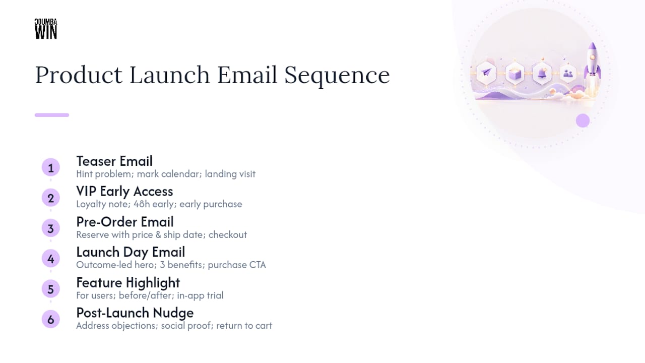
2. VIP Early Access Email Subject: “You’re on the list — [Product] opens for you first” Body: Acknowledge their loyalty, state the early window (e.g., “48 hours before everyone else”), and give one clear reason to act now. Swap: the loyalty reason (past purchase, waitlist signup, referral). Segment: existing customers or waitlist subscribers only. Expected CTA: early purchase or signup.
3. Pre-Order Email Subject: “Reserve yours before [date]” Body: State what they’re securing, the price, and the ship or access date. Add a scarcity line if inventory or slots are genuinely limited. Swap: quantity or slot numbers, delivery timeline. Segment: engaged openers from the teaser. Expected CTA: pre-order checkout.
4. Launch Day Email Subject: “It’s here: [Product Name]” Body: Lead with the outcome, not the features. One hero sentence, three benefit bullets, one CTA button above the fold. Swap: the hero sentence and benefit list per audience segment. Segment: your entire active list, split by VIP vs. general if timing allows. Expected CTA: purchase or trial start.
5. Feature Highlight Email Subject: “New: [Feature] is live in your account” Body: Speak to current users, not prospects. Show a before/after or a short use case, then link straight to the feature. Swap: the feature name and use case. Segment: active accounts only. Expected CTA: in-app feature trial.
6. Post-Launch Nudge Subject: “Still thinking it over?” Body: Address the hesitation directly (price, timing, uncertainty) and offer proof, like a stat or a short testimonial-style line. Swap: the objection you’re addressing. Segment: openers who did not click. Expected CTA: return-to-cart or demo booking.
Pro Tip: Write your launch-day subject line last. By the time you’ve drafted the teaser and VIP emails, you’ll know exactly which benefit resonates, and that’s the line that belongs in the subject field, not a generic “we launched” announcement.
The Launch Email Sequence: Timing and What to Measure
A single announcement email is not a strategy. Launches that treat the rollout as a staged campaign, built up, dropped, and closed, consistently outperform one-shot blasts because each stage does a different job.
- Build-up (teaser) — sent 2 to 4 weeks before launch. Objective: generate curiosity and list engagement. Watch open rate; anything under industry norms means your subject line needs work before you go further.
- Reveal (early access or waitlist) — sent 1 to 2 weeks before. Objective: convert curiosity into a captured lead or reservation. Watch click-through rate on the signup or reservation link.
- Launch day — sent on the go-live date. Objective: drive the primary conversion. Watch click-through rate to the product page or checkout.
- Follow-up — sent 3 to 7 days after launch. Objective: recover hesitant openers. Watch conversion rate on the recovery offer.
- Closing push (optional fifth email) — sent near a deadline or limited window’s end. Objective: create final urgency. Watch conversion rate against a control send with no urgency language.
A SaaS launch might run all five over five weeks. An eCommerce drop often compresses to four emails over ten days, front-loading scarcity. An info product launch frequently squeezes build-up through closing into a single week, since the entire model runs on urgency rather than sustained awareness.
Sequenced campaigns using at least 3 to 5 emails, instead of a single announcement, are the pattern behind most high-performing launches, not an occasional exception.

Subject Lines and Opening Lines That Actually Get Opened
Your subject line is the whole ballgame before anyone sees your beautiful hero image. Here’s a swipe file organized by what you’re trying to trigger.
Tease:
- “Something’s coming for [audience]”
- “We’ve been quiet for a reason”
- “Mark your calendar: [date]”
VIP / early access:
- “You get first dibs on [Product]”
- “Early access starts now, just for you”
- “Skip the line: [Product] opens early”
Scarcity:
- “Limited spots available before [date]”
- “Closing in 48 hours”
- “Last call before we open to everyone”
Benefit-first:
- “[Product] cuts [pain point] in half”
- “Finally: [outcome] without [common obstacle]”
- “Get [specific result] starting today”
Curiosity:
- “We changed everything. Here’s why.”
- “This wasn’t supposed to launch until 2027”
- “The thing nobody expected from us”
Keep mobile in mind: subject lines between 30 and 50 characters display cleanly on most phone screens, while anything longer gets truncated right where your best word was sitting.
Opening lines matter almost as much. A value-first opener states the payoff immediately: “You’re about to save four hours a week.” A curiosity-first opener withholds one detail: “We built this because of something a customer said last spring.” A social-proof-first opener leans on numbers or names: “Over 200 early testers already switched.” Match the opener to the subject line’s promise, or the reader feels bait-and-switched before they’ve scrolled past the preheader.
How to Structure Email Copy That Converts
Every high-performing launch email follows a rough anatomy, and skipping a piece is usually why a send underperforms.
- Headline: states the outcome, not the feature name.
- Preview/preheader: extends the subject line, never repeats it verbatim.
- Hero sentence: one line, the core promise, above any image.
- Benefits: three bullets max, each answering “so what?”
- Social proof: a stat, review count, or named use case if you have one.
- CTA: one button, one action, repeated once more near the bottom for long emails.
- P.S.: a secondary hook, often the deadline or a bonus detail skimmers catch.
Segment your swaps deliberately. A VIP list can handle a warmer, more familiar tone and can skip the “why should you trust us” proof section entirely, since they already do. A cold list needs the proof section doing real work, and needs shorter copy overall, since patience is thinner. For mobile readers specifically, cut every sentence that isn’t carrying its weight; a body that reads fine on desktop often feels bloated on a five-inch screen.
Accessibility and deliverability aren’t afterthoughts. Every image needs alt text, since a meaningful share of opens happen with images blocked by default. Stick to one primary CTA per email, not three competing buttons. And keep your unsubscribe link visible and clearly worded, both because compliance requires it and because a hidden unsubscribe link is a fast way to get flagged as spam by tools like Gmail’s spam filter. A well-designed CTA does more conversion work than another paragraph of persuasive copy ever will.
Pro Tip: Read your launch email out loud before sending. If you run out of breath before the CTA, your copy is too long for a phone screen.
Design Choices That Make or Break a Launch Email
Design-led changes, a clear hero image, an above-the-fold CTA, simplified copy, routinely produce measurable lifts in open and click behavior, which is exactly why Coumba Win Design treats email visuals as a strategic lever rather than decoration.
Choose your hero image type based on the stage. A hero illustration or brand graphic suits teaser emails, where you’re building mood, not showing product. A real product photo belongs in launch-day and pre-order emails, where the reader needs to see exactly what they’re getting. A screenshot works best for feature announcements and SaaS launches, where the “what” is a screen, not a physical object.
A few non-negotiables:
- Keep total email file size light. Heavy images slow load times and get clipped by some inboxes.
- Design mobile-first. Most opens happen on a phone, so your single-column layout should look intentional, not like a fallback.
- Put your CTA where a thumb naturally lands, not buried under three paragraphs.
- Add alt text to every image so the message survives even when images don’t load.
- Write preview text deliberately. Don’t let it default to “view this email in your browser,” which wastes valuable inbox real estate.
Run a quick preflight before you hit send: load the email in a couple of clients, confirm every image has a fallback, and check that the CTA button still reads clearly with images off.
UTM Tracking: Naming Rules and a QA Checklist Before You Send
Skip UTM tagging and your launch data lies to you. Clicks from email frequently show up as direct traffic in Google Analytics when links aren’t tagged, which makes it look like your launch email did nothing even when it drove real revenue.
Three parameters are mandatory on every link: utm_source (where the click came from, e.g., “newsletter”), utm_medium (the channel, e.g., “email”), and utm_campaign (the specific launch, e.g., “launch-2026-spring”). Google’s own URL builder guidance recommends adding utm_content when a single email has multiple links, so you can tell a header-button click apart from a footer-text click. Reserve utm_id for unique partner or paid-campaign tracking if you run any paid promotion alongside the organic send.
Keep everything lowercase and use hyphens, not spaces or underscores, since inconsistent casing fragments your GA4 reports into duplicate campaign rows that look like separate campaigns entirely.
| UTM Parameter | Example Value |
|---|---|
| utm_source | newsletter |
| utm_medium | |
| utm_campaign | launch-2026-spring |
| utm_content | hero-button |
Before you send, test every tagged link manually, confirm redirects land on the right page, and preview the campaign inside GA4’s real-time report. Manual link testing before send catches broken redirects that would otherwise sink your launch metrics silently.
A/B Testing Priorities for Your Launch Sequence
You don’t have time to test everything, so test in this order.
- Subject lines first. They gate everything downstream; a weak subject line means your best body copy never gets read.
- CTA text second. “Get Started” versus “Claim Your Spot” can shift click-through meaningfully with almost no design work.
- Hero image third. Illustration versus product photo versus screenshot, once your copy is locked.
- Send time last. Useful, but marginal compared to the first three.
Because launch sequences are short, you rarely have time for a slow full-split test. Instead, stagger tests across cohorts rather than delaying the whole send to wait for statistical certainty. If your list is small, wait for a reasonably sized sample in each variant before declaring a winner, and fold that winning version straight into your next send in the sequence rather than saving it for “next time.”
What Design-Led Launches Taught Us About Email Performance
The biggest mistake founders make isn’t skipping emails, it’s treating every send like a press release instead of a conversation. On one educational platform launch, the client insisted on a text-heavy announcement email until we tested a version with a single hero sentence and one benefit-driven screenshot. Click-through improved noticeably once the copy stopped competing with itself for attention.
The second lesson is about consistency. A high-end apparel brand we worked with saw their feature announcement emails perform better once the visual language matched their website exactly. Disconnected branding between email and landing page reads as an unfinished launch, even when the product itself is ready.
— Coumba Evelyn
Get Launch-Ready Email Assets Without the Agency Scramble
Coumba Win Design builds the exact pieces this article walks through: templates, hero images, and the landing page components your launch-day CTA needs to land on, all matched to one visual identity instead of stitched together at the last minute. For founders demoing at an event, the Demo Day Kit bundles pitch deck design, booth materials, and branded swag alongside your email assets, delivered in 14 days rather than the weeks a typical agency engagement takes.

A starter engagement typically covers your launch-day hero image, one to two email templates matched to your brand, and the landing page components your CTA links to, so the click-through from email doesn’t land on a mismatched page. If your launch date is already on the calendar, request a quote through Coumba Win Design this week so the design work doesn’t become the bottleneck.
Key Takeaways
A successful product launch email campaign needs a staged sequence of 3 to 5 emails, consistent UTM tagging on every link, and design choices that support a single clear call to action.
| Point | Details |
|---|---|
| Use a real sequence | Send at least 3 to 5 staged emails (build-up, launch, follow-up) instead of one announcement. |
| Tag every link | Apply utm_source, utm_medium, and utm_campaign consistently, using lowercase and hyphens. |
| Match subject length to mobile | Keep subject lines between 30 and 50 characters so phones don’t truncate your hook. |
| Test in priority order | Optimize subject lines first, then CTA text, then hero image, then send time. |
| Get design support fast | Coumba Win Design delivers launch templates and the Demo Day Kit in 14 days for founders on a deadline. |
Sources
- URL builders: Collect campaign data with custom URLs - Analytics Help
- UTM parameters explained: Smarter campaign tracking - Shopify
- The Best 790 Product Launch Email Examples in 2025
- How to Write the Perfect Product Launch Email (+8 Inspiring Examples) - Drip
FAQ
How Do I Write a Product Launch Email?
Start with the outcome your product delivers, not its features, then structure the body around one hero sentence, three benefit bullets, and a single CTA. Match the tone and proof level to the segment receiving it, since a VIP list needs less convincing than a cold list.
How Do I Announce a Product Launch?
Announce it through a staged sequence rather than one email: a teaser two to four weeks out, an early-access or pre-order email, the launch-day send itself, and a follow-up three to seven days later for people who didn’t convert.
What Is the Email Sequence for a Product Launch?
A typical sequence runs build-up (teaser), reveal (early access or waitlist), launch day, and a follow-up or closing push, with 3 to 5 total emails performing better than a single announcement across most launch types.
How Do I Write an Email to Offer a Product?
Lead with the specific result the product delivers, state the offer clearly (price, availability window, or early-access terms), and close with one obvious action, whether that’s a purchase link, a reservation, or a demo booking.

