How to Design Inclusive Digital Experiences for Communities
How to Design Inclusive Digital Experiences for Communities
Why inclusive digital design is the foundation every community project needs
Accessible technology assists 57% of computer users in navigating websites more easily. That number, drawn from World Bank data cited by Section508.gov, is the kind of stat that should stop you mid-scroll. More than half of all users benefit from accessibility features, which means designing without inclusion isn’t a niche concern. It’s a majority problem.
Inclusive digital design is the practice of creating digital experiences that work equitably for people across a wide range of abilities, situations, and backgrounds — not by building one rigid solution, but by offering flexible, comparable experiences that don’t ask anyone to settle for less.
The W3C Web Accessibility Initiative frames it clearly: when websites and tools are badly designed, they create barriers that exclude people from the web entirely. And the web, per the UN Convention on the Rights of Persons with Disabilities, is a basic human right. So when you design inclusive digital experiences for communities, you’re not doing a favor. You’re doing your job.
Table of Contents
- Core principles that should guide every community-focused digital project
- How to spot and fix the bias that’s quietly excluding your users
- Why your design team’s lived experience is the real competitive advantage
- Practical strategies and tools for building accessible digital experiences
- Coumba Win Design builds the inclusive digital foundation your startup actually needs
- FAQ
- Key Takeaways
Core principles that should guide every community-focused digital project
The seven pillars of inclusive design give you a practical checklist that goes way beyond “add alt text and call it a day.” According to the Inclusive Design Principles, here’s what they actually mean in practice:
- Comparable experience: Every user should be able to complete tasks in a way that suits their needs, without the quality of the content taking a hit. Visual content needs programmatic equivalents.
- Consider the situation: Your users aren’t always sitting at a desk with fast Wi-Fi. Design for low bandwidth, bright sunlight, one-handed use, and every other real-world condition.
- Be consistent: Use familiar conventions. Jakob’s Law reminds us that users spend most of their time on other sites, so your interface should feel like home, not a puzzle.
- Give control: Don’t suppress browser or device preferences. Let users stop animations, adjust contrast, and interact in their preferred way.
- Offer choices: Drag-and-drop should also work via keyboard. A grid view should also be available as a list. Access, not feature bloat.
- Prioritize content: Use layout, visual weight, and semantics to help users focus on what matters. A cluttered interface is an inaccessible one.
- Add value: Leverage device capabilities like voice control, geolocation, vibration feedback, and dark mode to genuinely improve the experience, not just check a box.
These principles connect directly to WCAG 2.2, which defines testable success criteria across a wide range of disabilities. If you’re building for U.S. audiences, WCAG 2.2 is also the benchmark for Section 508 compliance. Knowing the principles is great; mapping them to legal requirements is what keeps your product defensible.
How to spot and fix the bias that’s quietly excluding your users
Here’s an uncomfortable truth: most exclusion in digital products isn’t intentional. It’s the result of designers solving problems through the lens of their own experience. Microsoft Inclusive Design calls this out directly. Exclusion happens when you build for yourself and assume everyone else works the same way.
The Nielsen Norman Group draws a distinction worth knowing cold. Universal design aims for one solution that works for everyone. Inclusive design accepts that you might need multiple adaptations to meet diverse needs without sacrificing quality. That’s a meaningful difference. A ramp serves wheelchair users and parents with strollers. A digital equivalent might be offering both a voice interface and a text-based one, rather than forcing everyone into the same flow.

Microsoft’s methodology breaks exclusion into three categories: permanent disabilities (a user who is blind), temporary disabilities (a user recovering from eye surgery), and situational disabilities (a user in a bright outdoor environment). When you map your product against all three, you find gaps you’d never catch in a standard usability test.
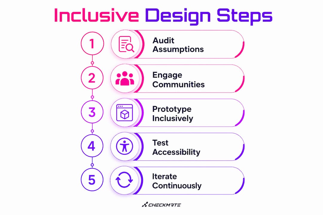
Pro Tip: Run a bias audit before your first prototype. List every assumption baked into your user personas, then ask: who does this exclude permanently, temporarily, or situationally? That exercise alone will surface design decisions you didn’t know you were making.
Why your design team’s lived experience is the real competitive advantage
“Nothing about us without us.” That mantra, cited across inclusive design literature, isn’t just a slogan. It’s a structural requirement. According to Adobe Design’s community co-creation research, inclusive design teams should include members with lived experience as active co-creators from the planning stage, not as consultants brought in at the end to validate decisions already made.
That quote hits differently when you’ve seen a product launch flop because the community it was built for didn’t recognize themselves in it. Token participation, where one person from an underrepresented group is added to a team but given no real influence, produces the same blind spots as no participation at all. Empowered co-creators shape the brief, challenge assumptions, and redirect priorities. That’s the version that actually works.
Coumba Win Design’s work on educational platforms reflects this directly. When the design process includes people who actually use the product in the conditions it’s meant for, the outcomes are sharper, the empathy is real, and the product doesn’t need a second redesign six months post-launch.
Practical strategies and tools for building accessible digital experiences
Getting from principles to shipped product requires a specific toolkit and a willingness to test with real users throughout, not just at the end. Here’s what that looks like in practice:
- Semantic HTML and content mapping: Screen reader users depend on proper heading structure, ARIA labels, and logical content flow. Visual design alone doesn’t cut it. If your markup is a mess, your accessibility is a mess.
- Keyboard navigation testing: Tab through every interaction in your product. If you can’t complete a task without a mouse, neither can a significant portion of your users.
- Automated + manual audits: Tools like Axe, Lighthouse, and WAVE catch roughly 30–40% of accessibility issues automatically. Human review catches the rest. Use both.
- Diverse usability testing: Recruit testers with disabilities, older adults, non-native speakers, and users on low-end devices. The Nielsen Norman Group recommends prioritizing inclusive research and educating stakeholders about how diverse users actually interact with technology.
- Device capability integration: Voice control, dark mode, and geolocation aren’t just nice features. They’re meaningful accessibility enhancements that serve users in ways a standard interface can’t.
- Continuous feedback loops: Build in mechanisms for community members to flag barriers after launch. Inclusive design is iterative, not a one-time sprint.
For accessibility in UX, the practical starting point is always the same: audit what you have, identify who you’re currently excluding, and fix the highest-impact gaps first. WCAG 2.2 gives you the criteria. Your community gives you the context. Pairing web accessibility with SEO is a bonus that most teams don’t realize they’re leaving on the table. Accessible markup, clear headings, and descriptive alt text all improve search performance alongside user experience.
Coumba Win Design’s platform work for educational clients showed a consistent pattern: when interaction design is built around real user conditions from day one, the product requires fewer post-launch patches and earns stronger community adoption.
Coumba Win Design builds the inclusive digital foundation your startup actually needs
Most design agencies hand you a beautiful product that works great for one type of user. Coumba Win Design builds digital experiences that hold up across the full range of people your community actually includes.

If you’re a founder, product manager, or community leader who’s tired of shipping products that leave people behind, Coumba Win Design is the partner that treats inclusion as a design constraint, not an afterthought. The work spans branding, platform development, and UX strategy, all built around the principle that user dignity isn’t optional. Case studies in educational platforms and high-end apparel show what happens when bold design meets genuine community understanding. Ready to build something that actually works for everyone? Start the conversation at coumbawin.com.
FAQ
What does inclusive digital design actually mean?
Inclusive digital design means creating digital products that serve users across a wide range of abilities, situations, and backgrounds by offering flexible, comparable experiences rather than a single rigid solution.
How is inclusive design different from universal design?
Universal design aims for one solution that works for everyone, while inclusive design accepts multiple adaptations to meet diverse needs without sacrificing quality, per the Nielsen Norman Group.
What are the biggest accessibility mistakes teams make?
Relying on visual design alone is the most common gap. Screen reader users depend on semantic HTML, proper heading structure, and ARIA labels, none of which show up in a mockup.
How do I know if my digital product meets accessibility standards?
Test against WCAG 2.2 success criteria using a combination of automated tools like Axe or Lighthouse and manual testing with diverse user groups, including people with disabilities.
Can Coumba Win Design help with inclusive digital projects?
Yes. Coumba Win Design builds platforms and digital experiences with inclusion built into the design process from the start, not retrofitted after launch.
Key Takeaways
Inclusive digital design is the single most effective way to build community-focused digital products that serve diverse users without exclusion, and it requires principles, diverse teams, and continuous iteration.
| Point | Details |
|---|---|
| Inclusion benefits the majority | Accessible technology assists 57% of computer users, making inclusive design a mainstream necessity, not a niche concern. |
| Seven pillars guide practice | Comparable experience, situational awareness, consistency, user control, choice, content priority, and added value form the core framework. |
| Bias causes most exclusion | Mapping permanent, temporary, and situational disabilities per Microsoft’s methodology surfaces gaps that standard usability testing misses. |
| Teams need lived experience | Co-creators with real stakes in the outcome, involved from planning through launch, produce more equitable and adopted products. |
| Coumba Win Design applies this | Coumba Win Design builds platforms with inclusion as a design constraint from day one, backed by case studies in education and apparel. |