7 Microcopy Examples and Ready Templates for Designers and UX Writers

7 Microcopy Examples and Ready Templates for Designers and UX Writers
Microcopy is the short, functional text on buttons, forms, error messages, and empty states that informs, influences, or supports a user’s next action. It’s often the difference between someone finishing a task or abandoning it mid-click. This article gives you grouped examples by UI element, before/after rewrites you can steal, a short set of best-practice rules, and ready-to-adapt templates.
TL;DR:
- Clear, outcome-focused button labels should be concise, usually under four words, and describe the result rather than the action itself.
- Empty states need a call to action that guides users to the next step, rather than simply stating that no content exists.
- Error messages should explain what went wrong and suggest specific actions for resolution, not just state a failure.
- Microcopy should serve one of three purposes: inform, influence, or support interaction, and be tested through A/B experiments to improve conversion.
- Prioritize rewriting critical friction points like buttons and error states before less impactful elements such as tooltips or low-stakes notifications.
Table of Contents
- Microcopy Examples by UI Element
- Before and After: Rewrites That Actually Change Behavior
- Microcopy Best Practices: The 3 Is and a Few Hard Rules
- Microcopy Templates You Can Steal Right Now
- How Coumba Win Design Approaches Microcopy in Real Projects
- What Most Microcopy Advice Gets Backward
- Get a Microcopy and UI Review From Coumba Win Design
- Sources
- FAQ
Microcopy Examples by UI Element
Good microcopy examples share one trait: they answer a question the interface itself can’t. Here’s what that looks like across the elements you’ll touch most often, organized by where friction usually shows up.
Buttons. Button copy should be short (typically 1 to 4 words, per Euleinstitute’s rewrite guidance) and name the actual outcome, not the mechanics of clicking.
- “Save My Draft” instead of “Submit”
- “Start Free Trial” instead of “Continue”
- “Send Invite” instead of “OK”
Empty states. An empty state that just announces absence wastes prime screen real estate. Nielsen Norman Group’s research on empty-state design is blunt about this: the most common failure is stating that nothing exists without telling the user what to do about it.
- “No projects yet. Create your first one →”
- “Your inbox is empty. Nice work catching up.”
- “No results for ‘blue sneakers.’ Try a broader search term.”
Error messages. Errors should explain what went wrong and what to do next, not just that something failed.
- “That email’s already registered. Log in instead?”
- “Password needs 8+ characters and one number.”
- “We couldn’t process your card. Check the number and try again.”
Onboarding and tooltips. These earn their space only when they teach something the interface can’t show on its own.
- “Tap the star to save this for later.”
- “This syncs automatically. No need to save manually.”
- “Swipe left to archive, right to delete.”
Notifications. Notifications work best when they name who or what triggered them.
- “Maria commented on your design file.”
- “Your export is ready to download.”
- “Storage is 90% full. Upgrade or clear old files.”
Form labels and placeholders. Labels should describe the data, not repeat the field’s obvious function.
- “Legal name (as it appears on your ID)”
- “We’ll only use this to send your receipt”
- A visible helper text example for accessibility: instead of relying on a placeholder that disappears on focus, add persistent helper text below the field reading “Format: MM/DD/YYYY” so screen reader users and sighted users typing quickly both get the same cue.
Confirmations. Confirmations should close the loop and, when useful, hint at what happens next.
- “Order placed. You’ll get a shipping update by email.”
- “Changes saved automatically.”
- “Account deleted. We’re sorry to see you go.”
Before and After: Rewrites That Actually Change Behavior
- Button, vague to specific. Before: “Submit.” After: “Create My First Report.” Principle: name the outcome, not the action.
- Empty state, dead end to CTA. Before: “No tasks found.” After: “No tasks yet. Add your first one →” Principle: every empty state needs a next step, per NN/g’s guidance.
- Error, technical to human. Before: “Error 403.” After: “You don’t have access. Ask an admin to invite you.” Principle: reduce ambiguity.
- Confirmation, silent to reassuring. Before: “Done.” After: “Saved. You can edit this anytime.” Principle: reassurance reduces re-checking behavior.
- Permission ask, generic to transparent. Before: “Allow notifications?” After: “Get notified when someone replies. Turn off anytime in settings.” Principle: address user fear directly, a pattern Built In highlights as a way to lower friction at decision points.
- Loading message, blank to informative. Before: “Loading…” After: “Loading your dashboard. Usually takes about 5 seconds.” Principle: set expectations.
Pro Tip: Read your error messages out loud. If you wouldn’t say it to a coworker standing next to you, rewrite it.
Microcopy Best Practices: The 3 Is and a Few Hard Rules
Nielsen Norman Group frames microcopy around three purposes: it should inform, influence, or support interaction. Evaluate every line of copy by asking which job it’s doing, because copy written for the wrong purpose (say, a button trying to “inform” instead of drive action) tends to underperform regardless of how clever the wording is.
That framework holds up because microcopy technically qualifies as the smallest category of UX writing, defined by NN/g as under three sentences, covering labels, tooltips, errors, and instructions. Short text has less room for nuance, so purpose has to carry the weight instead of length.
A few rules worth pinning above your desk:
- Keep buttons to 1 to 4 words and always name the outcome.
- Match tone to severity: calm and helpful for warnings, direct and clear for critical errors.
- Never use copy to patch a confusing interface. NN/g’s own guidance on UX copy sizing warns that if users need a paragraph to understand a button, the button (or the flow around it) needs redesigning, not better words.
- Prioritize scannability. A concise label paired with a short explanatory fragment beats a dense sentence, since the label needs to work for someone skimming and the fragment is there for whoever needs more.
For measurement, treat copy changes like any other design decision: test them. Micro-conversions (form completion rate, error recovery rate, empty-state click-through) are small enough to A/B test in a sprint or two, and they tell you faster than a survey ever will whether your rewrite actually helped.
Microcopy Templates You Can Steal Right Now
These are slot-based formulas. Fill in the brackets, adjust for tone, and test.
- Button: “{Action} {object}” → “Send Invite”
- Button with outcome: “{Verb} {object} — {result}” → “Publish Post — go live now”
- Empty state: “No {items} yet. {Next step} →” → “No templates yet. Create your first one →”
- Error with reason: “We couldn’t {action} — {reason}. {Next step}” → “We couldn’t save your file — the connection dropped. Try again.”
- Loading: “Loading… {expected time}” → “Loading… usually under 10 seconds”
- Permission ask: “{Benefit}. {Reassurance}.” → “Get order updates. Turn off anytime in settings.”
- Confirmation: “{Action} confirmed. {What’s next}.” → “Payment confirmed. Receipt sent to your inbox.”
If you write for a global audience, avoid idioms (a phrase like “nice work catching up” won’t translate cleanly) and keep helper text visible on the screen rather than buried in a placeholder that vanishes when someone starts typing.
How Coumba Win Design Approaches Microcopy in Real Projects
Coumba Win Design treats microcopy as part of the interface, not an afterthought bolted on after visual design ships. Copy decisions get made alongside layout, especially for startups where every screen is doing double duty as a sales pitch and a product experience.
A well-placed line of copy at an empty state or error screen can carry as much weight as a redesigned layout, because it’s often the only thing standing between a confused user and a completed task.
One recurring pattern across Coumba Win Design’s project work has been rewriting onboarding flows so early screens tell users exactly what to do next instead of just labeling what’s on the page. The workflow that tends to work: draft the copy, run it through a usability check with real users or teammates, A/B test the strongest contenders on a live micro-conversion metric, then ship.
What Most Microcopy Advice Gets Backward
Most guides treat microcopy as decoration. Word choice as vibe, not function. That’s backward. The research keeps pointing the same direction: microcopy earns its place only when it does one of three jobs, informing, influencing, or supporting interaction, and copy that fails all three is just noise taking up pixel space.
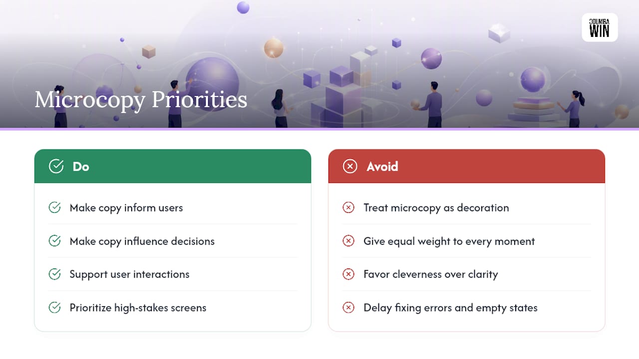
The bigger miss in most advice columns is treating every UI moment with equal weight. An error on a checkout page deserves more scrutiny than a tooltip on a settings toggle nobody visits twice. Prioritize the screens where money, data, or trust changes hands. Rewrite your empty states and error messages before you touch your onboarding tooltips, because that’s where abandonment actually happens.
I’d also push back on the instinct to make copy clever before making it clear. Personality has a place, usually in low-stakes moments like a 404 page, but it should never come at the cost of a user understanding what happened or what to do next. Clarity first. Voice second.
— Coumba Evelyn
Get a Microcopy and UI Review From Coumba Win Design
Coumba Win Design is the alternative to a generic template fix for startups whose interface reads fine but doesn’t convert. Instead of a cosmetic pass, the team rewrites the copy that sits at your highest-friction moments, buttons, forms, error states, empty states, alongside the UI Design and Accessibility Audits that make sure that copy actually reaches every user, screen reader included.
If your onboarding flow or checkout error messages feel like they’re losing people, request a microcopy and UI review. You can see the kind of interface work this looks like in practice on the Coumba Win Design portfolio, and teams standardizing copy across a growing product should also look at the Style Guide service for keeping tone and terminology consistent as you scale. Reach out through Coumba Win Design to get started.
Sources
- The 3 I’s of Microcopy: Inform, Influence, and Interact - NN/g
- Microcopy examples and practical rewrite guidance - Euleinstitute
- What Is Microcopy? | Built In
FAQ
What Does Microcopy Mean?
Microcopy is short functional text, usually under three sentences, that appears on buttons, form fields, error messages, tooltips, and confirmations. Its job is to inform, influence, or support a user’s interaction with the interface, not to persuade at length like marketing copy does.
How Do You Create Microcopy?
Start by identifying the friction point, an empty state, an error, a permission request, then ask which of the three purposes (inform, influence, or interact) that moment needs. Draft a short, specific line that names the outcome or next step, test it against real usage or an A/B split, and revise based on how it affects completion.
What Is Microcopy Writing?
Microcopy writing is the practice of crafting the smallest pieces of UX text, labels, button copy, error messages, so they guide users through a task without adding friction. It’s distinct from broader UX writing because of its length and its tight focus on a single decision point, as Built In explains.
What Makes a Good Button Label?
A good button label is typically 1 to 4 words and names the actual outcome instead of a generic verb like “Submit” or “OK.” “Start Free Trial” or “Send Invite” tells the user exactly what happens next, which rewrite guidance from Euleinstitute consistently recommends over vague action words.
Can Coumba Win Design Help Rewrite Existing Microcopy?
Yes. Coumba Win Design reviews existing interfaces for friction points, buttons, forms, error states, and rewrites copy alongside UI adjustments and accessibility fixes. Pricing depends on project scope and is available directly through Coumba Win Design.