
Three Sections That Close Deals: Media Kit Design for Startup Founders

Three Sections That Close Deals: Media Kit Design for Startup Founders
The three sections that actually close deals: a sharp “about,” your real metrics, and a contact method that doesn’t require three clicks to find. Grab a template, brief a designer, or build one yourself this week.
TL;DR:
- A media kit should focus on a clear hero metric displayed prominently on the first page to capture quick attention.
- Use both a portable PDF and a hosted press page to ensure your information stays current and easily discoverable.
- Visual consistency and accessibility are crucial, with simple design rules, high-contrast text, and properly tagged digital content.
- Prioritize audience-specific content: emphasize metrics for sponsors, case studies for sales, and your story for press outreach.
- Regularly update your media kit at least every three months to maintain credibility and ensure information remains accurate.
Table of Contents
- What Should a Media Kit Design Include?
- Step-by-Step Design Workflow: From Brief to Finished Kit
- Should You Use a PDF, a Press Page, or Both?
- Readability and Accessibility Checklist
- Media Kit Design Examples and Style Prompts
- What Agency-Grade Media Kit Design Actually Prioritizes
- How Coumba Win Approaches a Media Kit Project
- Get a Custom Media Kit Built for Your Launch
- Sources
- FAQ
What Should a Media Kit Design Include?
A media kit is a sales document wearing a nice outfit. Its job is to get a journalist, sponsor, or partner to say yes faster, and that means every element earns its place by removing friction, not by looking pretty for its own sake. PR professionals who build these for a living prioritize convenience over decoration, because the person reading your kit is usually skimming it between two meetings.
Here’s what belongs in every version, regardless of whether you’re a solo creator or a Series A startup:
- A one-line brand statement that says who you are and why anyone should care, followed by a short mission paragraph.
- Audience and metrics — reach, engagement rate, top demographics, and any platform-specific numbers that matter to the person reading. Pick one headline number and make it impossible to miss.
- A concise case study with a real result, a client name if you can get permission, and a link to proof.
- Visual assets: logo variations (light and dark), professional headshots, sample product or content imagery, and short video b-roll if you have it.
- Pricing or a rate request path, even if it’s just “email us for our current rate card.”
- Contact information with a name, not just a generic inbox, plus the file formats you can deliver assets in.
Adobe’s media kit framework covers six similar pillars, and the overlap isn’t a coincidence. Editors and sponsors have seen thousands of these; they know within ten seconds if yours is missing the basics.
Step-by-Step Design Workflow: From Brief to Finished Kit
Before you open a design tool, answer one question: who is this kit actually for? A press-focused kit leans on your story and quotable facts. A sponsorship kit leans on numbers and audience fit. A sales-focused kit leans on case studies and pricing. Trying to serve all three in one document is how kits end up bloated and vague.
- Define the goal and audience. Write down the single outcome you want (press mention, sponsorship deal, ad placement) before you touch a layout.
- Choose your structure. Decide between a single-file PDF, a multi-page PDF, or a hosted press page, since this decision shapes everything downstream.
- Design in this order: cover, brand overview, metrics, case study, visual assets, contact. This sequence mirrors how a skim reader actually consumes the document.
- Set your visual rules early. Pick one typography scale, one accent color, and consistent margins, then apply them everywhere so the kit doesn’t feel stitched together from three templates.
- Export and run a QA pass. Check PDF file size, test every hyperlink, and name the file something searchable like “yourbrand_mediakit_2026.pdf” instead of “final_v3.pdf.”
Pro Tip: Assign one metric as your “hero number” and put it in large type on the first page. A publisher wants unique monthly readers; a social sponsor wants average engagement rate. Guessing wrong buries your best asset.
Print-ready and web-friendly versions aren’t the same file. Export one in CMYK at 300 dpi for anyone who might print it, and a second in RGB with clickable, optimized links for everyone who won’t.

Should You Use a PDF, a Press Page, or Both?
Each format solves a different problem, and most creators end up needing more than one.
- PDF: portable, easy to attach to an email, and familiar to every journalist. The tradeoff is that it goes stale the moment your numbers change, and you have to resend it every time.
- Hosted press page: lives on your website, updates instantly, and is indexable by search engines, which makes it more discoverable than a static file buried in someone’s downloads folder.
- Interactive elements: embedded video, a clickable table of contents, and downloadable asset folders all make a digital media kit feel current instead of stapled together.
- Distribution: link the press page in your email signature, attach the PDF to press releases, and use a short, branded link when space is tight.
The winning combination is usually both: a PDF for portability, a press page for anything that changes often.
Readability and Accessibility Checklist
A media kit that’s hard to read gets skimmed and forgotten, and one that’s inaccessible gets skipped by a growing share of readers entirely. Neither outcome helps you land the deal.
- Use body text no smaller than 11pt, keep line lengths reasonable, and choose high-contrast color pairings.
- Tag digital PDFs properly, add alt text to every image, and structure content in a logical reading order for screen readers.
- Preview the layout on a phone screen: check that columns don’t collapse awkwardly and that links are actually tappable.
- Supply logos as SVG files and photography as JPG or PNG, clearly labeled so no one has to guess which file is which.
Accessibility guidance from University of Michigan’s brand team treats readable fonts and screen-reader tagging as baseline design requirements, not optional extras. That’s the right instinct. An accessible kit reaches more of the people you’re trying to reach, full stop, and it signals a level of professionalism that a beautifully designed but inaccessible PDF simply doesn’t.
Media Kit Design Examples and Style Prompts
You don’t need to invent a visual language from scratch. Pick one of these five directions and build from there:
- Minimal: lots of white space, one accent color, metrics presented in clean stat blocks. Good for founders who want the numbers to do the talking.
- Bold, type-driven: oversized headlines carry the brand’s personality. Works well when your voice is a bigger asset than your photography.
- Photo-led: large lifestyle or product imagery dominates each page, with metrics and case study tucked into smaller callouts.
- Editorial: magazine-style grids, pull quotes, and a case study that reads like a feature article rather than a bullet list.
- Product showcase: mockups and screenshots front and center, best for SaaS or physical product startups pitching retail or press.
Whichever direction you pick, keep the case study on its own page or section so it doesn’t compete visually with your metrics. Real-world examples from Entrepreneur show how much variation is possible while still hitting the same functional checklist. Adapting a template is smart. Just don’t let the template’s default fonts and colors override your actual brand system.
What Agency-Grade Media Kit Design Actually Prioritizes
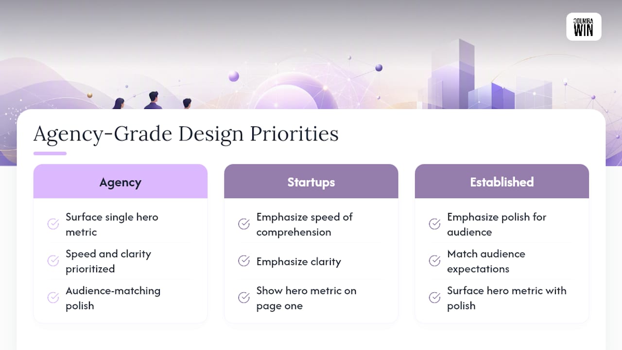
Strategic design choices move the needle on sponsorship and press outcomes more than most founders expect. Coumba Win’s case studies point to one consistent priority: surface a single hero metric on page one instead of burying it in a paragraph. Startups need speed and clarity; established creators need polish that matches their audience’s expectations.
How Coumba Win Approaches a Media Kit Project
A template works fine if your brand is simple and your deadline is tight. Custom design earns its cost when the kit has to carry real weight, like a Demo Day or a funding push. We usually cluster deliverables into one package: branded PDF, hosted press page, and an asset bundle, so founders launch once instead of assembling pieces for weeks.
— Coumba Evelyn
Get a Custom Media Kit Built for Your Launch
Coumba Win Design is the alternative to piecing together a kit from scattered templates and stock photo folders. We build the whole package as one coordinated deliverable: a branded PDF, a hosted press page that updates without a redesign, and an asset bundle your team can hand to any sponsor or journalist without a follow-up email.

Founders working with us typically get a print-ready PDF, a web-optimized version with live links, and a matching press page built on the same component system used across the rest of their site, so nothing looks stitched together from three different tools. That consistency matters when you’re pitching sponsors who compare you against a dozen other startups in a week. If your Demo Day, funding round, or press push is coming up faster than your design bandwidth, start a project with Coumba Win and get the kit built around your actual metrics and story, not a generic template.
Sources
- How to create a media kit: Tips & free templates — Adobe Express
- Prnews
- Accessibility design resources — University of Michigan Brand
- How to create a press kit — Presspage blog
FAQ
What Should a Media Kit Include?
A brand overview, audience metrics, a case study, visual assets like logos and headshots, pricing or rate information, and clear contact details. Adobe’s framework and PR-industry guidance both converge on these same core elements.
What’s the Difference Between a Press Kit and a Media Kit?
The terms are largely interchangeable today, though “press kit” historically leaned toward media coverage and “media kit” toward advertising and sponsorship data. Most creators and startups now use one document that serves both purposes.
Are Media Kits Still Relevant?
Yes. Major publishers still use them to manage ad placements and present audience data to advertisers, and sponsors expect one before committing budget.
How Can I Create a Media Kit for Free?
Free tools like Canva offer editable media kit templates you can adapt with your own brand colors, photography, and metrics. For a kit that needs to carry more weight, like a funding round or major sponsorship pitch, working with a designer or agency like Coumba Win Design closes the gap between “adequate” and “impossible to ignore.”
How Often Should I Update My Media Kit?
Review it quarterly at minimum, since stale metrics and expired links are the fastest way to lose credibility with a partner mid-pitch. For tips on keeping your marketing collateral current and credible, explore Our Services — Social, SEO, Websites & Automations | HarbourSide Digital.

