
Quit Kit
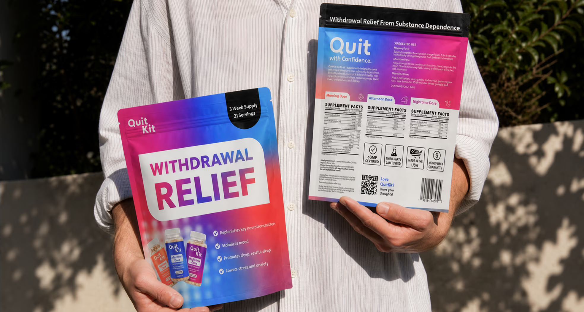
Quit Kit is a 21-day recovery system built around three supplement blends designed to support people tapering off kratom, 7OH, and opioids. We were brought on to design the packaging for all three bottles, giving the brand a system that feels credible on a pharmacy shelf and human in someone's hands.


Gameplan
Our collaboration focused on designing packaging that could hold real medical trust and real emotional weight at the same time. Together, we:
Studied the recovery journey Quit Kit supports, from first taper to full withdrawal, to understand what the package needed to communicate.
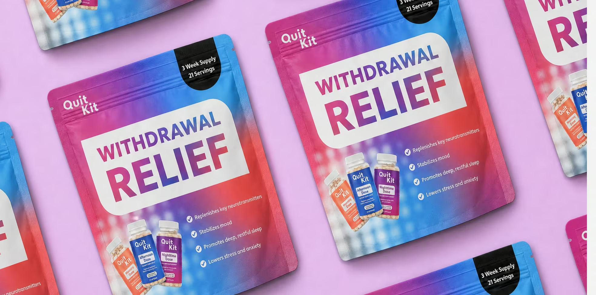
Developed a distinct visual identity based on the blends while keeping them unmistakably part of one system.
Designed label layouts that met supplement facts and regulatory requirements without losing the warmth of the brand.
Built print-ready files for the packaging, tested for shelf legibility and consistency at scale.


Challenges
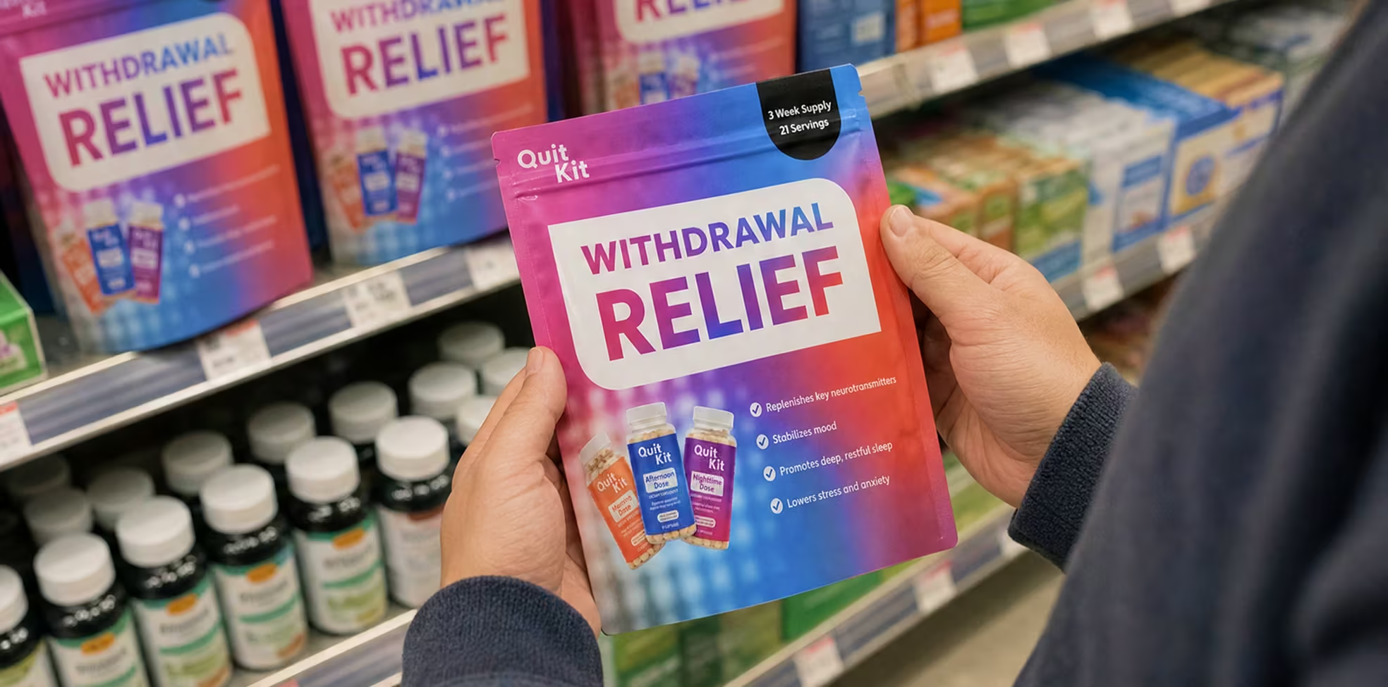
Quit Kit sits in a category where most packaging looks clinical or gets it wrong in the other direction, leaning too casual for something people are trusting with their recovery. The three bottles needed to read as one coherent kit, be told apart at a glance by time of day, and carry FDA-required supplement facts without turning into a wall of small print.


Solutions
We built a gradient-driven color system that shifts across the packaging to represent the three bottles, so the set reads as a single story rather than three unrelated labels. Bold, plain-language callouts sit above the supplement facts panel, keeping the clinical information present but not overwhelming.


Results
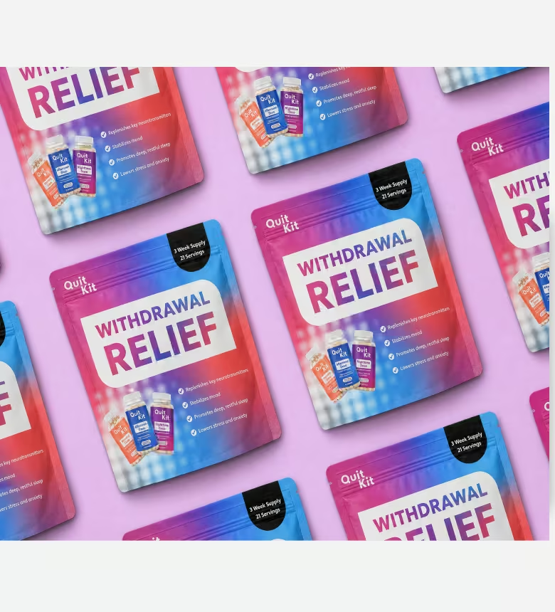
One visual language that ties Morning, Afternoon, and Nighttime together at a glance.
Supplement facts and required disclosures fit cleanly without crowding the design.
Shelf-ready differentiation.
Packaging that feels credible enough for a shelf and warm enough for someone's kitchen counter.