Build 3 Brand Email Templates Fast: Curated Playbook for Marketers
Build 3 Brand Email Templates Fast: Curated Playbook for Marketers
A brand email template is a reusable layout that locks in your colors, fonts, header treatment, and CTA style so every send looks like it came from the same company, on purpose. The fastest move is to grab a purpose-specific template from a proven library, or commission a custom shell, rather than designing from scratch every time. Whatever you choose, bake in accessibility and CAN-SPAM basics from the first draft, not as a last-minute copy edit.
TL;DR:
- Using a purpose-specific template from a proven library saves time and ensures consistency across emails rather than designing from scratch each time.
- Start with a core set of templates for newsletters, promotions, onboarding, transactions, events, and re-engagement to cover most customer interactions.
- Build templates as modular components with clear naming to facilitate maintenance, updates, and reuse across different email types.
- Designing for accessibility and compliance with CAN-SPAM guidelines improves deliverability, reach, and legal safety of email campaigns.
- Treat templates as a scalable system or product, and consider hiring a design partner if internal resources are stretched or a distinctive, on-brand look is needed.
Table of Contents
- Where to find inspiration worth stealing
- The template types every brand needs first
- The modular anatomy behind every reusable template
- Design, accessibility, and the CAN-SPAM checklist you can’t skip
- Turning templates into a library you can actually maintain
- Design rules that make a template memorable
- Templates as a growth asset, not busywork
- When it’s time to bring in a design partner
- Sources
- FAQ
Where to find inspiration worth stealing
You don’t need to reinvent the wheel here, and honestly, trying to is how you end up with a Frankenstein template that pleases nobody. Start with curated galleries built for exactly this purpose.
- Really Good Emails organizes thousands of real sends by category, so you can jump straight to onboarding flows, e-commerce promos, or editorial newsletters instead of scrolling blind.
- Marketplaces like Canva and Stripo hand you customizable starting points when you need speed over originality.
- Galleries like Email Love round out the mix with a scrappier, more design-forward angle.
When you’re browsing, look for three things: a cohesive header that immediately signals the brand (not just a logo slapped on a white bar), one memorable design element that makes the email recognizable even with the logo cropped out, and a CTA that reads clearly without you having to squint. Once you find something close, swap in your own brand colors and voice fast: replace stock photography with your product shots, rewrite the headline in your actual tone, and drop in your logo and accent color. Adapting good bones beats building from zero every time.
The template types every brand needs first
Not every template deserves equal attention out of the gate.
- Newsletter/editorial: prioritize readable text blocks and a clear content hierarchy over flashy visuals.
- Promotional/sale: lead with one hero offer and a single dominant CTA, resist the urge to cram in three deals at once.
- Onboarding/welcome: keep it warm and instructional, this is where new subscribers decide if they trust you.
- Transactional/receipt: clear account info and order details come first, minimal promo (if any) comes second.
- Event/invite: date, time, and RSVP button need to be visible without scrolling.
- Re-engagement: a direct, low-pressure ask works better than guilt-tripping someone back into your inbox.
Say you’re launching a new feature next month. You’ll want the newsletter template for the announcement, the onboarding template for anyone who signs up because of it, and the transactional template ready the moment they complete their first action. Build those three first and you’ve covered most of the lifecycle.
The modular anatomy behind every reusable template
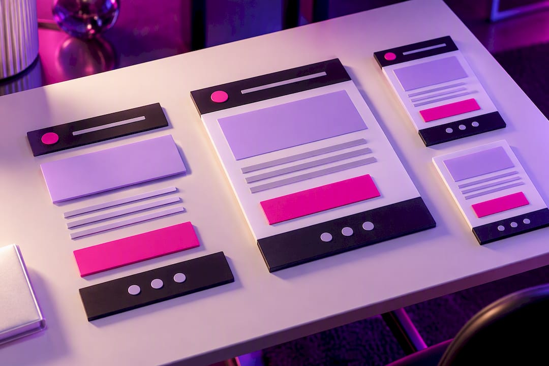
Think of your template less as one file and more as a shell plus swappable parts. That’s what makes it maintainable six months from now when someone new joins your team.
- Global shell: preheader text, branded header, correct from and reply info, and a legal footer with your postal address and unsubscribe link.
- Hero block: the visual and headline that sets context for the whole email.
- Single-focus CTA: one primary action, styled consistently across every template.
- Product grid or content module: reusable blocks for showcasing items or articles.
- Social proof or testimonial module: swap in for higher-consideration sends.
- Plain-text fallback: a readable version for clients that strip HTML.
Name your modules the way you’d name components in a design system, something like header-branded-v2 or cta-single-focus. That naming discipline is what lets you reuse a module across six templates instead of rebuilding it six times.
Design, accessibility, and the CAN-SPAM checklist you can’t skip
Good design and legal compliance aren’t separate checklists, they overlap more than people expect. Accessible design tends to be the same design that performs well.
Accessible design improves reach and deliverability, according to Validity’s research on email accessibility, which ties semantic structure and readable text to better engagement across mobile and assistive-technology users.
- Use semantic HTML structure so screen readers can parse your layout correctly.
- Keep body text at 14 pixels or larger and headers clearly distinct in size.
- Meet WCAG contrast guidelines between text and background colors.
- Write real alt text for every image, not just the file name.
- Design mobile-first, since that’s where most opens happen.
On the compliance side, the FTC’s CAN-SPAM guidance is non-negotiable: truthful header and sender information, a subject line that doesn’t mislead, a valid postal address, and an unsubscribe mechanism that works without requiring a fee or extra personal information. Also, classify a message’s primary purpose before you decide how much footer disclosure it needs, mixing heavy promo into a transactional email can flip its legal classification.
Turning templates into a library you can actually maintain
One template is easy. Twelve templates without a system is chaos, and chaos is expensive when a legal disclosure goes missing on send day.
- Build the global shell first, then branch into purpose-named templates (
newsletter,promo-sale,onboarding-welcome). - Adopt a naming and versioning convention (
template-name_v3) so nobody sends an outdated draft by accident. - Run a QA checklist before every send: rendering across clients, working links, functional unsubscribe, and alt text present on every image.
- Assign an owner for the library, schedule quarterly audits, and document clearly when a new template is warranted versus when an existing one just needs a new module.
Pro Tip: Keep a single shared doc listing every template name, its purpose, and its last audit date, it saves hours the next time someone asks “which one do I use for this?”
Design rules that make a template memorable
Pick one signature element, a bold header treatment or a distinctive CTA shape, and repeat it everywhere. According to design guidelines built for email, committing to one memorable element beats stacking multiple visual flourishes that compete for attention. Match the intensity to the audience: a fintech onboarding email earns restraint, a streetwear drop earns swagger. Keep your template tied to your live style guide and component library so both evolve together instead of drifting apart.
One memorable element, repeated consistently, does more for brand recall than five competing ones.
— Coumba Evelyn
Templates as a growth asset, not busywork
Treat your templates like a product, not a one-off task you knock out before a launch. Startups that build a real system get speed without losing craft, while the ones stitching together new decks every campaign burn hours they don’t have. Invest in the system once and every future send gets easier.
When it’s time to bring in a design partner
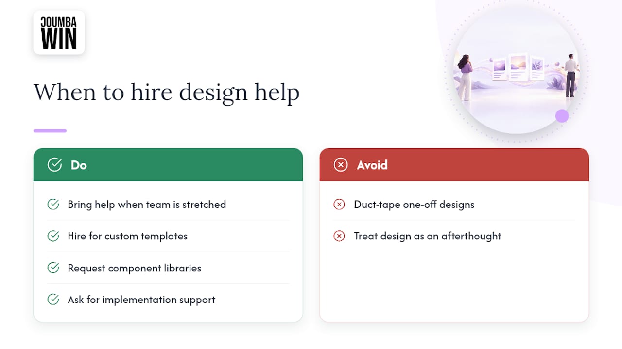
If your team is stretched thin or the templates you’ve patched together still don’t feel like you, that’s the signal to bring in help rather than duct-tape another one-off design. 
A design partner can build custom email templates, component libraries, and full implementation support for startups that treat design as a growth lever, not an afterthought. Such design partners often work directly with founders to build systems that scale past the next campaign. Check out our portfolio and past work or head to Coumbawin to talk through your next project.
Sources
For the legal fine print, see the FTC’s CAN-SPAM guide and the eCFR CAN-SPAM Rule. For inspiration and workflow integration, revisit Really Good Emails and this content publishing platform.
- CAN-SPAM Act: A Compliance Guide for Business | Federal Trade Commission
- Email accessibility in 2025: Why it matters
- Really Good Emails — Curated Email Design Inspiration
- Email design guidelines (PostHog example)
FAQ
What are some examples of branded emails?
Strong examples include editorial newsletters with a consistent header treatment, promotional emails built around one hero offer, and onboarding sequences with a warm, instructional tone. Galleries like Really Good Emails organize real sends by category so you can study working examples directly.
How do you create a branded email?
Start with a global shell (header, footer, legal info) then layer in purpose-specific modules like a hero block and a single-focus CTA. Pull your actual brand colors, fonts, and voice into the template rather than relying on generic defaults.
What is the 3 email rule?
Definitions vary depending on who you ask, some teams use it to mean sending no more than three emails per campaign sequence to avoid fatigue. There’s no single official standard behind the phrase, so treat it as a guideline rather than a fixed rule.
What is the 30/30/50 rule for cold emails?
This isn’t a standardized rule with an official source, and usage varies across marketing communities. If you’re building cold outreach templates, focus instead on the CAN-SPAM basics covered above: accurate sender info, honest subject lines, and an easy opt-out.