Turn Browsers into Buyers: 10 Conversion First B2B SaaS Sites for 2026
Turn Browsers into Buyers: 10 Conversion First B2B SaaS Sites for 2026
This is a curated, 2026-updated set of B2B SaaS website examples, picked for the specific patterns you can actually lift and test, not just admire. Our best next move: pick 2 or 3 examples that match your buyer type, then run one focused test (your headline or your plan matrix) before touching anything else. Consider this your shortcut, courtesy of Coumba Evelyn at Coumba Win.
TL;DR:
- Using clear outcome-based headlines and straightforward plans increases conversion rates and reduces buyer confusion at each sales stage.
- Linking plan matrix features to detailed pages and defining terms inline addresses common friction points that stall buyer comparisons.
- Industry and use-case pages should be role-specific and easily accessible to help prospects see themselves using the product before engaging sales.
- Optimizing for mobile, keeping navigation shallow, and including trust signals near decision points can significantly improve engagement and trust.
- Creating modular, standalone content like plan matrices and feature pages prepares sites to better serve self-serve and early decision-making buyers in 2026.
Table of Contents
- What makes a B2B SaaS website actually work
- Ten SaaS sites worth bookmarking right now
- Turning these examples into tests you can run this week
- Why we’re the ones pointing this out
- A shortlist to bookmark and revisit
- One prediction worth building around in 2026
- Let’s build the site your product deserves
- FAQ
- Sources
What makes a B2B SaaS website actually work
Before you screenshot ten homepages and call it inspiration, know what you’re hunting for. A good example teaches you something you can rebuild, not just something that looks nice on a Friday afternoon scroll.
Start with the essentials: a value proposition you understand in five seconds, a primary call to action that isn’t competing with three other buttons, and a real screenshot or demo clip instead of an abstract blob illustration. Buyers want proof of product, not mood lighting.
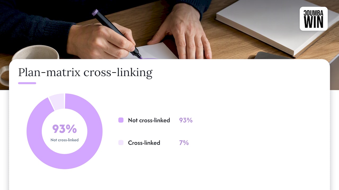
Plan matrices deserve special attention. The best ones are scannable, define their terms instead of assuming you know what “seats” or “workspaces” mean, and link each feature row to a detail page. Baymard Institute’s research on SaaS UX found that 93% of tested sites failed to consistently cross-link plan matrix features to feature-detail pages, which is exactly the kind of friction that stalls a buyer mid-comparison.
Industry and use-case pages matter more than most teams think; leveraging customer communication software for service businesses can help visitors verify whether a SaaS product fits their organization. They let a prospect see themselves in the product before they ever talk to sales, and that same Baymard research found 33% of SaaS sites skip dedicated industry pages entirely, leaving buyers to guess whether the tool fits their world.
A few other things to watch for as you study examples:
- Navigation that stays shallow, usually three to five top-level categories, so buyers aren’t digging through submenus to find relevance.
- Trust signals placed near decision points: logos, a short metric, a one-line case study quote, not buried on a separate “About” page.
- Accessibility basics handled by default: readable contrast, keyboard navigation, alt text on product screenshots.
- Mobile performance that doesn’t punish you, since a slow-loading plan page kills momentum fast.
Pro Tip: Open any example on your phone first. If the plan matrix turns into an unreadable horizontal scroll, that’s your first fix, not theirs.
Ten SaaS sites worth bookmarking right now
These examples each earn their spot for a specific reason. Study the page we point to, not the whole site, and note the one pattern worth copying.
- Ramp (homepage and pricing page). The homepage leads with a concrete savings claim and a product screenshot above the fold instead of a hero animation. Pattern to copy: anchor your headline to an outcome, not a category description.
- Kajabi (homepage). Built for a mixed audience of creators and small businesses, the homepage uses plain language and a single clear CTA path toward a free trial. Pattern to copy: write your headline like you’re explaining the product to a smart friend, not a procurement committee.
- Lattice (industry pages). Lattice’s use-case pages for HR leaders versus people managers each speak to a different buying concern. Pattern to copy: split your industry pages by role or outcome, not just by vertical label.
- Dropbox Sign (pricing page). The plan matrix here defines terms inline and links feature names to detail pages, addressing the exact gap Baymard flagged in most SaaS sites. Pattern to copy: never assume a buyer knows what your feature name means without a tooltip or link.
- Apollo.io (homepage). The homepage balances a self-serve signup button with a “book a demo” option, serving both PLG and enterprise buyers on the same page. Pattern to copy: give both buyer types a path instead of forcing everyone through one funnel.
- Loom (product page). Loom leans almost entirely on short product recordings instead of static screenshots, letting the tool explain itself. Pattern to copy: a 15-second clip of your actual interface often beats three paragraphs of feature copy.
- Figma (homepage and use-case pages). Figma’s navigation stays shallow while its use-case pages (design systems, prototyping, dev handoff) go deep on specifics for each audience. Pattern to copy: keep top-level nav simple and push depth into dedicated pages.
- Proof (homepage). As a smaller player, Proof’s homepage compensates with a tightly scoped value prop and a single, obvious next step. Pattern to copy: when you can’t out-feature the big players, out-clarify them.
- A developer-first platform’s API documentation entry point. Developer-facing SaaS tools that put docs one click from the homepage reduce friction for technical buyers who evaluate before anyone talks to sales. Pattern to copy: if developers influence your sale, don’t hide the docs behind a login.
- An enterprise-tier security and compliance page. Enterprise buyers often stall on trust, not features, so a dedicated security page with certifications and data handling details closes that gap. Pattern to copy: give compliance-minded buyers their own page instead of a shared FAQ accordion.
Turning these examples into tests you can run this week
Inspiration is worthless until it becomes a test. Here’s how to move from “I like that” to “we changed this and measured it.”
- Match examples to your stage. If you’re pre-revenue and PLG-focused, study Loom or Kajabi before you study Apollo.io. Matching maturity matters more than matching industry.
- Audit your homepage and plan matrix first. Check whether your headline states an outcome, whether your CTA is singular and obvious, and whether your plan matrix defines its own terms the way Dropbox Sign’s does.
- Rank fixes by effort versus impact. A headline rewrite takes an afternoon; a full navigation restructure takes a quarter. Do the afternoon fixes first.
- Test one variable at a time. Change your headline or your plan matrix layout, not both, so you know what actually moved the number.
- Track the metrics that matter. Demo starts, plan comparison clicks, and demo-to-trial conversion tell you more than raw traffic ever will.
- Document what worked and scale it. If a clearer plan matrix lifted comparison clicks on one page, apply the same structure to every pricing-adjacent page you own.
Our guide on creating a homepage layout that converts walks through the audit checklist in more depth if you want to go further before you start testing.
Pro Tip: Give each test two full weeks before you call a winner. B2B sales cycles are long enough that a three-day spike rarely means anything.
Why we’re the ones pointing this out
We spend our days building bold, outcome-driven sites for startups who treat design as a growth lever, not decoration. That means we’ve sat inside the same plan matrix debates and homepage headline arguments these examples solve, just from the builder’s side of the table.
We provide services including branding, web development, UI and UX design, and accessibility audits for founders who need their site to do real work, not just look sharp. You can see how that shows up in practice on our portfolio of Webflow projects, and our post on interactive features that convert digs into the mechanics behind a few of the patterns above.
A shortlist to bookmark and revisit
If you only save one list from this article, make it this one. Ramp and Apollo.io are worth a second look for anyone balancing self-serve and sales-assisted funnels on the same homepage. Kajabi and Loom reward a close read if your product sells itself best through visuals rather than copy. Lattice and Figma are the pair to study if your buyer base splits across multiple roles or departments, since both tailor their use-case pages instead of writing one generic pitch for everyone.
Dropbox Sign is worth revisiting any time you touch your pricing page, since its plan matrix handles the definition-and-linking problem that trips up most SaaS sites. Proof earns its spot for founders working with a smaller budget and team: it proves clarity beats scale when you can’t compete on feature count. Keep this shortlist somewhere you’ll actually open again, a pinned browser tab works better than a bookmark folder nobody revisits.

One prediction worth building around in 2026
Buyers are choosing themselves out of sales conversations earlier than ever. Gartner’s 2026 sales survey found that 67% of B2B buyers prefer a rep-free experience, which means your site has to do the convincing a salesperson used to do.
Our bet: the sites that win this year treat content as modular blocks, reusable across plan pages, chat tools, and whatever agent-driven search looks like next. Start by making your plan matrix and feature pages clear enough to stand alone, without a rep in the room.
— Coumba Evelyn
Let’s build the site your product deserves
Studying ten great examples is useful. Having someone translate the right patterns into your actual site, built around your buyers and your product maturity, moves faster. That’s the gap we close for founders who’d rather spend their time on product than on plan matrix debates.

We offer web design and development, UX and UI design, and Webflow builds, focused on startups that treat their website as a growth asset rather than an afterthought. If you’re ready to turn a few bookmarked homepages into a site that actually converts, start a project with our team and tell us what you’re working with.
FAQ
What makes a B2B SaaS website example worth studying?
Look for sites that pair a clear, outcome-focused headline with a real product screenshot or short demo clip, plus a plan matrix that defines its own terms. The strongest examples also link feature names to detail pages, closing a gap that Baymard Institute found in most tested SaaS sites.
How many examples should I study before redesigning my site?
Two or three matched examples beat ten random ones, since matching your buyer type and product maturity matters more than volume. Pick sites that serve a similar audience to yours, whether that’s self-serve buyers or committee-driven enterprise deals.
Why do plan matrices matter so much for conversions?
Plan matrices are often where buyers decide between options, so a confusing or jargon-heavy matrix stalls the decision entirely. Forrester’s 2025 predictions note that more than half of large B2B purchases now run through digital self-serve channels, which puts extra weight on a matrix buyers can understand without a rep.
Do industry or use-case pages actually affect buyer trust?
Yes, they let a prospect see their own situation reflected in the product before a sales call happens. Despite that, Baymard’s research found that 33% of SaaS sites skip dedicated industry pages, leaving buyers to guess at fit.
What does Coumba Win actually offer startups building a site like this?
Our services include web design and development, UI and UX design, and Webflow development, scoped specifically for startups scaling fast. You can see examples of that work on our portfolio page before reaching out.